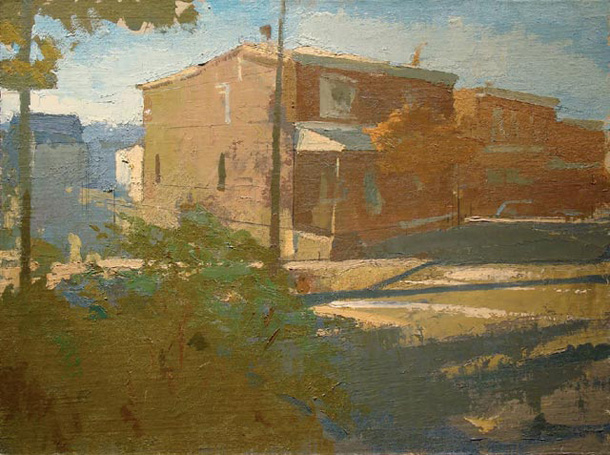
Peter Van Dyck, corner of ripka and wilde streets 18” x 24” oil on linen 2010
Peter Van Dyck was classically trained in the The Florence Academy of Art, Florence, Italy 1998-2001 and now is an adjunct Faculty at the Pennsylvania Academy of the Fine Arts in Philadelphia. He shows at the Artists’ House Gallery in Philadelphia and the The Grenning Gallery, Sag Harbor, NY. I first saw his work as part of the Perceptual Painters website that I wrote about in a previous post a couple of years ago. I was impressed then and now with his fined honed traditional painting skills especially with regard to the light and geometry of his paintings. His recent paintings impress me by his investigation of new ways of put together a painting from observation. I’m attracted to paintings, such as these, that take risks and are willing to leave the comfort zones of accomplished technique and never settle for just making clones from pot-boiling formulas. I was very pleased when Peter agree to answer a few questions for this blog about his work in an email a couple of days ago.
Larry Groff From what I’ve seen on your website your work seems to be starting to veer away from a classical realism to more modernist leanings. I see a greater emphasis on the surface, flatter shapes and painterly handling in general. I’m curious if you can say anything about this evolution of your work.
Peter Van Dyck I’m very pleased that you see this evolution in my work. Ironically, I think this “modernist” seed was planted in my “classical realist” training: I had what might be referred to as a neo-traditionalist atelier education but it happened to be one that emphasized an optical, shape based approach to representation (Vermeer as opposed to David). However, shape design was still taught mostly as a threshold to describing form, a necessary step so that one could model. But I did see people in school whose work had an assertive shape life and I guess I was attracted to that. So, gradually, shape design became (I think) the dominant organizational and expressive force in my paintings (perhaps at the expense of form) and as I have recently started to let myself go a little, I guess this interest has come forward even more. The same could be said about the paint handling and the surface that it generates.
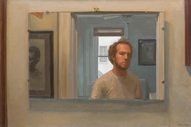
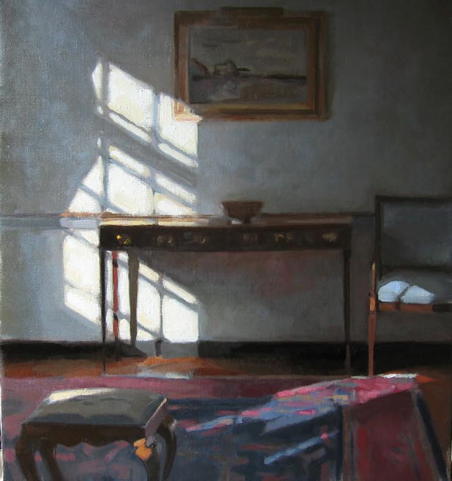
self-portrait leaving the guestroom 22” x 33” oil on linen 2008
(click for larger view – true for all the images in this article
LG What issues are you currently thinking about with these new landscapes like the corner of ripka and wilde streets and ripka st. porches?
PVD As far as the approach goes in the paintings you refer to (as well as the other recent urban landscapes): most of the subjects I used to paint were highly controlled and I really made an attempt to be a kind of “objective” human camera obscura, to copy the picture plane (I was not very good at it). But in the past couple years, especially when painting the city, I started to construct the painting from the ground up out of the perceptual elements that I was attracted to (I don’t know why it took me so long to figure this out). Then, the accumulation of the elements that I was perceiving and the orchestration of them as forces in the painting would start to build into something that in a surprising way got at my pleasure of the place or thing that I was looking at and was in no way a facsimile of the picture plane. I know that is all painting 101 but it was a genuine discovery for me
Also, these are the first paintings I have painted exclusively to please myself. When I was in school and for a good while after I left I was deeply influenced by my teachers and I think I always somehow painted to please them or to meet what I imagined to be their standards or expectations. Then for a while there were some galleries that were showing and selling my work and of course that had its own pressures. It was a blessing in disguise for me when the galleries that I worked with decided that I wasn’t good anymore. All of a sudden, I was really painting for fun and to make something that I wanted to keep for myself.
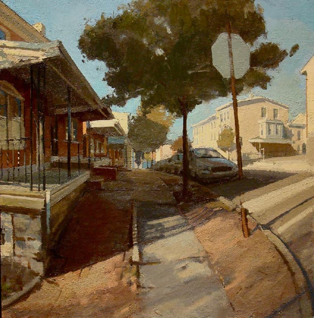
ripka st. porches 24” x 23” oil on linen 2010
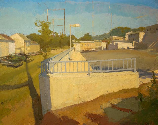
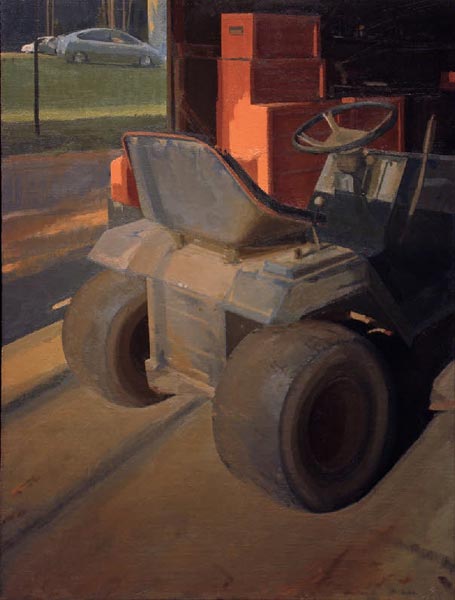
parking lot 16” x 20” oil on illustration board 2010
LG Who are some of your greatest influences?
PVD My influences are pretty obvious I’m afraid….Vermeer, Corot, Sargent, Antonio Lopez to name a few. I’m really inspired by a lot of contemporary people off in their own corners of the world making fresh energetic interpretations of their environments (thank god for the internet!) as well as my students at PAFA who are always better at doing what I tell them to do than I am.
LG Anything note worthy about your palette or technique that might be of interest to viewers?
PVD As far as my technique is concerned, I paint very directly with very little foresight and planning. I really don’t have any hard and fast rules, except to do whatever it takes to enjoy myself when I’m painting.
LG Your paintings all appear to be made from observation, do you use the sight-size method? How important is that to you?
PVD I work from direct observation but recently I have begun to work from memory as well a bit. I can only work from memory for a little while though before I run out of ideas. I was trained in the sight-size method but I haven’t worked that way for a few years now; for a number of reasons I think it would take me away from where I want to go.
LG Do you make drawings and studies for your paintings or just work it out on the painting itself?
PVD I don’t make drawings for the paintings. I tend to get excited about painting and then just want to start right in and fight it out on the painting.
LG Thank you Peter for taking the time to share your thoughts with us.
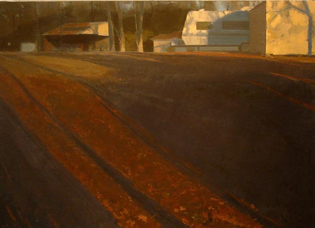
camper 22.5” x 32” oil on linen 2008
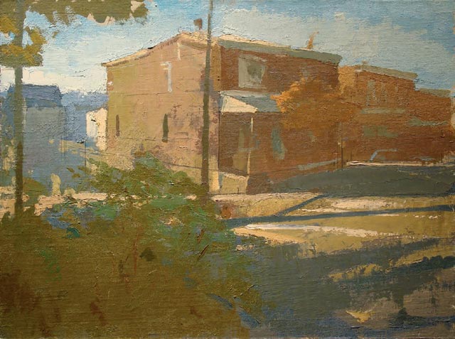
corner of ripka and wilde streets 18” x 24” oil on linen 2010
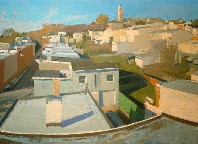
rooftop looking north 26” x 32” oil on linen 2010
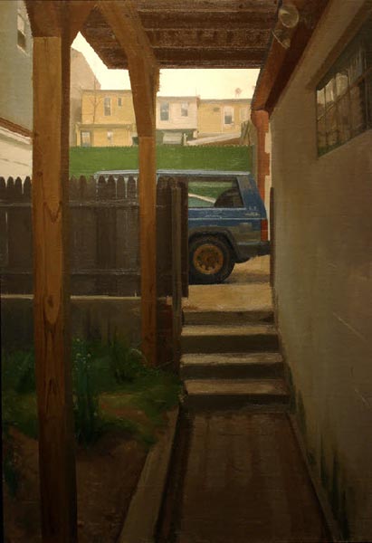
jeep 35” x 24” oil on linen 2008
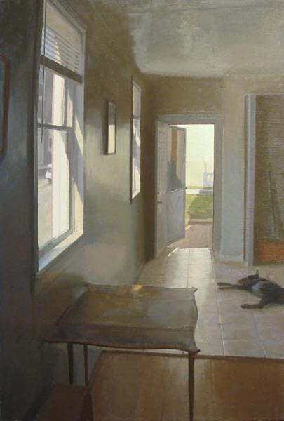
apartment story 35” x 24” oil on linen 2008
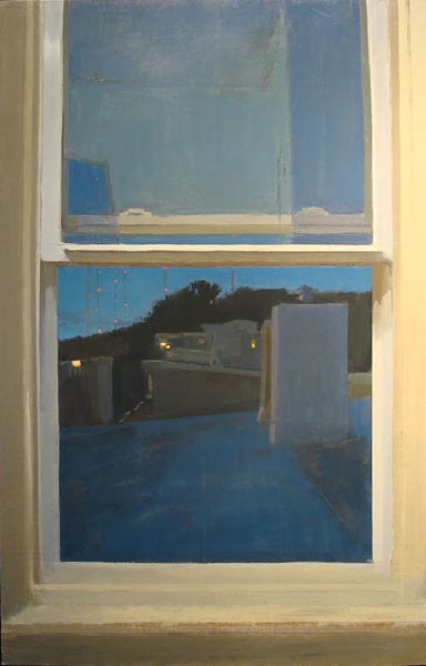
television towers by night 40” x 25” oil on linen 2008
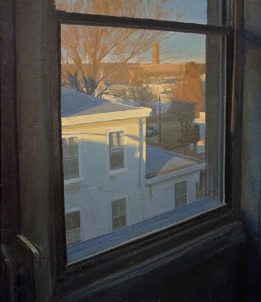
february 7 am 30” x 26” oil on linen 2008
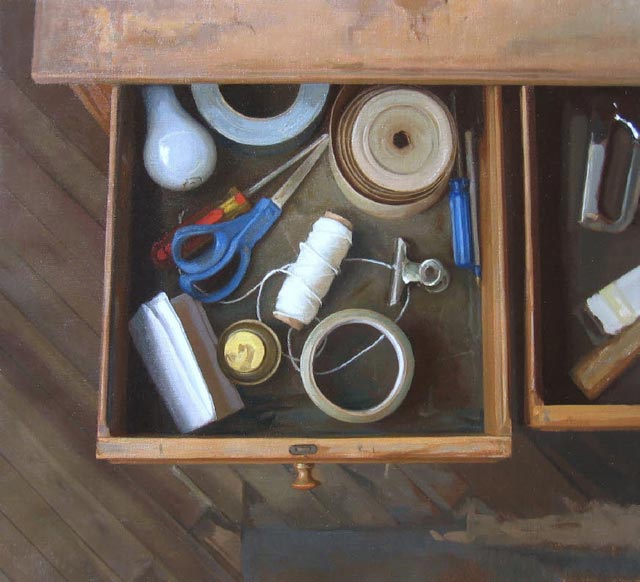
studio drawers 22” x 24” oil on linen 2007


His older paintings are good but I think the new ones are much more interesting.
Yeah, I love the curvilinear perspective, incisive drawing and matte surfaces. Exciting stuff. But the interview was far too brief! Nonetheless, thanks for some more great content.
I agree Austin and Hank there are some very exciting paintings here. I would love to know more about what goes on behind the curtains with Peter’s paintings as well but it is also nice to have a shorter interview too – if for nothing else it helps me to get the article posted quicker!
I’m thinking of having more shorter email interviews whenever possible, perhaps even just one question on occasion.
Great interview with a painter who deserves more attention, I am lucky enough to have had classes with Peter a few times, while being a student in the certificate program at PAFA. Iis Interior Painting class which I took last summer made a huge impact on my work and thought process. I have also attended the Sunday Painting Open studio that both Peter and Scott Noel run at PAFA. There you get to see both Peter and Scott employ these ideas and concepts you are talking about here, right before your eyes. Again, you just can’t beat this type of situation. Peter is also a really nice and funny guy–honest and even a bit too humble for a guy with his chops–which makes it all the better for those of us who get to work along side him.
I have just stumbled across this interview and the lovely paintings, and notice that Peter’s early work seems more moody and perhaps a bit lonely, a little like Hopper. Later work he moved outside into the sunlight with more expansive compositions.
The shift reminds me of the cinematography in the recent movie, Biutiful, with Javier Bardem, where the early part of the film has mainly interiors and limited vistas. Later in the film he learns he has inoperable prostate cancer and will die. At this point the camera moves outdoors and the Barcelona slum views are far more expansive.
I really enjoy looking at Mr. Van Dyck’s work. I admire his move towards more “observed” color, impressionistic in the best sense; the search for pigment to represent observed, seasonal, specific light conditions.
Compositionally his paintings are exciting. Almost reminds me of George Nick saying he used a divided viewfinder. I can imagine Van Dyck walking through the streets hunting for a painting. He makes interesting shape choices, and some of the inscribed rectangle within a rectangle shapes( in the sink/dish paintings, window paintings, bed paintings, or street paintings) create tremendous visual excitement to what could be mundane, mediocre subject matter. Shares some shape/picture plane affinity with Catherine Murphy, although much else is different.
The images of the casts (in what I assume is PAFA’s cast hall) are innovative in their sense of one’s feet in a specific spot looking around, and in their “twilight” hour color tonality.
I would really urge interested or intrigued individuals to check out his website, since there is so much exciting stuff not shown in this post or the perceptual painter’s website ( although I certainly appreciate this site in general, and this post in particular!).
Thanks Mr. Groff.
Hi, Peter! I went to school with you at PAFA in 1999 — I saw your face in American Painter and about fell over. Your work is exceptional. I’m so happy for your success. Take care – EC
I happily bump into Peter’s paintings every now and then on FB and I was glad to find this interview. It’s brief, but it gets right to the heart of the matter. I’m not sure why there is so much interest right now in traditional realism. I find it to be completely technique driven, even showy and fascist. There’s plenty of interesting realism that comes from Cezanne and Vuillard and Porter and Morandi which offers what I believe is a more humble and personal response to our surroundings: Knobelsdorf, Sangram Majumdar, Yael Scalia. Glad to see that Peter might be veering away from Eakins towards Ryder and Albert York…
I like theses paintings. I like the differnce you have given the viewer to enjoy a new style. I at least have not seen this til now. Great work.
Love your humility Peter…refreshing. But your work is tremendous. Unique area between realism/modernism. Beautiful to look at and done w a bit of a muted palette. Very impressive.