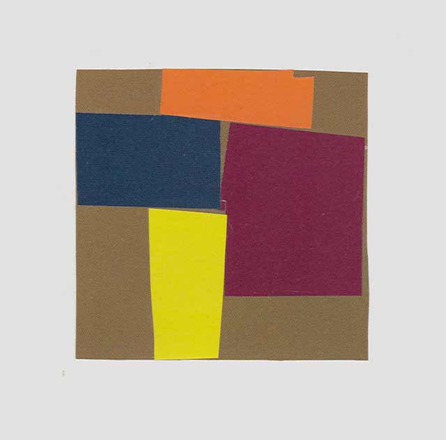
Collage
Overlapping is a large tool. Overlapping colors hold down other colors. They become steps, little and big, into and out of space.
One day I will give up talking and writing, no other form of communication except for painting.
Most things can not be separated. This includes color, form and composition.
Observe nature well and at the same time push the colors and shapes to emphasize what you loved about the thing you are painting. Push the abstraction to the point where you will lose something of the naturalness but will gain control over every part and where it will then be possible to adjust things further. Leave out the details altogether for awhile. The danger of details are that they can be use to tie everything together and to finish the painting too quickly. In the beginning try to limit the number of shapes you are working with. At this stage you are making an abstract painting using the elements in front of you. The idea is to go towards a stronger abstraction without going away from reality. The more exciting the abstraction the more exciting the painting and it then follows that the whole will be closer to the excitement of reality. The important part is translating the painting into a pure painting language, into an abstraction, strengthening that abstraction, without losing touch with the observable world.
Strengthen your sense of the abstraction to be better equipped not to be overwhelmed by the motif.
When painting abstractly try to come across forms and colors as naturally as possible, as if you were discovering them by walking through a landscape looking for a motif to paint. Except by the time you find something you would like to paint you have already painted it, and having done these abstract paintings more likely to find these things in the landscape.
Get outside soon and do some real, perceptual painting if that really exists or maybe more precisely some abstract painting from life
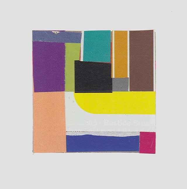
Collage
Consider everything equally then use them unequally. Make background details strong, distinct, shapes, then tie or cluster parts to form the larger interest or subject and to take its staring role without diminishing the other parts but letting them support without giving up their character or identity. Bring up the shapes in the background and then deal with them. In abstract work the subject is the abstraction itself. In working instead of focusing on the subject and less on the background stress the background. This will be the strong support for the main subject and will supply parts that when clustered becomes the main subject.
Remember everything in the arena of the work plays a part. Unlike a play the lights can not be adjusted from moment to moment. Everything is in focus and controlled. Everything can be viewed at once but the artist can guide the viewer by emphasis, relating and by making steps that direct the eye this way and that.
Every part needs to be abstracted in order for it to be adjustable. Everything strong and then placed under control. Try something other than muting. While speaking you would not say clearly what you want to say and mumble the rest. Remove in the work what is not important. I do not know if I could have figured out yesterday what is clear today. What I do today is different than what I would have done yesterday. In this way slowness has a large impact. Slow looking, working quickly, day after day.
In an abstract work there is a better chance that each color shape is given full consideration. Some of these will combine to make larger, more dominant, complex shapes. This shape will likely contain a portion of the subject of the work. In a figurative work an abstract shape may be taken in by the eye before the subject is recognized. It might be an important part of the subject but likely not the entire subject. The subject cannot be separated entirely from the whole. This abstract shape must be interesting in itself. One problem, and a big one, in a figurative work could be that a prominent shape is not interesting abstractly. For example a prominent dark shape might make up a part of the model’s clothing and start the journey to explore the other forms that make up the model with all this anchored within the shapes that make up the space around the model. The dominant abstract shape will start the journey that will explore the rest of the painting.
Take a painting done from life and do a collage after it. While doing this make several quick drawings of the painting. Let these be like quick notes. A few lines, just enough where if you were drawing from several different paintings you would be able to tell which drawing is of which painting but no more than that; so only what is necessary to identify which painting it was of. Starting with the blank canvas you start with one shape with four edges. The first mark transforms this shape and makes things more complex. In collage you are actually cutting the forms that make up the edges of the work and therefore you are more likely to be aware of them and their importance.
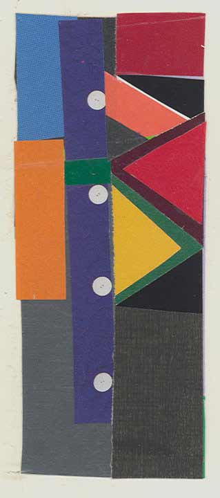
Collage
Attraction to a subject needs to be of the entire space that holds the subject, not just the subject. It cannot be one object. Just as one must treat the painting as a whole one needs to be attracted to the whole. Make sure there is a painting there. The relationships together will determine the skin of the work, its overall color/light/atmosphere. The artist may not be aware of this until afterwards and when seeing the work again after some time has passed and viewing it in a different environment and in a different light. It is very hard for the artist to judge the work with a wet brush in the hand and a remembrance of all the stages the work has gone through. The painting must be seen away from where it was made. The teacher coming upon the students work still before the motif can only wonder how the student saw what he painted. Away from the motif the artist should never defend the painting by saying that was the way it was. If it was and is not working then it had to be reinvented.
Instead of presenting a still life in a gentle way; front of table, edge, flat plane with objects, and wall, throw the viewer into the objects. Instead of being frozen to one spot try moving around your subject little a sculptor would. This is different to what the Renaissance did with perspective where the line of perspective put the viewer in a stationary spot. The objects disappear into space instead of coming forward. Braque said it better – “The viewer can back away or come forward as with real objects.”
Move around in the painting while you move from one color/value to another on the palette.
Pick three spots where a plane of color moves through the painting. Take for example a wall behind and between objects on a table. Let us say that the wall turns. Pick out one spot on the wall and compare it to another spot on the same wall, same plane and then another spot on the wall that has turned. The former spots will likely be in a closer range and where the wall has turned will be more of a jump in value. This will depend greatly on the lighting. If the painting demands it you will need to adjust the lights or invent what is necessary to create the turn. Likewise if painting a house or any cube shape, the light needs to strike one side more than the other or you will not have the allusion of going around the corner but instead the form with be flattened out unless other means are applied.
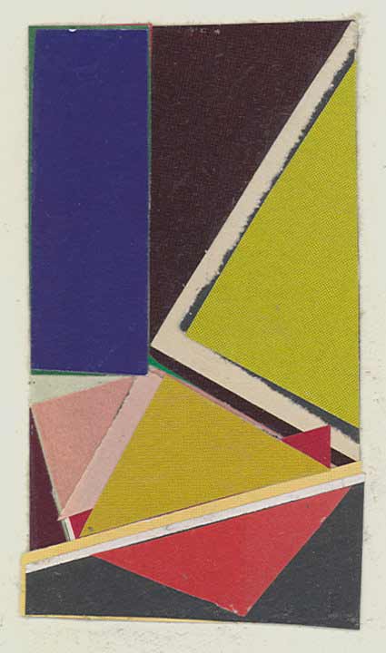
Collage
The one brush method enables you to do the constant adjusting as opposed to making up a new color each time.
You can not make something out of nothing and you can not just go out and copy the landscape. Perception and invention must work together. On the radio the other day I heard Stephen Sondheim talking about his lyrics and was surprised that he uses a rhyming dictionary, but then it makes sense, like the artist who has things before him to pick and choose from and then to construct his invention.
Nuance is what happens while working on the large things in the painting.
Do not fall in love with parts. They amount to little on their own. It is only how they make up the whole.
Painting is like I am locked out and I am trying every door, looking through windows, trying to find a way in.
You can try as hard as you want, trouble is, what you are trying to do has little to do with what you will do. But if you fail you will possibly get something far more surprising, something you just invented.
Look at as much great art as you can. Still better find an artist whose work speaks to you and spend a long time looking. This may happen with different artist at different times.
Look at paintings that give permission to go where you were cautious.
There are many abstract painters who claim that their work is derived from life and many figurative painters who claim to be abstract. Of course they are both right.
To sit among the frescoes of Lorenzetti in the Palazzo Pubblico in Siena and paint abstractly is not a contradiction.

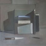

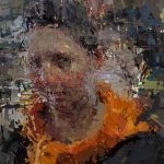

This is breathtaking. I definitely want to read more from Ken if that’s possible. I’ve heard a lot about Ken, have been following his work and hope to take a class with him at some point. I would love to take a color class with him! When I saw your Certosa photo of him putting pottery shards together in a color class it was most intriguing and I wanted to know more. Thanks for posting this, I’ve read it a couple times and will keep it close by…this is the way I want to hear about color. You are so right most writings, teachings on color are pretty dreadful, they certainly lack the passion Ken clearly has for it. Lots of great statements in here but for me the best line ever…”Love colors as writers love words. It is the love that comes through when the mind gets out of the way. Don’t think too much.”
Thanks Ann and Austin for such thoughtful comments. It isn’t easy to respond to the many ideas that Ken presents here but you both went to the heart of the matter.
Despite how much I like what he says, I’m not sure I could always follow his advice. Perhaps because I lean more towards the kind of writer who pulls his hair out and curses and bangs his hands on the keyboard that some particular grouping of words sounds so idiotic!
Many times I feel that way with color and painting, that it is less play than a agonizing struggle to capture the fleeting moment, trying to “get” something seemingly impossible. Yet, other painters, like Corot, get it dead on. But it is wonderful paradox that the more you try to copy nature the less real and “off” it tends to look but once you get the bigger, more abstract structure of light and form right and gives the painting feeling of rightness – from what the painting needs. It is in this moment, when you loose yourself in this process that the color can really transcend the arbitrary (like you see in colored drawing or more decorative approaches) and start to take on real meaning in the painting in terms of how the color relates to the whole.
For me, this starts to feel like loving colors and not thinking too much. I wish I could get there more often.
Thanks for this. Rather Zarathustra on color. You can always tell a good teacher by the absence of pedantry. As for me, getting grey was a turning point in my color journey, i.e. mixing black w/ a transparent yellow. The possibility of all those gentle modulations was an epiphany … or love at first sight. That seems to be the secret: you have to fall in love first. It was a struggle for me as an autodidact, to find my color, to fall in love. But that begs a question. How do non-painters ever get it? Especially in this age of diminishing connoisseur-ship, when, as Mr. Kewley points out, standard art-education is joke. I guess the patron’s reasons don’t matter so long as they’re patrons.
On another note, I’ve heard it said, and observed it in nature, that an particular animal species’ intelligence can be judged by the amount of time its young spend in play. Ex post facto maybe. But I like to believe they’re intelligent because they play.
Thanks for great paintings and an interesting article!
What a great attitude Ken Kewley has towards the making of a painting… There is so much in this interview that could be discussed. I have been reading choice parts of this interview just to kick start my day of painting.
Thank you Larry for the Interview and a big thanks to Ken Kewley for his heart felt words.
What a generous article. Thanks to Ken and Larry.
I really was interested to read what he said about painting the model-
“When painting the model, treat each part (do not name the parts) as something separate and then compose the parts into a whole. Into a composition. Use as few shapes as possible, do not think human.”
I’ve always marveled at how Ken finds surprising shapes and marks and angles in his figures, and this gave me a clue as to how that happens. Composing separate pieces as opposed to constructing a human figure.
Hi Larry and Mr Kewly
Wish I had been able post this sooner – Great article. These are great thoughts – perhaps too many all at once. It’s like trying to read Robert Henri’s The Art Spirit in one sitting. That’s in part what took me so long – trying to give the ideas the time they need. Mr. Kewly has said so many useful things in this grouping. Some of which as artists we may know but we would be wise to revisit and others which are really profound and new. I love the idea that we need less in the paintings and that so many paintings are ruined by having said too much. I am disappointed that when I’m in Philadelphia for Stuart Shils workshop, Mr. Kewly’s talk won’t coincide with that. I’ll have to keep an eye out for any talks that he gives in NYC.
What a wonderful article – thank you. Being from Australia, I have not heard of Ken Kewly. How sad is that? Now I have discovered his wonderful abstracts, so will my students. He speaks to my heart and has managed to put into these few pages – and so succinctly- much of what I have been trying to teach my students all year (and yes, I am amazed at how beautiful paint can end up so ugly!) Being predominantly a landscape painter, his words”Do not make a picture of a landscape, create a landscape.” were particularly resonant, and “to relate everything in a complex journey without resulting in chaos takes a lifetime to master” is what keeps us all, I imagine, going. Nothing challenges, engages and rewards so much as painting.
And I will take note: “If you try too hard it will show up in the work as an unpleasant element. I do not like to see artist suffering”. Neither do I, nor do I like to experience of suffering myself, but it happens…after this, I will remember the joy more!
Ken.
Thank you so much for your words of comfort and clarity. Just pulled myself out of a hole and am grateful to be painting without that pit in my stomach. That hard time was a great learning time because I made mud. Then I realized it was actually pulling out of a process that wasn’t true for me and I’ve moved forward…clearer and more truthful. Love what you said about not making a picture of something but making something. Thank you for the wisdom.
all best.
Cynthia Wick
“Rinsing the brush can be avoided by transforming whatever is on the brush toward a nameable color by adding that color or the color that when mix becomes that color or away from that color by mixing that color’s opposite.”
Um, why am I the only one confused???
“Group both lights and darks to make a light complex and both darks and lights to make a dark complex within the composition.” “Composition = a composite.”
Can someone loan him a dictionary???
“Do not make a picture of a landscape, create a landscape. Every color needs to correspond to another, to others, and to the whole. The same sounds, the same paint, can be pleasurable in the right context.”
Genius use of cliches…
“Most things can not be separated. This includes color, form and composition.”
Oh god… Please stop writing Mr. Cruelly
As a painter who is primarily concerned with colour, I found this article very interesting and very helpful. It is also beautiful to read, as Ken writes so eloquently about his art and painting in general.
love this article! a lot of great observations. would love to share this with students.
what an amazing and inspiring read! thanks for sharing! this whole thing is quotable.
i wish i could tell you how helpful those observations are. i’ve never heard anyone get to the heart of what i’ve wondered about for so long. my sincerest appreciation for everyone’s effort with this as the information in it will be indispensable to me and my practice.
I’m very happy this was so helpful to you.
Ken Kewley’s article on color (I am new to this blog) interested me greatly. Do you realize that artists are not often asked specifically about color: how they see it, use it, create it etc. in interviews. …..Kewley’s remarks are most helpful to me in that sense. And……. what about the great, great Braque Atelier paintings, beginning in the late l920s and up through the 1950s…sheer poetry. I feel that Braque has been forgotten, but I look all the time at the studio paintings from those years and am enthralled with their beauty. John Gage’s Color and Culture chapter on painters and
their palettes is a frequent reference for me, as is Nicholas Watkins book on Bonnard’s palette and
his use of color.
Just reading my almost daily page or so of this beautiful essay, I believe it will become a classic – for working artists – in its way, like gombrich on art history or Barry Nemett on art appreciation.
First, great site newly brought to my attention. Bookmarked.
Kewley’s work with color reminds me of process and method in Howard Stern’s book “How to see color and paint it.” It is the best book about painting. Essentially it uses spectrum color theory wherein you mix clean color complement colors, find the neutral grey between them and all the variations from the warm to the cool side. For instance blue violet on the color wheel is pigment ultramarine, some alizarin and touch of white. Opposite on the wheel is yellow orange with pigment cad orange and cad yellow pale. Take 70% of each and mix together for your grey. From the grey you can add white and make incredible variations.
This Blog is engaging, thoughtful, practical,…like finding a friend. I use it to encourage students, add greater depth of information where I lack it, and see powerful work. Ken Kewley’s notes are equally enlightening and empathetic.
He is very intriguing. It seems to have a very extensively complex yet emotional understanding of color and how certain colors can spark specific feelings in the art viewer. I would actually love to see more of his work.
Very inspiring post! Thank you.