review by John Goodrich
March 26-April 25, 2015
Lori Bookstein Fine Art (Gallery website has online exhibition)
The painter John Dubrow has already made his mark on the New York art scene. But what is especially rewarding about his latest work, currently on view at Lori Bookstein, is the way it continues to explore and evolve. In his case, the evolution isn’t towards a more provocative technique or motif – if anything, these aspects of his work have taken on a more utilitarian cast. The articulateness lies elsewhere, and in a trait that may not be evident to every viewer: in his forceful and eloquent arabesques of color. If your definition of active color is simply high-chroma hues or academic, volumetric modeling, his particular gifts may not be apparent. But if you see in color a chance of compositional purposefulness – as evidenced by painters ranging from Chardin to Matisse – Dubrow’s work will consistently impress.
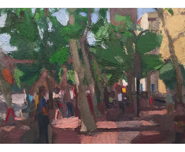
John Dubrow, Leaning Trees, Early Morning 40″ x 54″ Oil on linen 2013-15 image courtesy of the artist and Lori Bookstein Fine Art
Color has always been the moving force in Dubrow’s paintings, which to my eye has been strongest when recording nature in its broad, stark contrasts: overhead canopies of leaves, hanging viscerally above receding planes of lawn. In more complexly modulated motifs—portraits, hillsides of houses—the duty of representing seems to slight cramp the synthesizing of the purely optical. But this appears to be happening less in the newest work, which turns figures and buildings with equal dispatch to planes of nuanced, weighted color.
Increasingly, Dubrow’s paintings reveal an intriguing disjunction between heavy mark-making technique and fleet articulations in color. The textures of his crusted, almost-crater-like patches of pigment can feel clotted, as if applied and re-applied with dull deliberation. (In point of fact, the artist worked for several years on most paintings in the show. His favorite means of applying paint is with a hand.) But this misses the paintings’ intent. All attention clearly bends not towards technique but to how each color leverages every other color. And this is where Dubrow consistently excels.
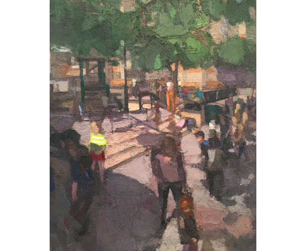
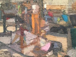
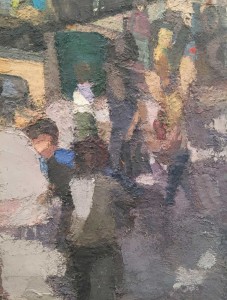
At a glance, a painting like “Playground” (2012-14) is an enigma. In terms of framing a motif, it practically inventories a scene, much like a camera’s split-second recording of a slice of life. Yet these objects are not the least bit frozen in place. Each element, reduced (or is it expanded?) to a facet of color, struggles against its location, acquiring in the process a particular character—looming, receding, insisting, rising—within a larger orchestration. In other words, objects acquire meaning through rhythmic intervals, not illustrational or stylistic means. The painting becomes a living mesh of shapes, each uniquely responding to the transformative pressure of light.
At bottom left, the grayer forms of figures hum amongst the absorbent blue-grays and purple-grays of a broad shadow. One surmounts the shadow, her shirt abruptly shifting from deep earthy brown-greens turn to a brilliant chartreuse; in an effect unique to artist’s paint (and not reproducible in print or on a monitor), one palpably experiences the weight of light.
Dubrow continues, in coordinated fashion. A trail of figures, overlapping in their illuminated and shadowed portions, slips into the distance at right. Between these two zones, a series of mid-toned horizontals—various medium-toned violets, reddish-beige, and ochre—establish the receding ground plane that supports from below. Overhead, extending the canvas’ entire width, a lowering canopy of leaves—churning through degrees of shadowed green—compress the space beneath, already animated by the luminous shifting facets of people and ground.
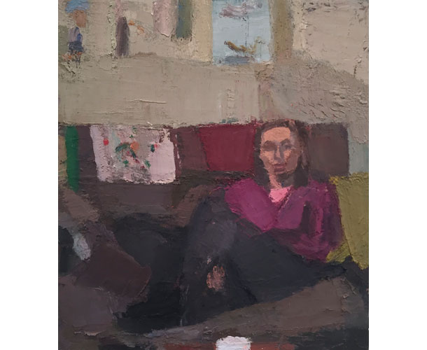
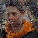
Audrey, Weavings, 36″ x 32″ Oil on linen 2015 image courtesy of the artist and Lori Bookstein Fine Art
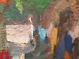
In “Audrey, Weavings” (2015), hues of pinkish-terracotta, ranging through a variety of tones imposed by light, carve the subject’s facial features. Quietly luminous against a sofa’s more subdued hues, they culminate as a mass barely surmounting the sofa’s tide of purple-gray. Again, deprived of the more superficial means of description—feathery or smooth modeling, polished or slashing strokes—all elements reflect, with startling directness, the unadorned force of color.
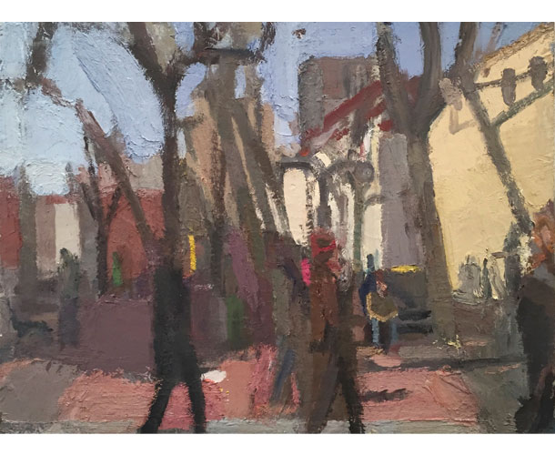
Leaning Trees, Winter, 30″ x 40 Oil on linen 2015 image courtesy of the artist and Lori Bookstein Fine Art
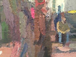
Best of all, “Leaning Trees, Winter” (2015) captures, in ragged horizontal bands, the four states of light within a street scene: the remote ultramarine glow of sky; the hard pinkish-browns of sunlit ground; their shadowed counterparts in deep retiring purples; in-between them, a clattering horizontal of building facades, turned yellow-beige, brick red, and off–white by the vicissitudes of sunlight. Impossibly different, but bound together by the circumference of the painting, each zone presses against the others, charging the space. Streaming across the entire proceedings are the vertical trunks of trees, holding far aloft their forking branches, and melting into the forms of striding pedestrians below. Like the best paintings here, we have the sense of being brought suddenly, unblindered and blinking, before a sunlight-animated vision.
Optical sensations, maximized within a contained arena: this summarizes the powers of the language of painting to recreate what we see. If you’re the type of person who wonders at how Corot exceeds Daubigny and Harpignies, or how Matisse transcends Max Weber, it’s a gratifying experience.
“Leaning Trees, Winter” is notable for the clarity of its hierarchy of colors—it’s top-to-bottom apportioning of pressures that spins off each element in its own unique and lucid moment. Not every painting in the show is quite as decisive. In some other canvases, the on-the-fly-responses seem to slow down to accommodate a complication here or wade through a diffuseness there. This is only to say that at points the color lacks the supreme articulateness of Chardin, or the certitude of Matisse. But every painting impresses with its priorities. Many a painter can deploy an evocative technique, or quirks of subject and style. But to speak with color—this is a different, higher order of expression, one Dubrow is clearly driven to pursue.
Please see John Dubrow’s website for more detailed images of the paintings and much more.


Inspirational.