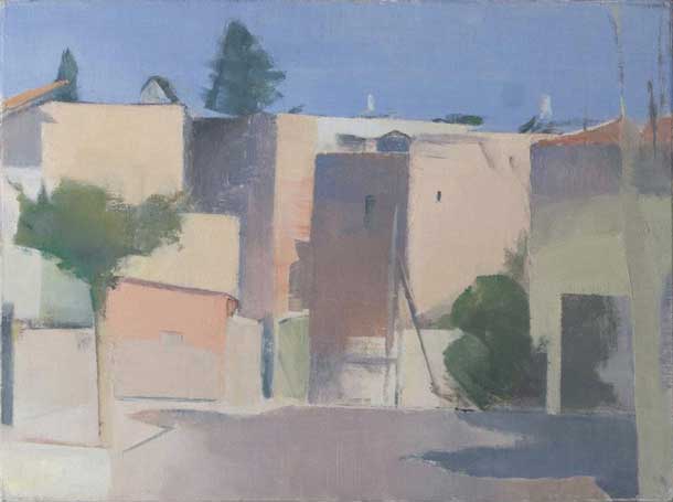
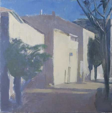
Yael Scalia Lud Street, Jerusalem
click here for a larger view
I was fortunate to meet Yael Scalia in Italy during the JSS summer program in Siena a couple of summers ago. I was smitten by her work and insights into painting and find myself returning to her paintings time after time for inspiration and ideas. I am delighted that she was able to share thoughts with us about her work and process in an email interview recently and to show us her latest group of new paintings. Yael Scalia was born in New York City and studied at the Rhode Island School of Design and the Maryland Institute, College of Art. She has lived and worked in Jerusalem since 1984 and is married to Israel Hershberg. She is currently represented by the Rothschild Fine Art in Tel Aviv, Israel and previously with the Ice Gallery, New York. Her work is included in numerous public and private collections internationally.
Larry Groff: What led you to decide to become a painter? What are some of the biggest influences that led you to become the painter you are today?
Yael Scalia: Although I didn’t actually conceptualize “being a painter” as a calling until I was well into my twenties, I did, even as a little girl, talk about being an artist and loved to color and draw. When I was about 5 I had a coloring book which my grandfather once colored in for me, using all kinds of colors and blending them – rather like Renoir might have colored – and I remember that this completely enchanted me and I saved this picture. My grandfather was a furniture designer and did some drawing and watercolor on the side, and he taught me how to draw, that is, how to measure when drawing, when I was nine years old. When I was about 11, my mom put me into a Saturday morning watercolor class in the neighborhood, where I learned the basics of watercolor technique – how to lay down a wash, how to save out whites, lift off color, etc. Painting with watercolors, using a brush, was very natural for me, and I continued to do it for my own pleasure until I went away to art school.
Art school, which was the Rhode Island School of Design, was a descent into confusion, or rather chaos. I started in painting but concluded quickly that there was no one who could teach me to paint there, switched to graphics, then dropped out and moved to New York where I thought I would become a painter but just didn’t connect with the right people and did not find a teacher. The next few years were spent doing all kinds of things, but painting and drawing, and the sense that I should be doing them, were always there. Finally, when I was 27, I enrolled in a summer course at the Maryland Institute College of Art. I chose this course on the basis of its title, “Using the Nude in a Universal Story-Telling Picture Situation”, and it was being taught by an Israel Hershberg. The first day in class I realized that this was really what I wanted to do, and told Mr. Hershberg so, who, looking at my canvas conceded “Yeah, I think you got something there.” As it turned out, Mr. Hershberg was finally a painting teacher who seemed to actually have something to teach, and I recognized this immediately.
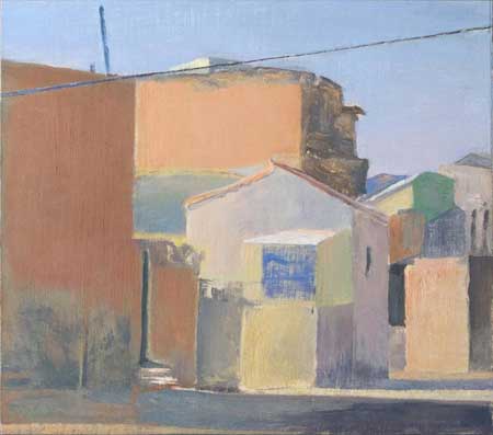
Even Sapir Street Before Construction
The first painters I became familiar with as a child were Renoir and Matisse, because my aunt gave me a little Skira book on Renoir when I was around 10, and a little book called “Jazz” which was Matisse paper cuts. I loved these and looked at them a lot for a few years. My mother loved Corot, so he was a presence throughout my childhood and we always looked for him in the museums, which we did visit. And my aunt would take me to MoMA when I visited New York. At home we had a series of books from the Met called (I think) “What Is Painting?” which interested me greatly and which I read when I was 12 years old. So by the time I began to study with Israel Hershberg, though I knew nothing about painting with oils, I felt familiar enough with the art of painting that everything seemed to fall into place. I took his class “Copying from the Old Masters” and began to copy paintings in museums, which was all the formal painting instruction I received at that time. These copying experiences were extremely valuable – they taught deep looking at painting, and developed thinking about strategy in building a painting through learning the techniques of the Old Masters. They also kept me in the museums for good stretches of time. I had just taken a studio and had begun painting there, and felt like a fish thrown back into the water.
This period was a time of discovery, and I was pretty excited about most of the painters I looked at. We went to see a fantastic Balthus exhibit at the Pierre Matisse Gallery, where some of his big paintings were being shown – The Canyon, which is now at the Met, the two Japanese paintings with the figure on the floor, that green one with the girl in the fanback chair. These really bowled me over and I began to look at him a lot. I loved his classicism and connection to the old masters, his light and color, and just the rational, elegant way he handled paint. I also studied the paintings of Chardin, the sepia drawings of Claude Lorrain, Edwin Dickinson, Corot, Degas, Derain, Matisse. Then I saw a book on Morandi for the first time and that was quite a primal experience. Although I had never seen his work before, I immediately recognized something that was deeply familiar, somehow known to me. He spoke a language which was obviously esoteric and highly personal but which I understood. It was not just an identification with his sensibility, but an encounter with the possibility that painting could lead to a very personal vision and expression. Morandi is still a key for me, a portal to the seat of sensitivity in myself and my deepest responses to the visual world.
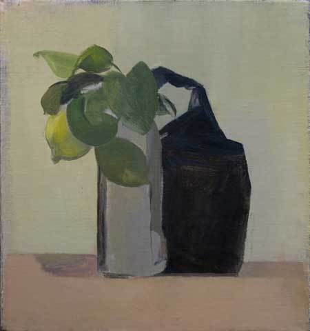
Still Life with Coffee Bag and Lemon, 35.9 X 33.9 cm, oil on canvas mounted on board, 2009
Years later, when we began to spend summers in Italy, seeing Roman fresco painting left a similarly deep and indelible impression. I had connected with this source period of painting years before through books, but seeing the actual frescoes, experiencing the beauty of their color and handling, their balanced compositions and measured intervals, was extremely exciting for me and became an ideal which still leads me. Italy in general has been very formative. The great works we return to year after year – the Pieros, the Giottos, the Brancacci Chapel, San Marco, Museo Morandi, the masterpieces of Siena, are new and profoundly moving each year. I have always been attracted to great art that possesses a degree of primitiveness – like many of the frescoes and works of the early Renaissance. I find it to have a certain power, a special beauty, and I think seeing the great masterpieces and antiquities of Italy planted in me the desire that my work should feel connected to these wonderful works of the distant past.
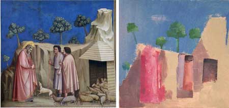
transcriptions from Giotto, 2010 oil on paper
For a long period, too long, I made money doing illustration, which, though not painting, was not a total waste of time. My drawing developed, as did my ability to build pictures from my imagination, I became proficient with crowquill pen and ink. I worked a lot with water-based paints, and this impacts my handling of oil paint to this day. Of course, spending my life with Israel, a great painter and gifted teacher, has been and continues to be basic, essential, constant. And my contact with the JSS is extremely nourishing – I’ve been kind of an external student and it has become very important to be connected to a group of serious, committed painters, the many gifted artists who have come out of the JSS, and the wonderful teachers who have come as guest artists. I have learned from all of these people, I’m inspired by their work, and everyone is very generous.
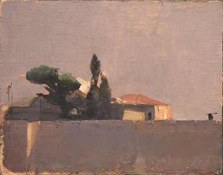
View of the Old City, Oil on cotton mounted on board, 20×25 cm / 2006
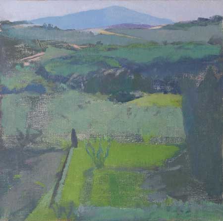
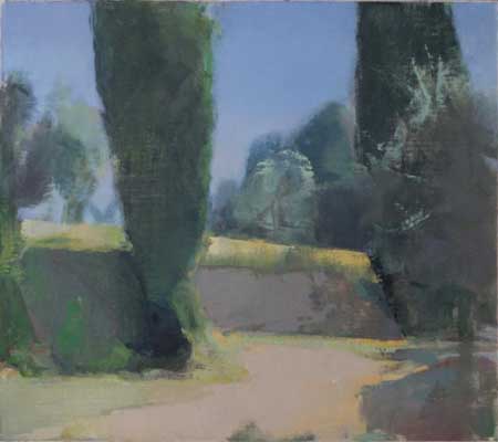
View over the Certosa Garden, Toscana
LG: What are some of the most important considerations for you in making a painting?
YS: I want my paintings to be beautiful and I’m an apostle of Ingres’ statement that in all beauty there is strangeness. I’m looking for a certain kind of poetry in painting, and sometimes the most mundane subjects can be the vehicle for that. Subject does not possess significance; how I paint it endows it with meaning – or unimportance. Poet Wallace Stevens said it nicely: “Things as they are/ Are changed upon the blue guitar.”
The search for what satisfies me in a painting can sometimes be arduous. I can start, wipe out, start again, wipe out. I’m frequently preoccupied with a particular great painter or period in art history, but if I go after that too consciously it usually doesn’t work out, because painting really has to come from the gut, not from the brain. Where I am seated inside myself, and the relation I feel to my subject at the moment of putting color on canvas is perhaps most essential. Motif is cardinal, it is the painting. But the language of the paint itself, those transparencies, impastos, brushstrokes, scrapes, scratches, accidental edges, movements and passages, is probably the most seductive aspect of painting for me, to the point that it can become a distraction from fundamental problems in a painting.
Structure is essential; I need to have a very strong sense of the skeleton of the painting and of the big movements from the start. Color, the rightness of the relationships, makes or breaks the painting. Color needs to be beautiful, but also so precise in the context of its relationship to the other colors. If a painting lacks color richness and harmony it is simply humdrum. When I look at great paintings, I’m always impressed by the sense of absolute necessity, inevitability, of one color next to another; it simply couldn’t have been any other way. The strong sense of the reality of a painting is the correctness of its color. It’s really what determines whether a painting is compelling. If I manage to create a harmony and a degree of believability, that’s very gratifying.
The abstract elements of a motif and its pattern of dark and light have to be very clear to me. Shapes need to be wonderful. I like to manipulate shapes for composition, and am drawn by the emotive power of shape. The genius of the Sienese painters in their control of shape has become a preoccupation. Figure/ground ambivalence is something that’s becoming increasingly interesting to me, and I expect will absorb me more with time. Over the past few years I’ve become more interested in a certain tension between the abstract qualities of the surface and the elements of the picture. However, I’m pretty sure I don’t really want to be an abstract painter – I have a desire to depict the world around me, as Albert York said, “put it into a design.” I find it interesting when a painting makes us notice the abstract, non-objective qualities of objects.
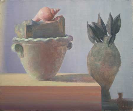
Roman Still Life, 42 X 50 cm, oil on canvas mounted on board, 2009
LG: What aspect of a view attracts you the most to paint? What subject might you consider impossible to paint?
YS: What makes a motif exciting to me is rather elusive; I have to see a painting before me. The first thing I perceive is a composition. I need an interesting arrangement of darks and lights, organized clearly and with visible structure. And a satisfying color statement. If I don’t see a composition out there, there won’t be a composition on my canvas. But all this said, I start the painting as a leap of faith, and with the knowledge that it won’t end up as I think it might, because the painting sort of pushes itself and me forward once it’s started. So much is born on the canvas. If it’s a good start.
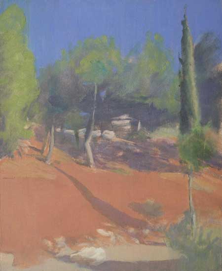
Sometimes I fall in love with the shapes in a motif. Or there may be a very striking element that I want to build a painting around, like that red hillside in the Jerusalem landscape. Sometimes a motif reminds me of a painting I?ve seen by one of the painters I love, and that may make it attractive. Occasionally I try to compose a painting using a famous painting as a sort of model – like the Roman Still Life, which was based on a Roman fresco fragment of a still life which I have a poster of in my studio. When I’m attracted by the sheer beauty of something it gets tricky, because I want to avoid simply making a picture of a beautiful place or object. For me, it can be a real challenge to build a composition around a very beautiful thing.
Most of my motifs are found in the places I frequent, the things I look at repeatedly. Frequent and sustained looking becomes more intelligent looking. As Stuart Shils says, “Familiarity is a good thing.” In the studio it’s more difficult, since there I have to generate the motifs by arranging things. This can be the hardest part of still life painting. It’s not only a problem of creating a composition, the objects have to speak to each other in a way that makes sense. Occasionally, I’ll be surprised by seeing something around the house or in my studio, a motif that has just fallen together accidentally like the coffee bag with the lemon that I painted.
What would I not paint? A motif that doesn’t move me, that I don’t find exciting enough to respond to or explore. Again, it’s not a question of the subject itself, but its abstract qualities.
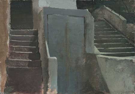
“Steps In Nahlaot”, oil on canvas mounted on wood, 2000.
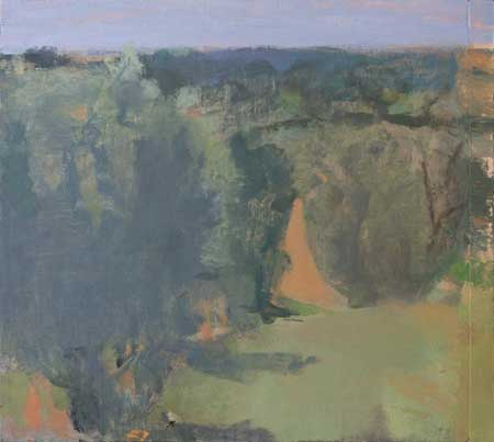
Olive Trees at Midday, Toscana
LG: Your paintings have a remarkable feeling of light and air, clarity and restraint of tone that make for rich color harmonies. Can you tell us something about your approach to finding the right colors in your paintings. Do you use a particular palette of colors?
YS: My painting teacher was a demanding tyrant when it came to color mixing, and that was helpful! I still use pretty much the same palette I used when I first started painting, with a few additions over the years: Cremnitz white, raw umber, ultramarine blue, cobalt blue, quinacridone blue, burnt sienna, lemon yellow, cadmium yellow, Indian yellow, cadmium orange, cadmium or other warm green, Veronese green, vert Aubusson or pthalo green, a purple, cadmium red, alizarin crimson.
When I start a painting I usually try to establish a few large areas that make the big statement with color. I spend time mixing on my palette and trying out two or three spots one next to the other to see if they say what they need to say – for example, sky against treetops, rocks, and land, or wall, bowl, tabletop. This is the method taught by Charles Hawthorne in his little book, “Hawthorne on Painting”
, and it’s a good starting point. I try to make the big statement with as few colors as possible. I was taught to make the first few spots really right, not approximate, and I still try to do that. It doesn’t mean they’re never changed later. Actually I try as much as possible to paint as I want it to look in the end, aiming for a premier coup even though I don’t usually finish in one shot any more. I try to follow Lennart Anderson’s rule of comparing colors and looking for similarities – this helps to create unity. For example, sky coIor sometimes serves as the basis of tree or shadow color. I worry much less about literal color than I once did; if I can make a building and the tree next to it out of the same color, I do. If they’re close enough in value in nature, it will work on the canvas. This has developed as I found it necessary to work faster to get down a motif outside – the light changes very quickly in Israel – so I’ve developed kind of a shorthand, which has become my language. Sometimes I lay in a really big area with one color, just building the forms by painting with it thicker or thinner. Then I can go back into that and add accents or local color. If a spot needs adjustment I add color to the spot on the canvas, altering it by mixing on the canvas. If I can’t take a satisfactory step forward in one area of the painting, I move to another area. If an area’s too dark or wrong I scrape it on the spot, and the resulting transparency can sometimes be used. A landscape will sometimes radiate one dominant color, and that will be the key to paint in. Urban landscape is more fragmented and patchy than rural or pastoral areas, and so can be very challenging.
My thinking about and sense of color has changed a lot over the past few years. Color has become much more important in my work and I am finally beginning to compose with color and not just with values. Stuart Shils and Ken Kewley have been great teachers and influences. Ken’s “Notes on Color” are a must read, and I go back to them now and then. I like his rule of starting with your favorite color in the motif. It’s fairly recently that I have begun to improvise with color, make up colors, deviate from nature when I need to. I also like the idea of painting with a color theme, and I do this sometimes in still life. A couple years ago I did a red still life, remembering that Titian said that a painter has to master three colors, red, white, and black. I hope this year to get to black. Painting with gouache has also helped free my sense of color, and is great for thinking economically, learning to say more with fewer colors.
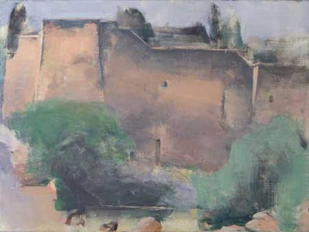
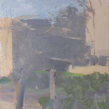
Monastery 1, Valley of the Cross, Jerusalem
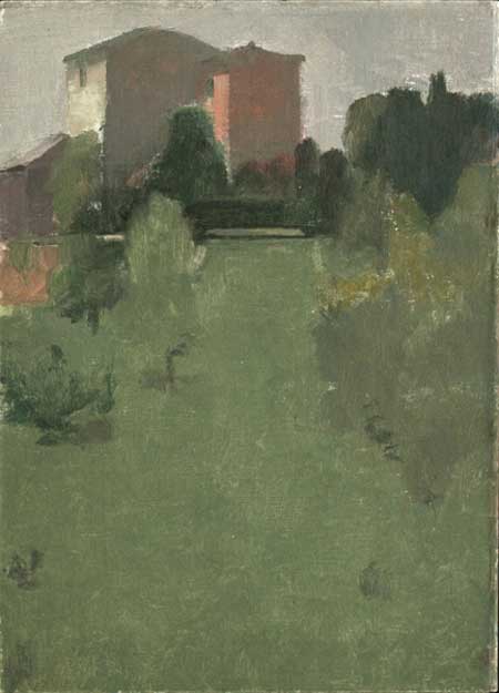
Farmhouses, Umbria, Oil on canvas mounted on board, 33×24 cm / 2007
LG: How important is the process of observation to your painting? What are some considerations you think about in finding order out of the chaos and complexity of nature? How do your strike the right balance between simplicity and unity on one hand and variety and contrasts on the other?
YS: Observation is extremely important; it’s the starting point. My paintings are always inspired by what I see, and I draw the basic elements of a painting from what I observe – the general composition, the key of color, the light situation – brightness, degree of contrast. However, I take freely from what I’m looking at, and as I said, it’s only the starting point. Painting involves poetic selection – one doesn’t use everything that appears in a motif, and omission is a powerful tool. A motif is what it says it is – it’s your motive. Sometimes the size or shape of things gets changed in the assemblage of a composition. Sometimes a color gets exaggerated or played down. Sometimes a line or angle gets changed to move the eye more smoothly through the composition. De Kooning has a number of abstract landscape paintings; it’s an extreme example, but he left out most of what he saw yet communicated so beautifully the light, space and feeling of being in that place – its visual impact.
I use a viewfinder, and it’s a great tool for finding compositions. When a motif hits me in the face I usually do a quick drawing, or several drawings of it on the spot, which help me to understand what about that motif really interests me, what I want my painting to be about, where I should crop the image. The virtue of a quick drawing is that you will of necessity filter out all extraneous information and put down the essential elements, the large dark areas, the big lines and angles, that caught your eye. Then I’ll go back to the motif with my paints. Trying to keep in mind what struck me when I first perceived the motif, I usually work directly from the motif two to four sittings, in which the big statement is established. The rest of the painting is finished in the studio, which may involve only one or two sessions for tweaking, or it may take many sessions to reach something that feels like it’s working. The same goes for still life. At a certain point, whatever I was working from becomes irrelevant, because the painting has its own demands which have nothing to do with nature, but are problems in the internal language and life of the painting. It sometimes happens that I reach a point of being stuck, not finding the way to carry a painting forward. If there’s enough I like about it as it is, I just leave it against the wall of my studio and look at it from time to time, and usually, after working on other things, I get an insight about how to move on with it.
Achieving a unity with a happy balance between simplicity, variety, and contrasts is what painting is really about, so there is no simple answer to this question. Hopefully, one sees and isolates a motif because it has this balance of simplicity and variety. The same challenges exists in composing a piece of music or writing a poem. A familiarity with the history of painting is essential. The more one looks at great paintings the more one comes to understand what makes a painting, and one develops their own taste about what they like in a painting, what they want to develop in their own work. Doing transcriptions, with drawing media or paint, is invaluable for internalization of principles. I do transcriptions occasionally, sometimes in charcoal, sometimes with paint.
I was taken aback when a couple of people told me at my most recent show that they found my paintings “relaxing”. Trying not to feel like a failure, I gave this a fair amount of thought, and have concluded that they were responding to the general feeling transmitted by the paintings, which results mostly from color harmonies and the balance of the composition. Balance in a painting is very physical, and by that I mean that it really relates to the painter’s own body and its innate sense of balance. Balance in a composition is felt internally. A painter has to develop a critical sense that is rooted deeply within him, that tells him “that’s too big, that’s too dark, this should be warmer, that needs to move slightly to the left, this should line up with that, it would look better without that, etc etc etc. “ Some of these decisions are made on site, when painting before the subject, some of them are made later on in the process. The point is that this is what painting is, it’s part of the essence of painting, and it’s how art is made. Its a process, sometimes a war, of constant decisions, constantly relating one part of the painting to the part next to it and to all the other parts, until a pleasing balance, give and take, interrelationship of all, works together to create a whole.
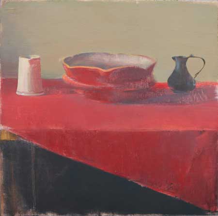
Red Still Life , 40,3 X 40,5 cm, oil on canvas mounted on board, 2009
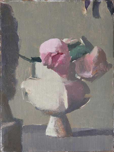
Still Life with Rosebuds, 2008, oil on canvas mounted on board, 20 x 15 cm



Beautiful work and a wonderful interview- thank you
Wonderful interview of an artist previously unknown to me. Inspiring paintings. Thank you!
Are all of them very small works? (Some don’t have dimensions). Very beautiful work–and interesting that Yael mentions Hawthorne’s teaching on accurately relating color spots, but on the other hand she will use the same color for different objects, which Hawthorne expressly taught against. It works well for her.
Great interview full of ideas. The color is wonderful in your work.
Another wonderful interview and more beautiful paintings. Thank you!
Wonderful. Thank you.
nice work, enjoyed the landscapes
Beautiful paintings!
Terrific work. Direct, straightforward and rich, rich, rich in terms of visuality. If I was ever to return to reprrsentational painting I’d want my things to look like these. Congratulations, Yael!
Yael, your statements are so articulate!!! brilliant explication of what cannot be explained except through the DOING.
“Steps In Nahlaot” is a terrific work.
Beautiful paintings…funny i had just been introduced to Ms Scalia’s work a few days ago by a new friend and I can’t stop telling people about it…
Thank you for this wonderful interview so generous and rich in insight The paintings are truly wonderful and understanding the thinking and process behind them, put in such straightforward terms, makes it a source of inspiration I will return to again and again.
Strikingly beautiful paintings. They produce a feeling of place which transcends mere depiction.
Many thanks to phil scalia for bringing these paintings to our attention. Insightful interview. I want to see more of Yael’s paintings
Liked the paintings, and especially enjoyed reading the interview. Thanks.
The paintings are wonderful. I was not familiar with her work. I think the interview was especially well done. I’m sure this will resonate with many of my painter friends. Thank you.
Beautiful work!
BEAUTIFUL AND POETIC PAINTINGS!!
Wonderful Paintings! I was struck by how the landscapes look more spontaneous and the still lifes more considered. They both work. Beautiful design and color!
Intersting intervew and lovely paintings. Could not take my eyes off the red stillife. Thank you
Wonderful painting and an insightful interview. Painting is alive and very healthy.
I love Yael’s work. I think my favorite is the Rosebud still life, but the landscapes are wonderful as well. I see Morandi’s influence,he is one of my favorite painters. I did not know this painter previously. I am doing a power project on contemporary painters for a grad class and I will include her in my project to introduce her to others who may not know her work. Yael, thank you for being very genereous in sharing how you go about creating your paintings. If you read this, I have a quick question for you. I am studying the golden section and I was wondering if you use it in your work. Thank you.
Enjoyed seeing these paintings. Beautiful.
Very beautiful work I love the muted palette and ‘unfinished’ look to some of the paintings
I love these paintings!
Wonderful lyrical paintings with such a delicate balance between emotional intensity and
tranquility. Very penetrating work and interview. A pleasure to experience both.
Thank you so much for sharing the work and insights of Yael Scalia. I am very impressed with the paintings and very much enjoyed the interview. I hope to one day see the work first hand, I am sure the surface is remarkable.
I started reading this on my phone and decided I must print the whole interview for ease in reading and to take them with me on my upcoming painting trip to Italy. The commentary is of such a high quality, sensitive, classic and individualistic. I hope to join this group in Civita some day. Thanks.
Gorgeous, wonderful paintings! As too those at Yael Scalia’s web site. Delighted to have discovered them. … and much else at the JSS in Civita sessions. Hope to see many more in the future.
Lavori interessanti ispirati dalla pittura di Giorgio Morandi, uno dei più grandi maestri italiani del novecento, di cui è evidente l’influenza. Ammirevole l’armonia e l’equilibrio cromatico.