
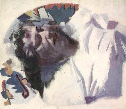
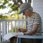
E W Dickinson, Carol Cleworth, 20 x 23 in oil on canvas 1959
more information about this painting at http://www.edwindickinson.org/catalogue/entry.php?catNo=559
from typed notes by Carol Cleworth, former student of Edwin Dickinson at the Art Students League
(see pdf of images of the typed original notes from this link )
EDITORS NOTE: these typewritten notes were likely written by Carol Cleworth in the late 50’s or early 60’s. They were given to me by David Kassan) who stated that these notes had been passed on by many of the Art Students League students over the years. This is an incredible treasure-trove of painting wisdom from a true master of painting and I hope these words will be of benefit to painters young and old. I tried to transcribe the original document as closely as possible but in a few places the text was too faded to be able to transcribe with certainty.
Beware of clichés.
It is very important to paint under the best physical conditions possible. The simple physical rules that must be observed are: the perfect illumination of the canvas at an angle of 30° to the window. Bring the canvas slightly forward.
Just as a customer’s face must be right in front and in the middle of a painting so must the artist’s. In this way the glint or shine of the window will not impede your work.
There are five ways to see things big:
- The intellectual decision to see only the big things and the big values.
- The squint of the eyes.
- To converge the eyes on a point before the model or the thing to paint.
- To converge the eyes on a point behind the model.
- ?
The brush entangles you with small things, which you don’t need yet in the beginning. The knife is a clumsier tool, which doesn’t give the facilities of putting in little areas of values, and thus allows you to put in the big values.
Two ways of composing:
- To prepare carefully the whole composition.
- To start at once without any preparation at one point of the model and go from there, covering the whole surface of the canvas. Here are two possibilities: you can start anywhere in the center of the canvas and develop all over, or you can start at any of the four entrances (sides of the canvas) and go towards the center.
Of the four entrances, the lower one is the most difficult composition-wise, put the canvas on its four entrances to study the composition even on its four corners. Use the mirror.
The most interesting composition of a profile is to put it very close to the picture’s edge, where it is looking at, and have the remaining space in the back of it interestingly filled in and painted.
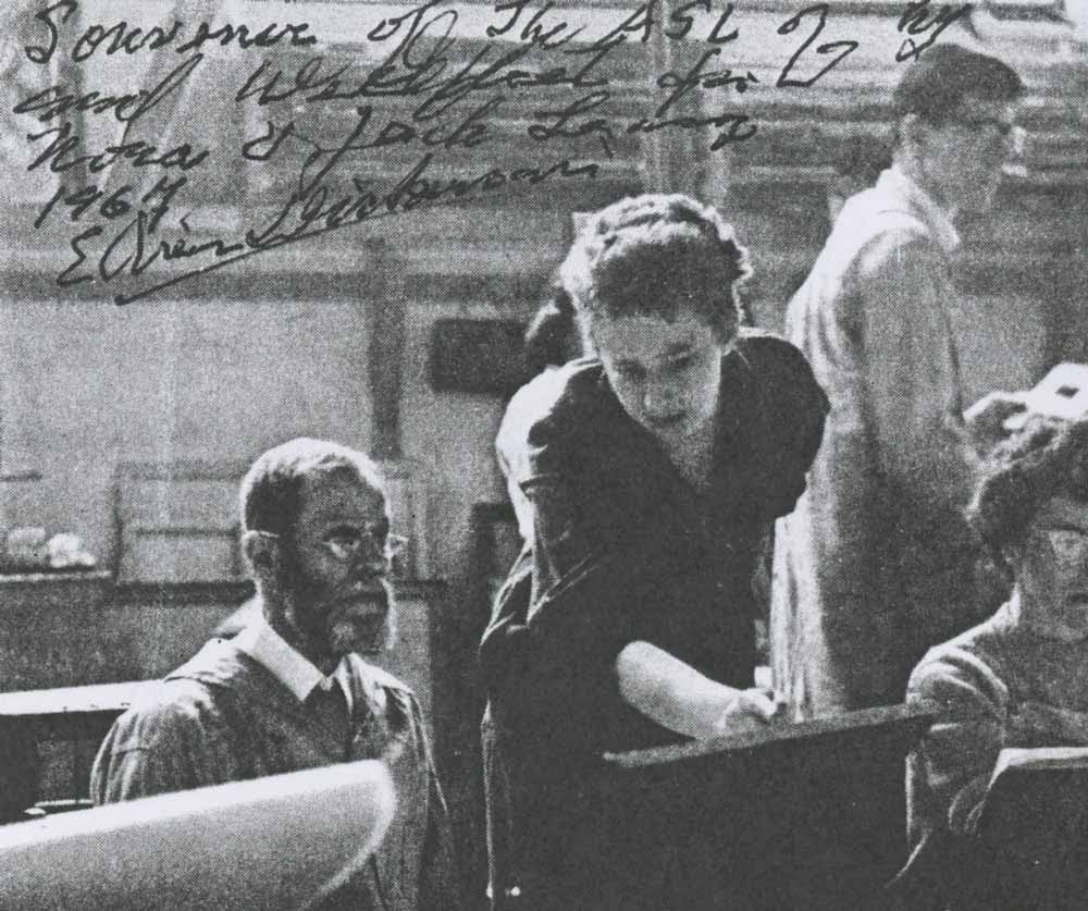
Carol Cleworth next to E.D. with John Leavey standing behind – 1957 or 1958
Value: the stretch of value has to be planned to be as great as possible. From the darkest dark to the lightest light, the stretch must be as big as possible. According to our appetite to observe, this stretch of value will get bigger and bigger. At first we may be able to put only a relatively small number of values between the darkest dark and the lightest light, or between black and white; but as we go on experimenting, the number will go increasing to an unlimited number, even to infinity. Depending on one’s sensibility and a very individual temperament, one artist may put as many values between a white and a light gray as another artist can put between white and black.
The number of values between white and black will naturally be limited in the beginning. With experience, that number may increase to say about fifty. A very experienced artist may well be able to put as many as 300.
For studying values it is recommended to make a selection of one big area, preferably a very light one (for instance, the belly region or a breast of a model). Try to paint it as well as you can, relating it to one neighboring dark value. Concentrate on the light values and half tones first. Put down three spots of values adjacent to each other and get the feel of their relationship to the best of your abilities before you do anything else. Spend on it a much longer time than you intended to.
Don’t try to cover the canvas. Never put on poor paint for the sake of getting the space covered.
The better the light values and half tones are painted, the better the darks will look.
As for the darks, it is very important to put them down from the very beginning in the true and right dark tone. It is almost impossible to get them right if you carelessly have put there a lighter or any value, without intense observation, and you had better leave the canvas.
To poor variations of light half tones in the light, by dropping some of them will cause a flattening of the painting. The light form will look like a poster. It will have too much white in it. So watch out the halftones in the light, don’t have them all in the same value. Prepare on the palette different (a)mounts of light values each time to approach the light value you intend to obtain.
The general rule is (that it’s better) to start too dark then too light. The color will be purer when you have to lighten it up than if you have to darken a too light spot. Thus one models from dark into light.
One must learn to lower the key so one will be able to paint better and get better color.
Never painted a dark that you cannot paint any darker.
Be highly discriminating in your darks and in your halftones. The half tones are not spread enough.
I would guess that in comparative value of the flesh tone is too high.
The Caucasian fleshtone: resist the habit of misconception of the flesh. The basic color of the white skin is neither yellow ochre nor pink but blue. Remove the yellow ochre from the palette. Right from the beginning start to use cool colors, completely different from the ones you usually use as fleshcolors, for instance a greenish white or lilac white (white, blue, and matter)or a pink white (white and matter) or a blue white, for the light fleshtones. Assure yourself that you would not see a rather cool tone for a warm tone. Start the light parts of the flesh with a high violet.
Choose any big area of the model and think of its 5 values:
- The highlight
- The light middle tone
- The middle tone
- The low middle tone
- The shadow
Prepare 5 mounts of values on the palette going from the light value to the dark, and staying into the arbitrary chosen color (greenish, ? ish, or violet, etc.).
A key thing is not to go easy on the local colors such as suntan, places of increased blood circulation, etc. but keep in mind the real
Never begin to paint a white thing with white, but with the and get it wiped by working hard. You will be experimenting, you will be getting busy.
There are lots of luscious darks in the model.
Don’t let the brush wander into the pieces done with the palette knife and vice versa. We all know that in one and the same painting the characteristics of each of the knife and the brush can be shown clearly, this regarding the descriptive quality of the thing one paints (its smoothness, etc.) Which people without experience first look for, but which have nothing any more to do with the painting. This is a painting and not the things seen in nature.
One square inch of green is greener then a square foot.
One square inch of charcoal is darker than a square foot.
A violation of the aesthetics of color: keeping a red as red as it appears in nature (as the local color) is a violation of what you have learned by working from representation.
Although representation is not at stake, (it is not our aim) the red kept the same red in the painting, doesn’t feel right.
Do the background (part of it first) and have it a little darker than the middle halftone of the model, but lighter than the dark.
Anybody can see the big contrasts, but it requires the well-trained eye of the artist to notice very slight value changes.
The charcoal drawing:
(from the beginning) Learn to reserve certain areas of the paper pure clean white, which you’ll need for later. Circumscribe them with a boundary. Edible charcoal– Paper Ingres.
To get a deep dark on a grainy charcoal paper, it is necessary after carefully rubbing the finger on a clean rag to take away the grease of the skin, to rub the spot of charcoal with one stroke the edge of the little finger, in order to have the charcoal enter in the interstices of the grain, then cover it with another bold (?) charcoal stroke repeat the rubbing out of the finger for as many times as that charcoal tone can become deeper.
(?)… big interstices.
Join the extremities. Establish the extremities of the directions. Relate any directions of the lines you draw to the world vertical and the world horizontal., for instance, the posture of trees (Cezanne).
The cardinal directions are angles and triangles. The acute angle is easier than the obtuse angle.
I consider the use of a ruler in drawing–well it is well to have it out of reach. The implement gets in the way.
Medium to paint linseed oil: 4/5 Turpentine 1/5
Be less insistent on linear structure
Be more concerned about planer structure and “color” structure.
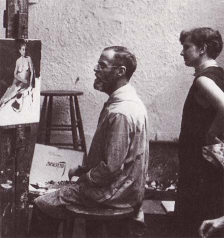
Edwin Dickinson with student
E.D. Comments In His Studio March 1, 1960
One could make a whole painting just of the columna (under the tip of the nose)
You’d think that a person that had all the beautiful bits that go to make up a face would be too conceited to live with.
Use wet paint next too wet. If necessary repaint adjacent areas of day before (save yesterday’s paint). Store mixed paint in tubes especially when working on large canvases.
Artist in Society
The artist is thought of in a high sense but socially considered and inferior
Lecture on the possibility of finding geometric shapes in almost all parts of the body.
Painting far lower cheek– “I never saw that position before.”
Took tube to class to look through and show students that Caucasian flesh is neither pink nor yellow but an unnamable color.
In trying to did to judge disparity between two near values which are separated by something in a painting, put spot of darker on lighter.
Authors, Musicians
Mozart – an angel, a saint
Often quotes Proust
James Joyce, Ulysses – likes fireworks scene
Compares two judges decision in Lady Chatterly’s Lover case and Ulysses. Judge Wooley’s decision superior (Ulysses)
Neither book pornographic
Handel – some must have thought him mad the way he gets carried away by his subject
If you have to choose between getting good color or correct value, choose color.
Varnish finished painting which has dark areas. (Mrs. Keck, restorer says varnish painting after one year, Aquival-good varnish)
Squint to see values in nature.
Large canvases strengthen a student.
Always roll canvas butter side out.
Signature – sign by scratching paint with a sharp instrument before it has hardened.
Paint from tube warm enough in studio to use without medium.
Impasto- proper consistency: when knife passed over twice, weave of canvas doesn’t show
Have your canvas lower than would have thought to be convenient. You can’t add one cubit to your stature
Student question: What is the primary thing in a beautiful painting?
E.D.’s answer: Beautiful spots of color
The only things we are sure of in nature: world vertical, world horizontal.
Tools
Plumb line
Finder (adjustable)
Two Palette knives, deep drop after handle and ordinary common knife
Mahl stick
Scalpel
Penknife
Etching tool
Medium: 4/5 Linseed oil, 1/5 turpentine
Canvas (smooth)
Stretchers and keys
Palette- Masonite- oiled with linseed oil
Additional material on the teachings of Edwin Dickinson
Terrific video lecture by John Leavey on The Teaching Legacy of Edwin Dickinson. See more information on John Leavey’s website
John Leavey – The Perfect Squint: The Teaching Legacy of Edwin Dickinson from justin adkins on Vimeo.

I have several Carol Cleworth paintings from the early 1960’s. I can find no information on her work or career past that date. Any leads or information about her and her work would be greatly appreciated. Thanks to John Leavey for the Art Student’s League photo.
Hi David, thanks for your comment. I don’t have any information about her other than a few tiny images of her work that are rather poor quality. Apparently images of a few pieces of her work that were being discarded somewhere. If you have any images of her paintings that are good please send them to me and I can add them to this article. (larry@173.254.55.177)
Larry
So wonderful to read and see this.
I did a catalog on him and his work in 1974(?) when I was Director ancpd Curator at the Provincetown Art Association and Museum.
Ms. Miles
Did you know of Carol Cleworth when she lived in Provincetown?
David Wise