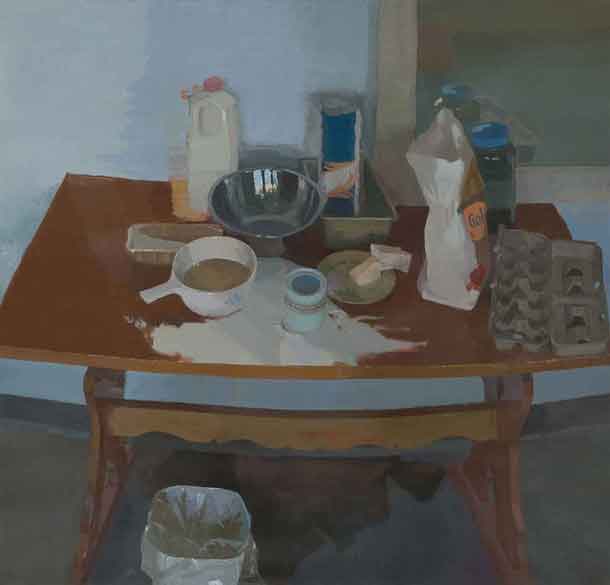
Breadstuffs 51” x 54” 2009 oil on linen
click here for a larger view
While surfing the web I recently ran across Dan O’Connor’s terrific paintings and wanted to know more about him and this intriguing work. He agreed to an email interview.
Larry Groff: Can you tell us a bit about your background, where did you study and what painters and painting has most influenced you?
Dan O’ Connor: I was born in Kentucky and grew up in the Greater Cincinnati Area. I just returned here about two years ago. I have found Cincinnati to have a really interesting painting tradition and, in my opinion, is a great place for young painters. We always have the paintings of Frank Duveneck looming over us. I received my BFA in painting and drawing from the University of Cincinnati in ‘07 and then went on for my MFA from the Pennsylvania Academy of the Fine Arts in ‘09. I have been fortunate to study with some great instructors, going back as far as high school. However, the instructor who had the most profound impact on the way I paint now would be Scott Noel. I worked closely with Scott for both years at the Academy. I credit him for really teaching me how to look; both at paintings and the potential held in the physical world for paintings. He also introduced me to some of the painters that influence my painting the most now, Edwin Dickinson, Charles Hawthorne, Lennart Anderson and many others.
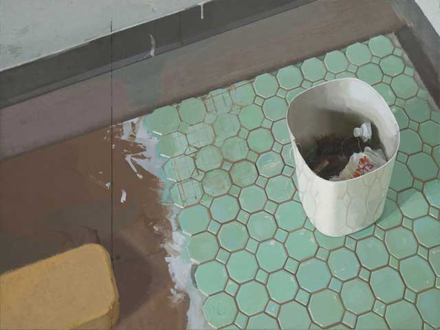
Waste 24” x 31.75” 2008 oil on linen over two panels
LG) Please tell us something about your process in painting. For, instance, how did you go about making the bathroom tiles and wastebasket painting (“Waste”) from beginning to end? How much does working from observation play with your work?
DO) I think my process in painting could be described as somewhat erratic. I always paint from observation and I almost always paint on my feet. Recently I have been painting atop a ladder in my studio, climbing up and down to mix my colors. I whistle, talk to myself, talk to the model, move around a lot and must generally appear fairly agitated. I even announce the colors sometimes before I mix them. Anything to jumpstart the process, I guess. The painting, Waste, was made in grad school and proved to be a rather tumultuous exercise. I reworked the whole painting countless times trying to navigate my way through those tiles. I became obsessive about measuring their layout, but still struggled with the aerial perspective I was dealing with. The entire painting was made really to serve one moment within it, where the tiles were being faintly reflected on the front wall of the wastebasket. That painting is also an example of constructing or modifying the subject, which occasionally occurs in my work. I am typically careful about selecting what I paint and try to retain a degree of honesty in my observation of it. However, if I feel strongly enough about an idea, a moment, or abstraction, I will sometimes make modifications to the subject. The wastebasket did come from my own bathroom. I had just cut my hair and looked down at this somewhat repulsive collection in the trash, full of hair, toothpaste, dental floss and countless other bathroom detritus. I thought it could make a good subject, so I very carefully transported it from my apartment in West Philly, via the trolley, to the Academy, being incredibly careful not disturb the arrangement of the trash. I then went so far as to lay the tile myself on a piece of mdf in the corner of my studio. I then spent the next month trying to paint it. It was kind of strange experience investigating my own trash on a daily basis.
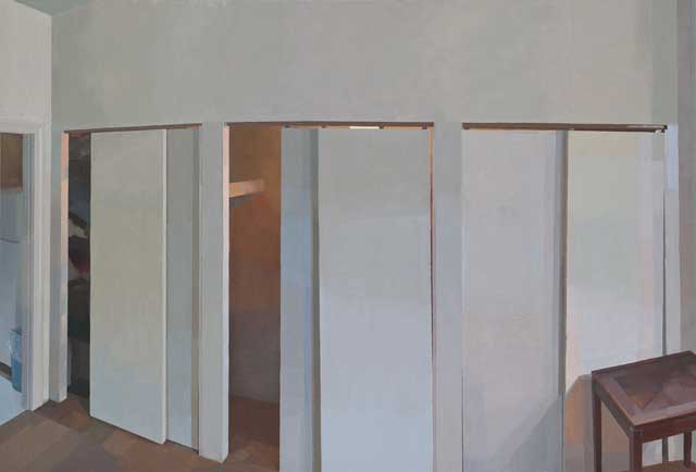
Johann’s Wall 28.75” x 42.75” 2008 oil on panel
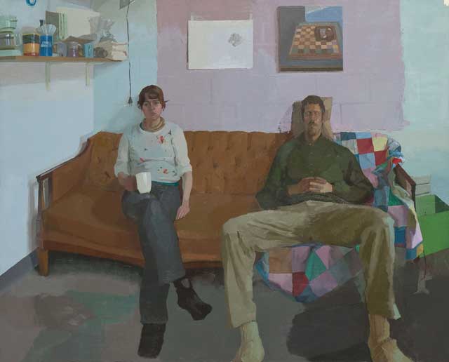
Dear God, Thank you For Friends 43” x 53.5” 2009 oil on linen
LG) If you walk into a very large group show of painters you’ve never heard of before, what work will be most likely to catch your eye and hold your interest? What type of work will you walk past without even looking?
DO) I think I am initially always drawn to strong abstract work when visiting shows or museums. As a painter, abstraction becomes pure pleasure. It is like looking at the world with all the superfluity stripped away and all that’s left is the moving construction of things. That is always going to hold my attention. Even the best of subjects can become tiresome, but good abstraction is always going to be fresh. Of course, I’m always going to be attracted to and on the lookout for great representational painting. But I think that comes from a certain wanton desire to know how to do it better, because I know that I always want it to be part of my own work in some capacity.
I try to keep a fairly open mind when looking at work, so there isn’t much I would immediately dismiss. I was just reading a Henry Miller book where he was talking about learning to paint watercolors and how when you are learning, everything becomes fodder for thought and has some potential interest, even commercial advertisements. He talks about sitting on the subway and simply devouring the folds of a shirt collar from a clothing ad on the wall. I try to keep that in mind when my eyes are open.
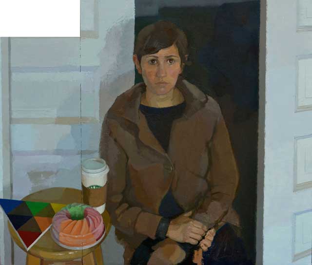
Painting of Jessie 46” x 52” 2011 oil on canvas glued to panel
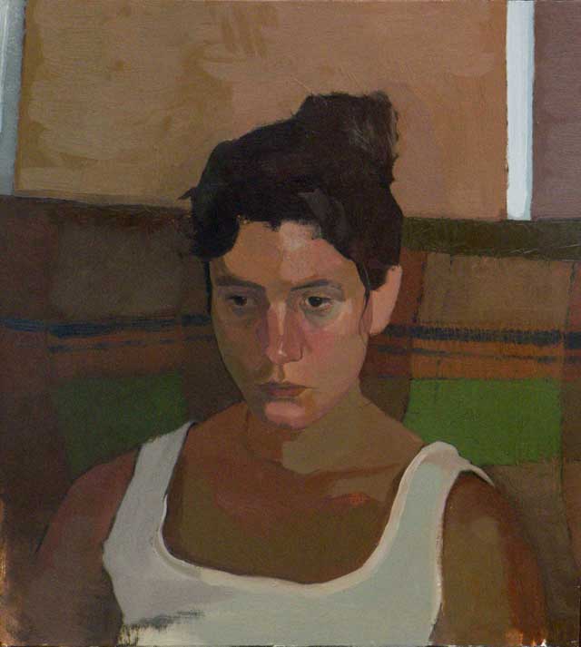
Patrice Visiting 26” x 24” 2011 oil on panel
LG) What are you working on now?
DO) Right now I am trying to figure out how to perpetuate a life of painting. It was a pretty radical shift for me from graduate school to trying to be a painter and still having to make a living. I have been teaching for the past year which has helped open up large blocks of time for painting as well as providing a great deal of motivation to do so. But, I still occasionally have to work other jobs to get by.
The paintings continue to develop as their own constructions and dialogues. I’ve made a shift recently to larger scale figures, which has provided a great deal of excitement for me. I am continually trying to introduce new ideas or ways of seeing into the paintings. A few months ago, I read a little catalog from a Diebenkorn exhibit where he mentions learning about the importance of whimsy from the paintings of Matisse. This has proved to captivate me for a while. I’ve always thought on whimsy as a sort of heavy-handedness or awkwardness that permeates through some paintings, but have started to see it now as something that could potentially relate a real, palpable truth about vision. It seems to present itself in limitless ways; the way you hold your brush, apply paint, stand, look, question. This playful manner of observing, I think, speaks loudly about the painter and the subject, while still providing a satiated, fully resolved, believable painting. Fairfield Porter seemed to have it.

Towelrack 12” x 43.5” 2008 oil on linen over panel
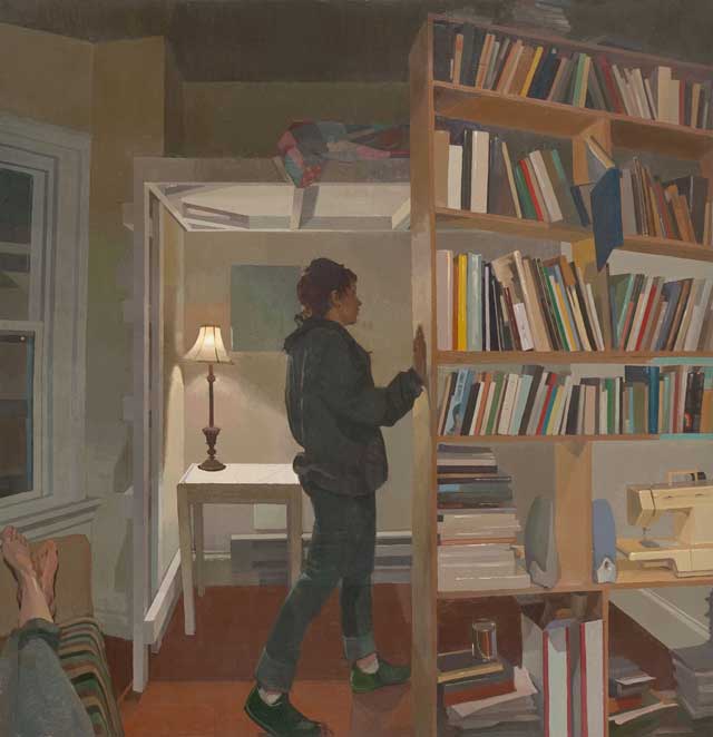
Four Feet of Spring 52” x 51” 2009 oil on linen
LG) Where can someone see your work? Any shows coming up in the near future?
DO) I recently setup a blog with some paintings on it: http://www.danieloconnorpaintings.blogspot.com/. Apart from that, you’ll have to come to my studio. I don’t have any shows coming up in the near future. Which hopefully will allow me time to get a large body of new paintings working.
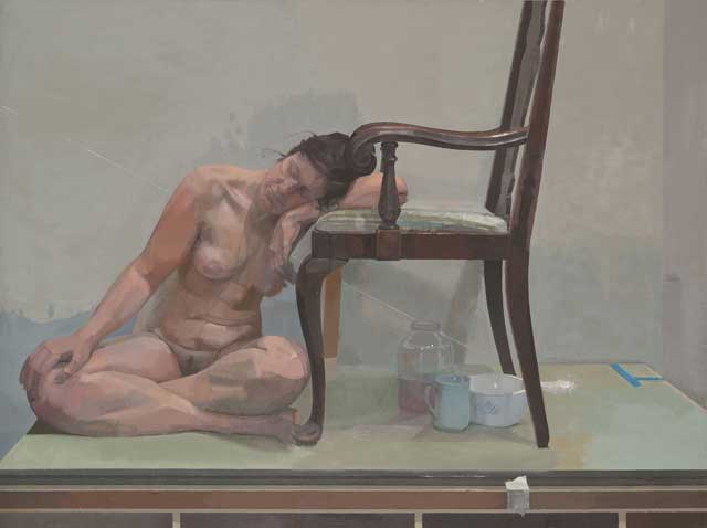
Susan 33” x 44.25” 2008 oil on linen
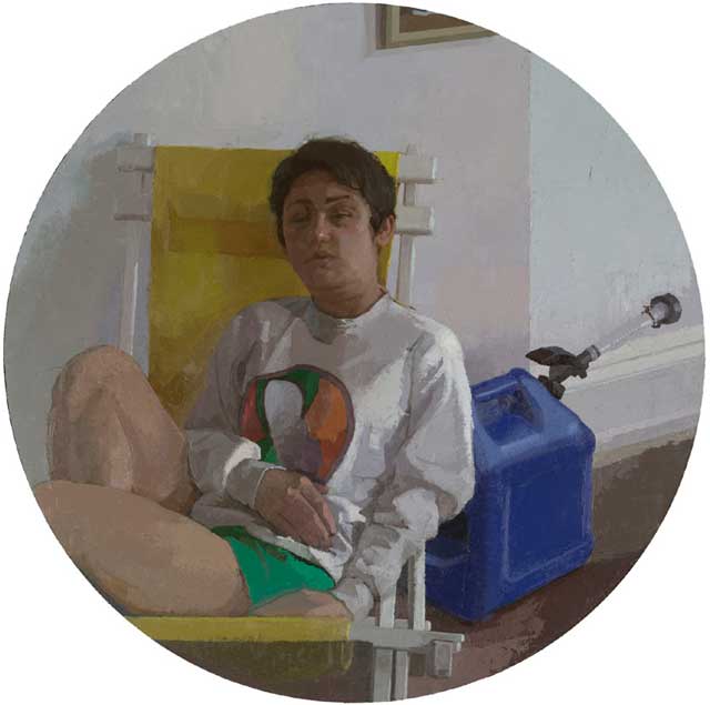
Painting of Sarah 40” diameter 2011 oil on linen glued to panel
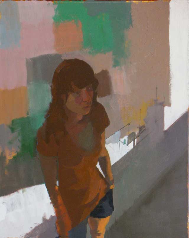
Ashley (unfinished) 40” x 30” 2011 oil on museum board
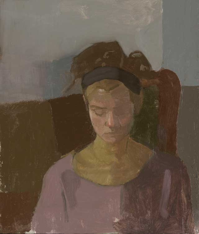
Barret 20” x 16” 2010 oil on museum board



some very wonderful paintings…I especially like “Waste”. The story behind it adds to my interest, but I like the simplicity of the composition and how the subject matter stands in for the painting process itself (constructing/covering/measuring/disposing). I’m curious as to why it was in 2 panels…was it one of those paintings that needed more ‘room’ as it went along? Keep up the good work Daniel…every time I see the painters that come out of PAFA, I wish I had gone there instead of Parsons, for Grad school.
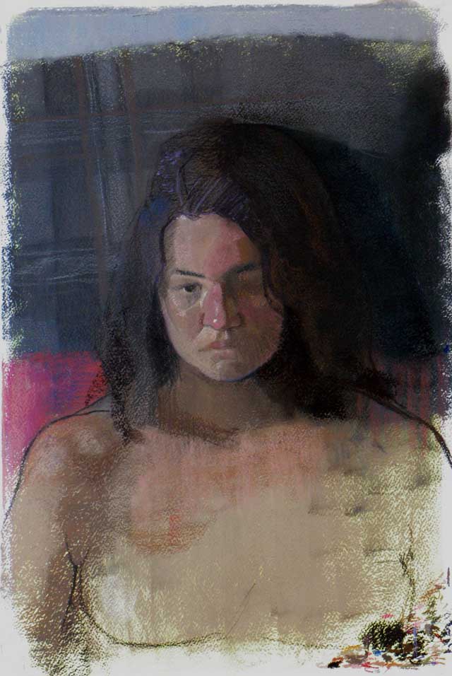
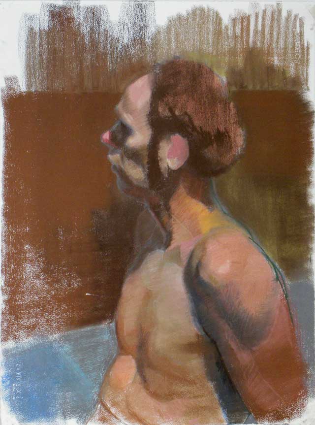
seem like really nice sincere painterly work, although the pastel drawings are more brightly and clearly colorful; and the sketchiness and unfinished areas really energize the images.
I love your paintings Mr. O’Connor. Thank you for sharing your work with us, and thank you Larry for this interview/presentation. Like Mr. Sills I find myself wishing I had attended PAFA when I see work like this and read the thoughts of the artists that come from that school. There seems to be an intelligent and soulful approach to reality and aesthetic experience so easily understood by these folks in common. I am truly a student of this blog. Thank you Larry from the bottom of my heart, thank you. Mr. O’Connor, thank you also for your brilliant work. I receive this gift with absolute gratitude, and am trying so hard to understand. I can feel it! My head just can’t get around it! Man, I am trying to understand what you all seem to know intuitively, naturally, effortlessly. I am trying to UNDER STAND. My heart feels like exploding when I see work like this. There is just something SO right about it…
I have been looking forward to a possible post with Mr. O’Connor since I noticed Mr. Groff’s comment on his blog!
Hard to know the kind of paintings the artist will make and the direction his work will move in during this beginning in his career, especially right out of grad school. I am uncertain whether the things i find compelling now will be disgarded by the artist as he develops and clarifies his path.
With that disclaimer, I really enjoy looking at the artist’s grad school work, specifically the woman and man on the couch painting, the woman, male feet, and bookcase painting, the woman on the porch with coffee(post grad), and the still lives at the top of the page.
I enjoy most the development of the alla prima, perceptual, observational, direct style of painting in finding some kind of truce between direct “sketch”, time-limited painting with the sustained development of light, color, and form that can only be found by multiple sittings and reworking over a period of time.
In the “woman, feet, bookcase painting”, I admire and am impressed by the flat color shapes of all the many books leaning in different directions, contrasted with the painterly yet well modulated color tones of the lamp, and its light cast on the wall and table. The repetition of right angles and variations in the bookcase, bunk bed, window frame, ceiling, etc, are especially nice. Regarding that lamp and its light cast on the wall, the management in this area of painterly color spots and their transitions, (an area I’ve often found to be a letdown in other paintings similar to this, like the spotting that occurs when value, color, and transition are too abrupt), seems incredible on my small computer screen. I think there is a pinch of Lopez Garcia in these works, and I can’t think of anything nicer to say.
The “man, woman , couch” painting is incredible! If PAFA didn’t give him some kind of cookie for it, then it is almost as shameful for them as firing Eakins! Its painterliness, color intensity, color movement across the composition, mini still lifes within a figurative painting, and psychological gesture/posture of the figures are all very memorable! I can close my eyes and picture the physicality of the figures, the masterful still life in the upper left, the patchwork quilt, funky green box, sagging rust orange couch, and a masterful depiction of north, or north-like, light on blue walls. I buy the man’s posture in comparison with the woman’s; the woman’s legs are crossed, contained, while her gaze is open, aware, and engaging. The male’s eyes are closed, hands relaxed, crossed. while his legs are open and spread wide, occupying a great deal of space especially in contrast to the woman’s legs. I can imagine a contrary view where one finds the figures’ body language too self conscious ( on the part of the artist, model, or both). In other words, the figures may be too self consciously designed to embody duality and opposition to be credible. For me, it works, and is powerful. I am interested in what others think. Anyone familiar with William Beckman’s Man/Woman Paintings of 86 and 87? ( http://www.georgeadamsgallery.com/archive/arcexhibition.php3?exhib=254) There are some parallels with Dan O’Connors’ painting, although from a formal and technical standpoint Beckman is considerably different and possibly unpopular and uninteresting to this blog ( although a Beckman/ Kassan comparison/contrast would be, in my opinion, riveting).
Incidentally, the part above where I was rambling about the beauty and success of Mr. O’Connors’ painting of and around the lamp; the opposite, in my opinion, of that passage’s color tone harmony are the floor notes at the figures’ feet. The color tones feel too abrupt, ill-fitting, and spatially flat.
Great post, great website, and great work by Dan O’Connor!
I know this was posted a few years ago, but does Dan have a website? I’d love to see what he’s up to now. A quick google search left me nowhere…