Introduction by Susan Jane Walp
I met Lennart Anderson during the summer of 1968. I was an undergraduate student at Mount Holyoke College, attending a summer program run by Boston University at Tanglewood, and Lennart was the painting instructor. We painted from the model, and Lennart painted along with us. Later he expressed some guilt over being paid for a summer of painting with very little active teaching, but nothing could have been more worthwhile for a beginning student than to observe firsthand how he worked. What I remember most from the silence and subdued light of that studio is Lennart’s palette and the orderly piles of paint he had mixed. That color could be so beautiful and that painting could involve these subtle, unnameable tones was a revelation to me.
Ten years later, after several years at the New York Studio School and a period of working on my own in Denver, Colorado, I found myself once again studying with Lennart in a still life class at Brooklyn College. I remember a large room with a wall of north facing windows. We students lined up our easels, and we each set up our own still life on the narrow shelf running the length of the east wall. Lennart made the rounds and sometimes, with permission, would work on a painting, bringing our unruly tones into relationship, softening and eliminating edges, helping us to see the big notes that could provide a more reliable basis for moving towards the smaller forms and details.
There was also a weekly evening session from the model that he supervised and that was open to all of the students in the MFA Program. At the time I had an inexplicable aversion towards Degas. I remember one evening becoming frustrated with how Lennart was going on about him, and I blurted out, “I think…[grasping for the right example]…Giotto was a greater artist than Degas!” After a few moments he gently, and with great kindness, replied, “I agree that Giotto was a greater artist, but…Degas, I believe, was the better painter.” I cringe a little now to look back on the naiveté of my comparison. His pithy response (he, of course, has no memory of any of this) was one of many things he has said to me over the years that went to the heart of some underlying obstacle in my own thinking and gave me something to contemplate for years to come. I was a slow and sometimes resistant student, but over time came to more fully appreciate the other painters in his pantheon (Matisse, Corot, Poussin, Velasquez, and Titian), the amount of time he spent studying their work, the detail in which he had memorized so many of their paintings in his mind’s eye.
After moving to Vermont in 1985, for a number of years on my visits to the city I often would bring along a painting or two to show to Lennart in the beautiful north light of his Brooklyn studio. He loved talking about painting but was reluctant to continue in the role of teacher as critic outside of the class situation. He had to be coaxed. I would ask questions, and eventually I would get something out of him, some insight into the work, a limitation, an obstacle, something to contemplate and work with until the next visit. I am guessing I am not alone among his students in saying that I didn’t turn to Lennart for compliments, which were rare, but rather for his honesty and knowledge, and I think also for the privilege of witnessing the integrity of his own inquiry, its clear focus and spirit of open questioning, the absence of dogma, the intimate and fluid relationship between his thinking mind and the activity of seeing and painting.
I have remained a student of Lennart’s work for most of my painting life. For me this has had nothing to do with imitation or with blind faith. It has been a repeated and evolving experience of recognizing qualities in his work that I quite selfishly want for my own, things that his paintings know that my own paintings want to know. Recently I have been studying a reproduction of his Portrait of Matthew Devlin (2001). I remember seeing this painting in a 2008 exhibit on Staten Island, and now I find myself marveling all over again at the subtlety of the tones, the exactitude of the drawing, the smallest details in perfect relation to the larger forms, and yet the brushwork so completely free, open, alive. I have been asking, how does he accomplish this? It is like seeing more clearly the next step for my own work, in this case a more compatible relationship between accuracy and spontaneity, and recognizing the habits that are blocking the way and not serving the seeing.
Is it possible to say in a few words what I have learned from Lennart? To zero in on something essential that could be of benefit to younger painters who are finding their way and haven’t had the opportunity of studying with him? I think back to that magical Tanglewood summer and how he opened my eyes to a new way of seeing the world, as an interconnected web of relationships, of colors and tones and light and space, free of the limiting labels of trees, grass, arms, and noses, and how thrilling the experience was of finding an equivalent for these relationships in paint. For lack of a better word (and one he might not approve of), it was an abstract world. Entering it was entering a realm of infinite possibility, and from the very beginning I loved dwelling in it. He has remained my guide and friend ever since.
Conversation with Lennart Anderson
This past August I was very fortunate to get invited to Lennart Anderson’s studio in Brooklyn where I went with Kyle Staver to talk informally about his thoughts and experience on painting and drawing. Regretfully, The first few minutes of our discussion failed to record properly and was lost. My recollection of this early part of our talk centered around his approach to drawing; Specifically with his use of three points along a vertical in drawing (especially the figure) to determine the width in relation to the height. He also talked about the importance of finding horizontal and vertical relationships of points seen in nature in a grid-like manner.
Lennart said he wrote an essay on drawing and painting that covered many of these concerns, saying, “I wrote that essay so I wouldn’t have to be interviewed!” (link to that essay below) I then asked how Lennart’s approach differed from the British painters like Euan Uglow, William Coldstream, etc. who had a similar preoccupation with measurement. Lennart, as I recall, said that to them measurement was everything but that wasn’t enough for him—he was more interested in other composition aspects besides just the vertical and horizontal alignments. I had asked him if perhaps their painting was more about mapping than traveling. This lead to asking what he thought of Euan Uglow’s more planer approach to form and color. Lennart seemed to be less interested in this approach, saying we don’t see form that way. This in turn lead to talking about the role of color in painting which is where the conversation began to be recorded properly.
LA: …Color in painting is almost not important. It is really a very simple thing.
Larry Groff: If that’s true how come so few people can use color as well as you?
LA: Because they are probably thinking of themselves.
Kyle Staver: Who should they be thinking of?
LA: They should be thinking of what they are painting and the relationships of those colors. It’s all about trying to paint what you are looking at.
KS: How do I know it’s your painting? How come your color and your light is particular to Lennart Anderson…what makes it your unique color?
LA: This gets complicated. It has a lot to do with the key that your painting is devolving to. It(the painting’s key)changes as you work from day to day, so that what you end up with is not exactly what you’re looking at. It’s as close as you can, but is dropped some, or probably will be dropped in tone from that because paint tends to drop in value as it dries. So, the decisions I’m making are against that kind of thing, I’m trying to hold it(tones) up. So that gets into my look to some extent. I’m always trying to get the what the relationship is…
It’s all Corot, you know, you’re a landscape painter, he’s the great tonalist. The real intimate kind of exactitude of a light in a spot. The ideal I like to refer to is his Bridge at Narni… what do you see when you look at it? oh my god, it’s the sun and everything, yes, you look at it and you see that he took a real… he saw something that no one else would have seen, that the shadow under the bridge is a blue, it’s BLUE – and the whole thing works because of it, in a sense.
I wouldn’t want to be able to tell how anything really works but that’s the excitement in the picture, really. That’s the excitement. It’s a relationship, as you said before, it’s about comparisons. You get excited when you look at it That’s A BLUE – but when you isolate it that spot through a pin-hole, you certainly wouldn’t see blue, it would be some nothing.
I was looking at a catalog of Sargent, and he was trying to paint somebody, and he was in the sunlight or something, a real Sargent tour-de force. and he couldn’t get it( he couldn’t get the right color) and all of a sudden he slapped his head, Its MAUVE! MAUVE!-(laughs) but if you isolated that you wouldn’t think it was mauve, in the context of the picture of a figure in the landscape It probably wasn’t really mauve but only in context.
Boy, that was a good question, why my pictures look different from someone else is because I see something that someone else wouldn’t see, somebody might even see it better. What I do is not necessarily better. but I think actually what makes my pictures the way they do… its hard to say because I’ve painted different things, different ways. Generally – landscapes are all one shot paintings. So that the light that is in the canvas is used to help out the light in the scene to some extent. You don’t want to lose the brilliance of the outdoors by mudding up the tone underneath. Try to hang on to the white, so you paint thinly.
LG: Do you use the knife when painting outdoors, scraping the paint to keep the painting thin, to keep the paint layer very close to the white ground, to keep the light up? to keep the paint layer thin and more transparent, close to the ground..
LA: No, no, never did, don’t use a knife, I’ve used a knife but never for that.
LG: So, you prefer to paint thinly to begin with then?
LA: Lately I’ve been trying to put more paint on the canvas. I’m trying to paint thickly now but its just developed but (I hate to bring up my eyes) try to keep that light tone underneath. and it had a lot to do with the surface of the canvas…
Lennart Anderson, Rita Natarova 2013
KS: The first time I met you were wearing a really nice suit with a blue tie and I remarked on what a nice blue tie you had, and you said don’t you know I’m a tonalist. Do you remember that? Can you tell me what you meant by that?
LA: Well, everyone is a tonalist, some are poor tonalist and some are better at it. I make a case for myself when I work but I don’t. I think people who are fighting it are hampering themselves. Matisse is a great tonalist. His color is never away from tone…
…(Matisse)… He’s basically a tonal painter. I don’t know what a color painter is, actually. I like to say that the only time there is color is when it’s in the tube. It’s in the tube, the screw is on there – that’s the color. It’s in there. Once you bring it out, it’s tone. Once you put in on the table, or on the palette, it’s a tone. It’s in a place; it’s taking part of the area. I think I more agree with Picasso that color is very tricky, and I know it’s true in terms of how light changes the picture so much. So tonal painting or value painting – the less color the better in a sense, because it stays there, it doesn’t keep shifting around.
Painting, to play with this business of certain intensities of different colors together that are the same value, is very interesting. There’s a saying, “Nature is best at the distance, it’s all together.” There’s a harmony, and I guess that’s what interests me: harmony. That includes color – color is an element. I made paintings based on black and white Muybridge photographs. There’s no color in them. But I don’t have any problem dealing with that. To me it’s not hard to understand what the colors might be when you look at a black and white photograph.
from an interview with Lennart Anderson by Jennifer Samet -see full interview here.
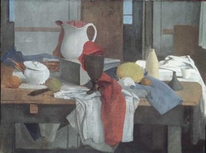
It’s all tonal, where you get into bad tonal painting–the question is it (tones) all together or not. I think with Kandinsky when he was painting realistically, he was out of his element but afterwards when he was painting abstractly–more kandinsky-like, its ok, not great but its ok. but color, I don’t like to get into this because people make color into a religion.
LG: Why is that?
LA: Because of Cezanne, I think, mainly.
KS: But you’re considered a colorist?
LA: I am, but so is everybody, you can’t put something down without it also being a value. That’s what tone is about, value.
LG: Perhaps the colorist’s have better tones because they think about value more. I always thought the tonalists are more about the drawing, drawings with color added–using the tone to accentuate the needs of the drawing rather than the sensation of color in its own right… or do you think I’m off base here…
LA: Well we talked about that to some extent, this is sort of like the difference between the Florentine and the Venetians. The Florentines put drawing first, I think the Venetians put drawing along with the color, with the value – especially value.
So much of what is great in painting is that if you reproduce it in black and white it comes out great too. You know because of the relationships. (of the values) I’m sure that the Bridge at Narni will look great in black and white because that blue is a surprising value there, and it will show, that when you expect to see something darker, it isn’t.
LG: Does the process of comparing tones and close study in observational painting offer advantages in color that invention can sometimes lack? Of course it’s still possible, but isn’t it harder to get at because you’re not comparing it to anything external? You have to do it all in your head.
LA: I do make up painting and I key them where I want them.
LG: so it’s the key, the keying is the key…
LA: Yeah, it’s still dark, middle and light but it isn’t necessarily black and white, but something else. It’s about key and value–what is the value that picture has assumed, or fallen to, or risen to. I think everything should be together. I don’t know of any painting that…, You would have to go a great deal to put up a still life that you couldn’t manage the color of no matter what you did on the table, you would still be able to handle it– because it’s taking the light of the room, it’s taking the place and it blesses everything together, you know?
So you can get things that a designer might say, would counter; “you can’t put orange there, we know that orange doesn’t work with such and such, or that you can’t put blue with green”–like Manet did in The Balcony, if you’re a painter you can do a lot with–the color, that’s good tonal painting.
LG: On many of your paintings you reduce or compress the range the values, keying the painting to a certain range of middle tones, often avoiding extremes of light and dark. Does this allow for much richer color, working in this more compressed color space?
LA: No, it think it has more to do with my different periods. When I was painting in the 50’s I was into what I call “kissing color”, things that were so close that you could hardly tell them from one to another, hardly tell them apart, what they were… I was into that and you could have something that was orange or pink. Well, de kooning was into that stuff too… maybe I got some of that from that kind of painting. But that is what I was doing to some extent… but generally, I think I make a mistake in that I don’t go dark enough in the darks because I know I’m not going to be able to keep it, that its going to move and I don’t want to try to move dark tones underneath things, you know what I mean? Its covering you don’t want to have too much to cover, I think I may have overdone that. I think I could have a better, a richer range from dark to light but I don’t think that necessarily follows from what you said what you just did… you are really just talking about a certain pictures at a certain time. You can’t say that (about my work as a whole) on really essential pictures like Barbara – no one would say that I’m cheating cutting back down (on a full range of color value) on her… but I am because there’s no black.
This is something I take on, what is the word… like a religion. The way I’ve taken it… there’s got to be space in the picture so there’s no black, the black is in the tube – once it goes out it’s part of the room, as it moves back into the picture it can’t be black..so that’s something I’ve used as my… sort of a rule.
KS: That you can’t have a black?
LA: You can’t have a black if you’re painting nature
LG: Not even in a nocturne?
LA: Well, I’ve never painted a nocturne…
LG: You don’t like to paint dark paintings?
LA: No, I don’t tend to like dark paintings, actually. However, Lois Dodd has painted black.
KS: You don’t like dark paintings?
LA: (laughs) You’re getting more than you figured on…
LA: Rembrandt, is he dark? is he black? Where as Caravaggio, he can be black…
LG: What about the notion of holes in the painting? Is that the reason you avoid black or is it more that you don’t want that kind of contrast…
LA: That’s interesting, holes in the painting. If you are Manet, you’re not making holes when you use black. When you’re Matisse and use black you’re not making holes – so it is a tonal thing if you are making a hole, it’s not good tonal painting if (your black) results in a hole.
LG: But if black is used as a great color? that sings as a beautiful color note in the…
LA: Well, I’ve said that, Matisse and Manet are the modern painters of black
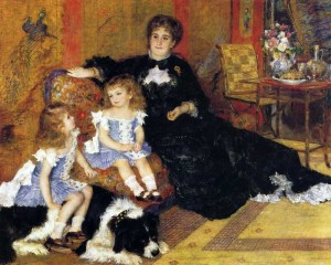
KS: Also, Renoir’s blacks are beautiful. Like in the painting of Madame Charpentier, the woman with the black dress…
LA: I’m not saying I don’t think his blacks are beautiful but I don’t think they’re there. It’s a very tonal, dark paint. There may be a black in it.. Manet would have a black but no it wouldn’t be characteristic of Renoir… you wouldn’t characterize that painting as black. The whole picture is a middle value…
LA: If you’re saying Renoir painted beautiful blacks you may be right, if he uses it, he probably uses it well. But I don’t think that characterizes Renoir. You don’t think of Renoir as a painter of black.
LG: What painter have influenced or driven you the most – I’ve been told you spend much time in the studio looking at art books before you even start painting, what painters do you go to the most? What do you find, or is this something you can’t really answer – that it’s different in every situation?
LA: Right, it all depends on what I’m trying to paint. If I’m painting heads, I have a whole table full of books on paintings of heads that I like. If I’m painting landscapes I’m looking at landscapes, looking at Corot, for instance.
LG: I wondering if you might have anything to say about Ingres and how his work might speak to you or about why he may be relevant. You have some great books here on Ingres…
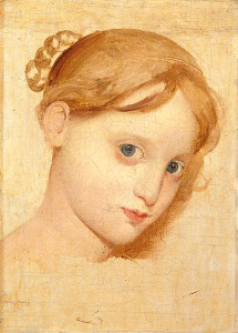
LA: I have this big book on Ingres, it has a photo of a painting that isn’t anywhere else – that I look at over and over again, it is a painting he did of his girlfriend – they just discovered it I guess.
Ingres, he’s a terrible painter, nothing worse than Ingres except maybe Courbet – of course the two of them have different ways of being terrible. They’re terrible when they are terrible.
LG: Why do you say that?
LA: Well, Courbet is his own problem. Ingres, he doesn’t seem to know, He knows he’s great but he doesn’t know when he is bad. Ingres doesn’t seem to know when he’s bad.. he knows he’s great. he does these terrible pictures, spending a lot of time on them. The truth is he probably doesn’t have a good imagination. I mean he can’t imagine really well, so, he does better when he’s working from something or from drawings that were done from (looking at) something.
KS: So those big allegorical paintings are horrible?
LA: No – they’re the best ones (laughs)
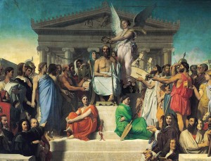
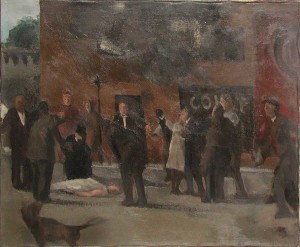
LA: The Apotheosis of Homer is a wonderful painting. That was one of the inspirations for my street scene that I did in the 50’s. The grandeur of those male figures, it’s just fantastic. You may not like the whole painting, I do, but it is full of wonderful painting, and a conception of what people could be. He was up to it, yeah, he was up to it. That was meant for a ceiling in the Louvre. You know what struck me about him was when I went to Paris for the first time, especially seeing pictures like that, what struck me was, what wonderful color.
I think that all had to do with fresco painting trying to make oil painting compete with fresco in the key, the value – it’s up. It’s not Delacroix. You see the difference and there is a big difference between those two artists. And you are right to think Delacroix. But for me as a painter, I was all Ingres – I didn’t like Delacroix at all.
LG: Why was that?
LA: I never liked that kind of overstatement that he was making with his values. I did like the The Massacre at Chios and The Death of Sardinopolis but generally I don’t like Delacroix…. But I’m searching for another great Ingres – that little Ingres is just so incredible…really like that little Ingre portrait. There is nobody that can compete with this… This is one of the few unfinished pictures that you can really study. Just shut up and look at the eyes…
LA: Aren’t those eyes unbelievable!
Ingres vs Hawthorne – follow-up question
A few weeks after the interview, I wrote Kyle to ask Lennart for the below follow-up question about drawing and color in relation to Ingres and Charles Hawthorne’s teachings about color and painting written in Hawthorne on Painting . Also, A great essay by Francis Cunningham comprehensively explains Hawthorne’s Color Spot ideas in depth as well as its relation to Edwin Dickinson can be read here.
Kyle Staver recorded the following conversation in Lennart’s studio.
Ingres said:
Drawing does not simply mean to reproduce contours; the drawing does not simply consist in the idea; the drawing is even the expression, the interior form, the plan, the model. Look what remains after that! The drawing is three-fourths and a half of what constitutes painting. If I had to put a sign over the door of my atelier, I would write: School of Drawing…and I’m certain that I would create painters.
LG: Some painters advocate painting along the lines of Charles Hawthorne’s color spot approach, giving the resolution of the big color notes priority over precise drawing. Do you see Hawthorne’s advice as contradictory to the Ingres’ quote above?
LA: One makes a picture with a number of things, drawing is one of the ways to go about certain subjects, especially figures. However there is no reason to think that a painting that has many figures in it that was not passed through ideas about areas of color. So it doesn’t mean that it couldn’t end up with an Ingres-like look, but the original composition could
KS: Did Hawthorne start with color? Was that his deal?
LA: I don’t think anyone starts with color, everyone starts with tone but also they’re usually (inaudible) thinking about the size of the canvas and where to place whatever it is you’ve decided to paint.
KS: Previously you told me you always go back to drawing when you don’t know what the hell you’re doing with the painting. Can you talk about that?
LA: If you are painting… I wrote a little piece about drawing while painting.If you lose track of that you end up without painting, you end up trying to solve the problem with drawing.
KS: When you lose track of the painting?
LA: If you lose track of the painting approach to it, which is one of place and shape. But mostly place, the minute you start shaping actually you start drawing and it sends out the form. One should have in their mind the composition. If this is just a simple composition of the figure, which often times that’s what these (Hawthorne) quotes are referring to. The problem I can see with this is that once you draw it how do you begin to paint it? Where if you paint it, if you’re using relationships of place it’s easy to locate where you’re working to – from, you can – drawing just naturally begins to make definitions for you, the paint has to be there. You’ve put the painting through a succession of relationships that support what you’re saying, the drawing is almost put in late.
KS: What you’re saying is that there isn’t a real contradiction to what Hawthorne and Ingres are saying?
LA: No, I don’t think either one of them are talking about…, they are talking differently I suppose, I don’t know how, where Hawthorne fits actually.
KS: What do you mean?
LA: Is he a Venetian or is he a Florentine? (http://www.visual-arts-cork.com/painting/colorito.htm) I would think that he tends to go towards Venetian painting. Ingres with his determination would go toward Florence.
KS: So Florence is drawing and Venice is color?
LA: Yes but I don’t think I made anything up when I was pressing the thought that drawing has to be carried on at the same rate as the painting. It shouldn’t be in advance of the painting more than a stroke. You don’t draw it and then paint it because the painting has to include things that cross over divisions of subject matter.
KS: So there is no argument? So why does Ingres say it’s all drawing, drawing, drawing?
LA: …When you’re painting it comes down to that to some extent, it’s not something that… in spite of what I said it’s still so integral to what you’re painting, the drawing is being struggled with as well but no ahead of everything. You’re dealing with proportions, relationships of tone – which includes color. You have to understand when I say tone, it includes color. There’s no elimination of color, if you want to eliminate it you use value, you use chiaroscuro or something. And you can do that and then break that into color and it will work but if you do it with line; it won’t work. Which is probably an Ingres thing, he would be a person who was going to solve it with line. It’s true that his paintings are linear or have a compositional element in his best paintings that can be seen as drawings. However, did not Ingres say that you finish your painting with drawing, put the rage of drawing into your painting at the very last, so it’s drawing at the end not at the beginning.
KS: So he would be in agreement with Hawthorne? I don’t know Hawthorne’s work…
LA: Well, you don’t have to know Hawthorne’s work. I could say that what he painting like up to a certain point was like what he taught but the ones I’ve seen often times end up with a drawing being separated at the end. Being at variance to what one would think Hawthorne was teaching.
LA: (Edwin) Dickinson curiously eliminated color from his tone, almost totally, almost all together, so Hawthorne is making the case for color, his most famous student is negating it. I don’t have his book (Hawthorne, so I can’t quote exactly) I understand or thought that Hawthorne was interested in using almost impressionist color but he’s not evidently, he’s really interested in solidifying the color of impressionism into a larger tone. That’s what Dickinson seems to be agreeing with in his work. In some ways he’s a Hawthorne student but he’s not a Hawthorne student because he’s not a color person. Hawthorne himself is not a Hawthorne! If you know his work, he returns to drawing at the end and often times I found it to be the case, not altogether, he’s a very traditional kind of Velazquezian painter, in many ways. I mean there is a big school of Velazquez that taught everyone how to paint but not how to compose, how to think about the painting as a whole. So it tends to be simple and simplified composition.
Everything I say is to be denied! I don’t know that many (Hawthorne) paintings. Coming from Detroit I know that they had I think two Hawthornes that were in the Detroit museum. I can only recall the first one, which was there when I was a youngster. The second one I came across when I visited this museum a few years ago. He’s a kind of bravura painter and tried, I’ve seen reproductions of his paintings from Cape Cod. Doesn’t seem to be about color they are too complicated and filled with forms that don’t really make you think I wish he had painted with more color, it wouldn’t have helped them.
KS: Would anything have helped them?
LA: Well sure, but you’d have to redesign the painting. They’re not bad paintings but he’s emblematic of Cape Cod with his fishermen and their life. He tried to paint the fishermen, their occupation and struggle. I suppose that’s a good thing but it doesn’t matter if the paintings are heavy and not euphoric.
end of the follow-up question
LG: It’s hard for painters today, do you think it’s any harder for painters today than when you were young? What advice do you have for a young painter who really wants to learn how to paint from life. In terms of study, what would you suggest?
LA: Study, who cares about study. You’re trying to make great painting from day one. When you’re in a class you should try to make a great painting, to hell with studying, you know! Only recently, since I can’t see have I had to study, you know…
KS: You are still trying to make great paintings.
LA: Yeah, I’m looking at things very closely that I’ve looked at for years and never really, they’ve become more… I can understand them a little bit better… I shouldn’t say understand, I should say I can appreciate what it takes to do and how simple it is. You look at the painting of the Cardinal by Velazquez that is in the Hispanic Society.. I was just telling someone, Velazquez made it so simple it was a joke. You look at it and wow, everything is there and there is nothing to it. So what were you questioning me about?
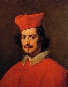
Diego Velazquez, Portrait of Cardinal Camillo Astali Pamphili, 1650 at the Hispanic Society of America
KS: What do you say to students who come wanting advice?
LA: This is a difficult thing to answer honestly, because you know, the truth is, they are not going to make it. I wasn’t going to make it. They are not going to make it. Forget about what year they are painting in, they are not good enough, they are not committed enough, they don’t use their brain enough so they can push away things that aren’t essential, you know. In a sense it is intellectual, you have to look at it, you have to discern what makes things really interesting and as you paint you find out that that wasn’t right and find out that it was even more interesting.
And another thing, people think that when they’re painting their best, that that is enough. but no… that’s just where you start. You have to paint better than your best and then even better than that! And sometimes when you are really lucky you get one that happens by accident and those are the best.
LG: Sometimes it can be confusing to decide which ones are best, isn’t this something you learn over time to recognise?
LA: Sometimes, yeah sure. I’ve found pictures that initially dismissed and then found I….
KS: Lennart Anderson, come on, when you hit like a big white shark you know you’ve hit, right?
LA: No, No, I should say that in my racks I have pictures that I didn’t consider much, but then later on, wow, that was really relaxed, that it really came out. When was relaxed enough to let it happen, it’s nice.
LG: The commitment for students is hard for them to get these days, especially with so many distractions. Especially with facebook, smart phones and things like that…
LA: (laughs)I don’t know anything about that.
KS: What were the distractions for you when you were a young painter?
LA: There was never any distraction, never distractions.
KS: You just painted no matter what?
LA: Well, I didn’t paint all the time but I was always about it, which I still am, I sleep with it, try to figure it out. I’m really, at night, thinking how to get the head right, (ask myself) what is it? all the things that I do, that I make up out of my head that I think about at night – perhaps I should try this or that. But it’s all washed away when you look at nature. Nature is just so much better than anything you can think up.
KS: Are you glad you are a painter?
LA: There was a time when I didn’t know if I could make it as a painter and that I might need to do something else to support it. I was thinking then maybe I could do some sort of minor crime and then (get arrested) and they would put me in a cell where I could paint all day.
KS: How did you get to be a member of the Academy of Arts and Letters in Rome?
LA: That’s a nice story. I was in Rome and certain painters came through to check out what was going in the studios in the Academy. This is something that happened to me a number of times, They discovered me then it’s like I’m their personal discovery, you know? And I was doing things that were touching them, I was really into it… it would be like “he’s not painting my dream but you know it was like that. I was grabbing things and holding them to myself, you know.. Piero, Ingres, Degas, Poussin – I was grabbing them all and I was treating them as my thing. And that was important and my work had some of that quality in it. And they recognized that, I shouldn’t say “they” there weren’t that many people I suppose but Rapheal Soyer was critical. He’s the guy who put me in Arts and Letters. Philip Guston was there, he came by, that was a thing.
LG: He was there while you were there in Rome?
LA: Yes, he just visited. I was somebody that fulfilled something that they sort of envied, like they were thinking “I should have done that…” “He’s doing it” There was a kind of envy there at times. I don’t know if it was honest by these big deals, especially somebody like Guston. When I came back to the States and I had a show at the Graham gallery in ’63. Guston got Barnett Newman to come, I had Barnett Newman at my show and we were talking away because he knew all about “French Academic art” and so he could talk about to me! (laughs)
LG: Did you give him an earful?
LA: No, Not really – we talked more about Larry Rivers, he thought Larry Rivers was a fake.
LG: Did you?
LA: No, he was a very interesting painter
LG: Who were some of the other people you meet who came to your shows?
LA: Lots of people, Nicolas Carone, Carone was a big fan. My last show, this was before he died, he was living in upstate New York in Beacon or something like that, he was upset that he couldn’t get down to see my show.
Brief edits of I-Phone video footage taken by Alex Goldberg of Lennart Anderson talking with Israel Hershberg and others about comparing vs looking in painting, thinking about a painting, the power of artbooks and some discussion about his current drawing process during his 2010 visit to Sienna, Italy at the JSS Summer Program in Italy.
Drawing for Painting
Lennart Anderson’s essay written for the Rider University Gallery Catalog of his show “Drawings and Paintings” April 2000
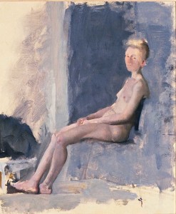
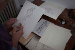
These figure drawings were done in class with poses lasting five, ten or twenty minutes. I always begin with a measurement that encompasses the length of the figure. The problem is then one of width. Using a standing figure, I take a measurement from a specific point. usually under the foot that bears the weight, to a specific point, perhaps at the bottom of the crotch. This measurement, taken at arm’s length, is held on a pencil. The pencil is then raised until the thumb, which is at the foot, is found at the point of the crotch. The point of the pencil is now found at a specific point in the face. I now have three points. The distance from the first to the second, and the second to the third, is the same. I then decide on the size of the figure I want to draw, and place my points accordingly on the page. These points are regarded as true. The bottom and middle points are fixed. The top may wander to the left or right based on the movement of the model during the pose.
My drawing develops from these points by a series of guesses, casting lines about trying to get a feeling for the mass, asking questions: How near? How far? Is it above this point or below? Is it to the right or the left? I have no aim to finish in the time allowed, but feel that everything is tending to its proper place. I concentrate on place rather than thing. This is especially important for painting, because I feel I can move a place more easily than a thing–for instance, a hand. In painting, certain qualities of place, such as tone and scale, can be dealt with before distinguishing it as a specific object. Paint has an advantage here in that it can approximate a visual effect more directly and completely. I find that working this way emphasizes relationships rather than subjects, and maintains spontaneity through the process.
Gorky’s Granddaughter Video Interview with Lennart Anderson Sept. 2014
Lennart Anderson, Sept 2014 from Gorky’s Granddaughter on Vimeo.
Fantastic new video interview at the Gorky’s Granddaughter’s site. Many thanks to Christopher Joy and Zachary Keeting for their incredible gift to Painters with their “Gorky’s Granddaughter” documentary art project, where they visit studios and talk to a wide range of important artists.

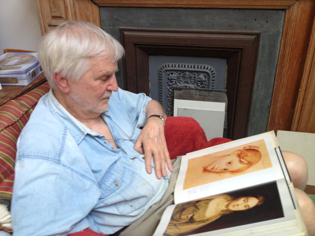
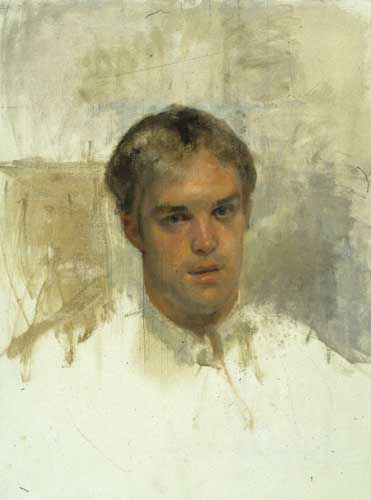
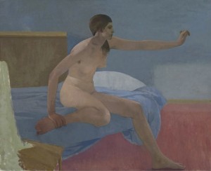
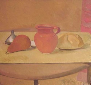
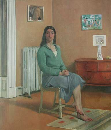
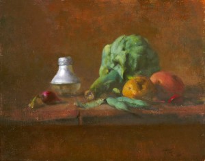



Impressive to say the least,good for anyone to see someone who takes his work more seriously than he takes himself.
Cezanne maintained that the man should disappear behind the work,not enough of that around at present.
Anderson has spent his painting life focusing on the big metaphor of paint as poetry, and has created some masterpieces as a result. I wonder what he thinks of Ewan Uglow’s work.
Have just come across Lennart Anderson’s work and it is just wonderful. The video is a great. Thankyou
this video is an inspiration. Now that I have discovered Lennart Anderson’s work I will follow his work and as this video allows learn more and more .