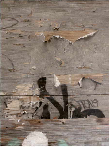
Peeling Paint, Oil on wood panel, 25 x 20 inches
Larry Groff:
That’s interesting. Well, I’ve seen your work, and it does have a really rich surface to it. The texture is really incredible, but it’s difficult to see it as readily online. You really have to see it in person to get the full effect. But, anyway, let’s move onto the next question.
Many of your larger figure paintings have a look of gritty, urban textures and graffiti that suggest abstract paintings, such as those by Robert Rauschenberg or perhaps Franz Kline. Your figures have remarkable level of solidity and weight to their form which contrasts to the flatness of these backgrounds. The shallow space between the figure in the background almost starts to lend the figure a kind of trompe l’oeil illusion from what I’ve seen.
Is there some statement here about the illusion of space and realism versus the celebration of flatness you often see in abstraction? Can you tell us more about what you’re thinking about with your figures against these backgrounds?
David Kassan:
This is a great question.
Really I just want to paint what interests me and I’m very interested in the contrasts of a painting. The flatness and the three-dimensional qualities of things. Abstraction, and realism. And I wanted to find a way to get things together in the same picture plane. And it’s almost limiting in some respects, because I can’t do genre scenes or anything like that. I’m limited in the spatial dimension. And sometimes, as I’m trying to figure out a little bit more, well, I don’t know if I’m making a statement, at all. I don’t think my work is really about statements at all.
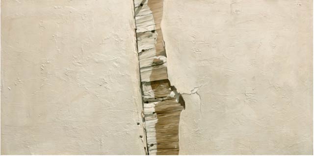
I could do the same painting a hundred times, the same format, with different models and be completely happy because it’s really about researching the model. And the backgrounds are more based on the environment where I live and the stuff that interests me about finding these found abstractions in nature and documenting them in paint.
Kind of like the found objects concept from Marcel Duchamp with ready made objects but finding things in nature that I find, or not in nature. There’s not much nature where I live in Brooklyn, but there are signs and typography that is worn down and there is design in all of this, formal elements. Combining that within a painting of the figure is really interesting and challenging to me. And then the level of painting that realistically and giving a tangible realness to these formalistic elements, really interests me as well.
So it’s got a lot of different little strata to it. But the figures, I do want that trompe l’oeil feel. I really strive for that, because I want the figures to be life size. All my paintings are life size. I want them to occupy the same space as the viewer, so that they seem more real.
So that again, with that tactile quality of the abstraction, it’s almost making the abstraction kind of real, because of the tactile feel that people can actually feel it. And they kind of can have a sense of place, even though they don’t know what or where it is. And it’s completely broken up typography, drips, stains, and graffiti.
So everything, the background is being rigid with the typography that’s broken up versus the roundness of the figure, with flatness versus the dimension of the figure. Its really an almost jarring kind of contrast that brings the figure forward. And I think that having that space is helpful to that. I’m not sure if I’m going to continue with this or if I’m going to evolve away from it…
…but I used to be a graphic designer, and I used to do everything in two dimensions. And when I would design websites, I would think about them as being abstract paintings, except with text in them.
When I started designing I would do designs for designers, using cool abstractions and compositions that had nothing to do with the information that I was supposed to be presenting, I was horrible, but it was a lot of fun. I quickly learned how to make the design subordinate to the information and have the sites more balances between the info and design. So all the designs are getting a lot simpler.
I mean, it’s very interesting. The more I learn about the Internet, the more simplified and sophisticated my site gets with the design and everything. I just want people to get easy access to all of the information. And I kind of feel that way with my paintings, too. It’s almost like a less is more kind of quality … that I kind of grew up with when I worked full-time. And I feel like all of this is just kind of, finally becoming like the sum of these crazy experiences that I’ve had of being a designer for a while, and then learning how to paint, then going through the wringer of the Art Student’s League, and the National Academy. And then being a follower of all these amazing painters and trying to digest how awesome they are at what they do, and how each one has an individual voice. And how does one get that voice? So it’s kind of like I guess it’s just by doing it now. I don’t know
See, I always get off-topic towards the end of the answer.


Thanks Larry…another artist I’ll have to hunt down here in Brooklyn. I really enjoy seeing his interest in the graffiti/urban patterns in the backgrounds, or just as a singular focus for a painting. Seems like work that has to be seen in person to fully appreciate. Very funny hearing him talk about meeting Lopez Garcia…must have been a life changing experience…good stuff.
Thanks for this, Larry. I’ve been admiring his work for a while now. Good to hear his thoughts on it and his process.
You raised an interesting question in the interview that I’ve been thinking about lately but am having trouble getting some feedback on. What is the difference between photo-realism and super tight realism done (mostly) from life if a viewer thinks the painting is a photo? The mechanical goals of capturing exacting detail and hiding the hand of the artist seem similar to me.
Most artists treat photo-realism like a red headed step child so it just seems weird to me that there is such a resurgence of tight, classical style rendering. Is this similar to your comparison of Rackstraw Downes to Kevin Macpherson where Macpherson is selling a skill set? Is the power of David Kassan (and many other rising stars) that so many artists want to draw and paint like him so they take his classes and buy his DVD?
Interesting Comment Hank.
Of course photo-realism and other highly rendered realistic painting all have one thing in common – they are made by individuals. So I’m not sure we can easily apply blanket statements to explain the motivations. That said I think there is often a considerable difference in paintings done with the primary goal of accurately copying a photograph (or a range of photos) and paintings with a goal to capture an observed situation accurately. Photorealist paintings often emphasize features commonly seen in photographs like flatness and airlessness. The highly rendered details and smooth surface appeals to many for its apparent high level of skill and complexity and perhaps also its cool detachment and lack of overt emotional expression. Realist works like David’s may look similar as they are also highly rendered with extreme detail and even incorporate the use of photos as David does – but I think there is a difference in the treatment, the surface, and the overall tone of the painting. Some of David’s work does seem closer to photo realism when viewed online but when you see it in person it takes on a whole new experience when you see these life size and the surface. I’ve only seen a few of his paintings but as I recall the form and tonal clarity of these figures are very striking and very different that what you usually see in photorealism.
David is young and unlike many other painters is very savvy with the web’s social media and actively promotes his work and name online. I’m sure a few people may raise their eyebrows over this but I think it’s one good way to try to make a decent living as a painter. I guess you raise a valid issue that it is like Macphersons selling a skill set. I do think there are inherent dangers in pushing the whole self-marketing thing too far. He could risk people in the artworld not taking him seriously but does the artworld take any realist seriously these days? I admire his taking it all head on by himself – getting his work seen and building a large following and getting lots of attention in many of the art magazines like American Artist.
He made a very good production with his DVD. I seen a number of DVD trainings for painters, and most I’ve found either really boring, really dumb or pretentious. His dvd was actually interesting and I only found myself nodding off in a couple of places (which is saying a lot – I almost always fall asleep watching artist dvds!) Now, I’m not interested in drawing like him and probably couldn’t draw that way if I wanted to. But I found a number of things I could relate to my own type of work and it actually inspired me to do more drawing. I’m personally not interested in tight and more classical type realism and academic art really bothers me. There are quite a few painters like him selling their DVDs, workshops, demos and the like. I get so much crap like that in my email and on facebook that it makes me sick and I wind up putting a lot of it in my spam folder. The overriding emphasis on making a buck has a corrupting influence.
Of course, I am not without my criticism of his work. I like many, but not all. I’ve made a policy (up until now anyway – this may change in the future) of not really giving real art criticism here. (the Macpearson article was an earlier one when I was more open to that) I mainly have been wanting to simply showcase or review the wide variety of paintings that are being done from observation (mostly) from very tight realists like David to almost completely abstract. I’ve been thinking that maybe by the end of the year I may change this and go back to having more real criticism – but that is another story.
Thank you Larry.
What really caught my eye is this interview was actually right in the beginning when Kassan talks about the lack of expressive brushstrokes in his work. When I initially think of the statement “lack of brushstrokes”, I automatically think the absence of the artist’s hand however, I don’t believe this is what Kassan is trying to say. While he doesn’t push the bold strokes in his work, due to the fear of distracting the viewer, it is more about building textures through layers and creating a quiet-like weight to his work. This happy medium in his paintings and the way he goes on about it is very thought provoking. I really enjoyed this interview. Thanks for posting it!!
Ally- good observation. I think that many times the brushstroke is seen as the presence of the artist, but Kassan achieves presence differently. I think it’s great that Kassan is able to work directly from observation. As a student, I can attest to the difficulty of finding willing models. I really love that he becomes more involved with his model and that it shows in his paintings- he focuses on bringing out the essence of the model through his layers and removing himself so that the viewer has a direct line to the subject. All of these things combined give the work authority and make it thought provoking. I definitely think that there’s a marked difference between Kassan’s paintings and photographs and I think it comes from his process and concepts about painting/