
Watteau, The Thaw Collection of Master Drawings, and The Olde Formalism Ye Hardly Knewe
Review by John Goodrich, guest contributor
Formalism. In today’s art world, the word denotes a particular side-aisle in the great bazaar of artistic practices. It tends to be an especially austere and cerebral aisle, one that asserts the significance of geometric shapes by — well, making geometric shapes.
How does it work in practice? Imagine this scenario: a museum-goer enters a gallery to find, spaciously hung in the middle of a wall, a large canvas covered with a single saturated hue. Approaching the painting, the visitor feels practically enveloped by its resonant color, and within moments absorbs a certain singularity of intent; down the middle of a canvas, extending top to bottom, the artist has drawn a single line. One needn’t be particularly savvy about art (or even to have read Barnet Newman’s name on the label) to experience a sense of transcendent purpose.
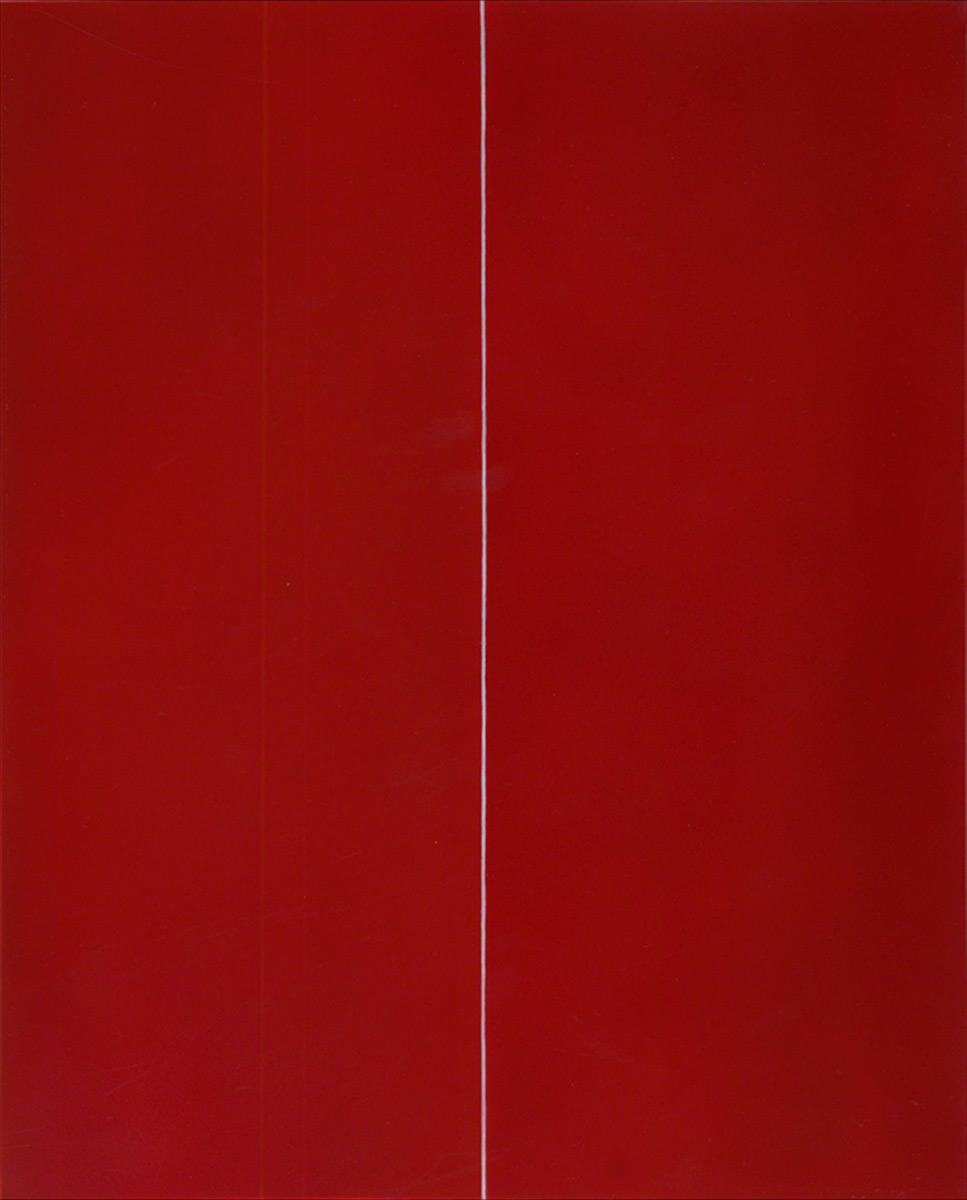
Barnet Newman, Be I, 1949, oil on canvas, 128½ x 75 in. ca. 1718, black, red and white chalk, 6¾ x 8 in.
But now much of this uplifting experience can be attributed to the internal workings of the painting, and how much to the museum context? A skeptic might point out that the transcendent experience is situational, even prescribed; after all, the very same museum-goer, visiting the cafeteria, probably won’t respond similarly to a vertical seam on a brightly painted wall. Newman’s almost evangelical faith in primal forms and color depends, in fact, upon a shrewd presentation – his, as well the museum’s — and to the extent that his paintings are explorations of form, they show how much notions of formalism have evolved, over the last century or so, from a complex optical experience to a contextual and philosophical one.
No wonder today’s Formalism tends to elicit a kind of obligatory appreciation. If discussed at all in an exhibition review, it’s liable to be in a single sentence on the order of “…moreover, in formal terms, this work positively exudes formalist values.” Formalism, in short, has acquired a role similar to vitamins: necessary but anodyne supplements to the feast of art.
This viewpoint gives short shrift to the millennia of artworks vitalized by formal values; it also vastly (and uncoincidentally) underestimates the richness and complexity of formal expression itself.
Just what were formal values in painting, traditionally? The history of painting is filled with equivalents of what the critic B.H. Haggin termed, in the context of music, “sublime utterances.” When absorbed as a purely visual phenomenon – those color-shapes on a surface – great painting is replete with the surges, recoupings, anticipations, climaxes and resolutions of a Mozart symphony. In other words, painting has historically provided us with extraordinarily rich expressions, based on a visual language available in no other medium.
There is a hitch, and a huge one. The mere act of seeing is more complicated than one might think. The habitual efficiency of our visual systems – eyes and mind, working together – means that we tend to scan with our eyes instead of fully absorbing what’s out there; we assign mental labels to the objects around us rather than taking in unfiltered impressions of them. Compounding this tendency is our reliance on pre-digested versions of our visual world — the pre-flattened, color-approximated, scale-deprived images that continuously bombard us on screen and in print. Indeed, this passivity of our visual systems may explain, in part, our preference for expressions of the immediately and socially relevant. By comparison, the traditional, purely optical version of formalism – call it “Ye Olde Formalism” – may seem an arcane connoisseurship of minor delights. But learning to see the forms in a painting – or, perhaps, relearning to see them, with the impartial perceptiveness of a child – will reaffirm the critical distinctions between artists traditionally considered greater and lesser, and moreover how these distinctions form a bridge linking antiquity and modernism.
Consider, then, another scenario: the existence of a kind of visual comprehension that precedes concept and context. What if painting, as a visual art, appealed to the purely optical, as music appeals to the aural? For a painter, such a potential would come into play with the first stroke of color, and lie latent in every mark. Any technical or conceptual bravado would become indulgent; every attuned artist, whether excruciatingly sensitive or ruthlessly unsentimental, would start, work and finish with these most irreducible elements.
In itself, any mark possesses only a few qualities: a certain visual weight, a location and likely a sense of direction. But the possibilities multiply as accumulating marks leverage one another. The physical limits – the flatness and confined dimensions – actually liberate, allowing investigations of interior scale and the resolution of movements.
This means that, in a cold-eyed, practical way, a line might coil about the painting’s surface and eventually join up with itself, dividing a contained zone from the surrounding “other.” The line may undulate along the way, departing and rejoining the overall circulation. These departures may vary – in fact will vary, if they’re inspired by some outer, larger event – their energies ranging from contradictory side trips to reaffirming echoes. An alert viewer will perceive an unfolding story, animating by interweaving sub-stories, each revealed in its own time and place.
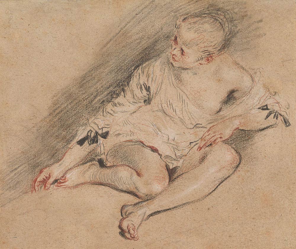
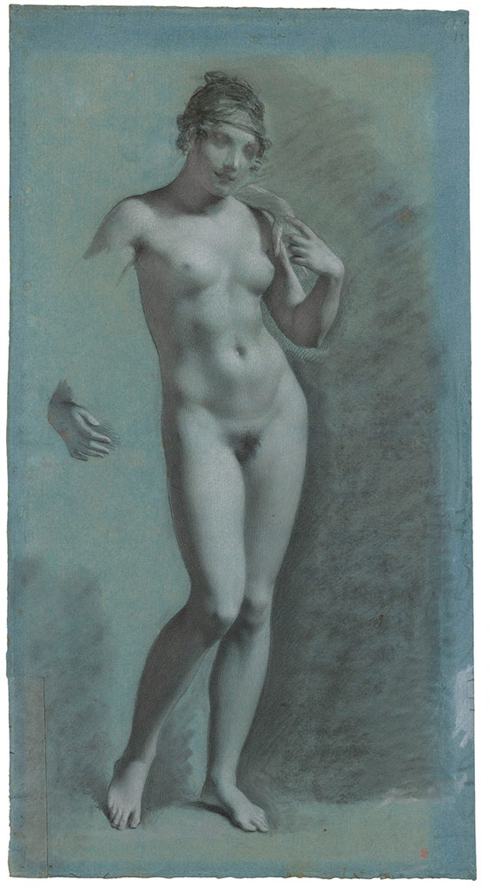
Antoine Watteau, Young Woman Wearing a Chemise, ca. 1718, black, red and white chalk, 6¾ x 8 in.
If that outer, larger, inspiring event is the sight of the human figure, and if you have the talents of Watteau, you may just come up with such a remarkable story as his Young Woman Wearing a Chemise (ca. 1818), one of the highlights currently in the Morgan Library’s superb “Drawn to Greatness: Mater Drawings from the Thaw Collection.” Superficially, Watteau is all fanciful froth – charming subject matter, feathery modeling, a light, darting touch. But what distinguishes Watteau are his extraordinary and comprehensive intuitions about formal rhythms — in this case, how powerful diagonals, moving from lower left to upper right, pace the intervals of the figure’s height; how the measured circulation of limbs releases, forcefully, the unfolding zigzags of one foot, while the “other” – that is, the surrounding plane of bed or couch – opposes, tangibly pressuring the shin of the folding leg above. Experienced as animated forces, the figure’s gesture culminates, finally, in the quick twist of the head, looking back (serenely!) over the long, climbing undulations of her own arm.
The figure’s contours burst with pressures that the mind reads as a human body, but our eyes absorb as a fantastical coherence of energies. The drawing is marks, but the marks (or more specifically, the momentum of their intervals) cohere as an intensely real but parallel version of life — not its physical duplication, but the most eloquent version possible in two dimensions. How radical. Such a drawing confronts, head-on, the sheer artifice of image-making, the rawness of its own materiality, and the struggle of the process. Anything less muscular would under-utilize the power of forms; anything in excess of this would dilute the vigor of a semblance in which every single element counts. And of course, what we ultimately experience is Watteau: his child-like openness to visual experience, and vast intelligence about mark-making. For the devoted museum-goer, knowing Watteau is understanding how he surpasses the relatively inert drawings by Prud’hon, Boilly, and Greuze hanging nearby in the Morgan’s installation of the Thaw collection. (And, for that matter, how the moving drawings by Claude Lorrain, Rembrandt, Goya and Seurat in the exhibition outshine those by Piazzetta, Magnasco, and Boullée.)
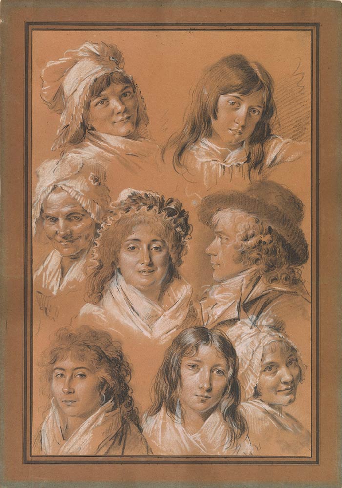
Louis-Léopold Boilly, Studies of Members of the Chenard Family, ca. 1800, black and white chalk, 17¾ x 11¾ in
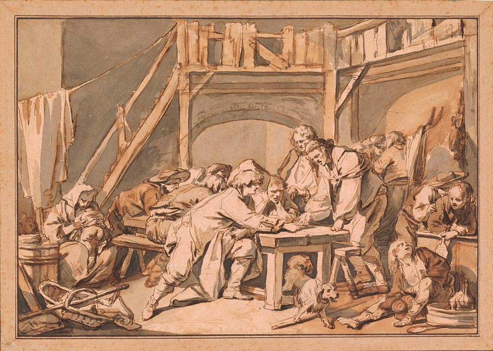
Jean-Baptiste Greuze, The Game of Morra, 1756, brown and gray ink over graphite, 9¾ x 14¼
Pierre-Paul Prud’hon, Female Nude, ca. 1810, black and white chalk on blue paper, 23¼ x 12½ in.
It’s also worth noting what Watteau’s drawing leaves out: all presumptions and conventions about how things should look, such as the volume of the neck that would logically connect head and shoulder — which an academic artist would deem indispensable – and the bones inside an arm that would stiffen a wrist. Nor does it reveal in any unique fashion – more so than other contemporaneous French drawings — the social issues and contexts of a particular time. Watteau’s expressions are, in short, universal and immediate, transcending the criteria of both the dyed-in-the-wool academic artist and the cutting-edge art theorist.
What further possibilities could an artist explore? Well, there’s, color – usually the most critical difference between drawing and painting, and one not really developed in Watteau’s drawing despite its traces of red and white chalk. While there are no Watteau paintings in the Morgan’s exhibition, a number of striking watercolors and oil-on-paper works by the likes of Cranach, Degas, Delacroix, and Daumier show what color can do: accord, with luminously atmospheric effect, a whole additional set of inflections to the pressures of lines and tones.
To touch back upon that painting by Barnet Newman – how would his attack have looked if he had explored internal energies just as intensely as these masters? If he had produced a painting that required no viewing context, that could be hung without diminishment in an attic, bowling alley, or palace, without signifying frame or label? We’ll never know, but we might find a clue in the example of Mondrian, and his obsessively inventive compositions. Within any one of the Dutch modernist’s canvases one may experience how a certain nuanced red anchors a stretching vertical white, wedged at one side by a particularly weighted yellow, and letting loose on the other side with a sail of spacious blue. Understanding the muscular poetry of Mondrian — lover of jazz and dancing – is comprehending how he surpasses Theo van Doesburg. Admittedly, in today’s context-suffused art world, this may take a special effort – a return to the unfiltered perceptions of a child.
But then, it takes a child’s eye to truly delight in the visual aspect of our world. Trees are eruptions, emerging and spreading from single points on the earth. Clouds, the largest items we may see on any given day, slowly bob over our heads. The earth’s surface, itself the micron-thin division between air and ground upon which we spend our lives, divides two crinkling shells: the atmosphere, whose bucklings are revealed, moment by moment, in movements of those clouds, and the earth’s crust, which creases at glacial speeds to build mountains and valleys.
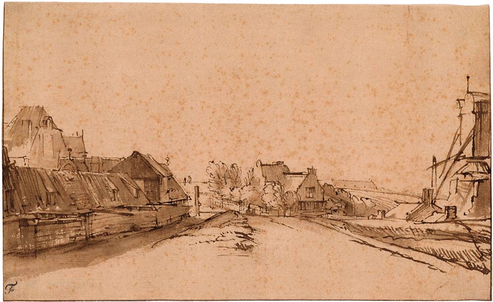
Rembrandt van Rijn, The Bulwark De Rose and the Windmill De Smeerpot, Amsterdam, ca. 1649-52, ink, 5¼ x 8½ in.
This is no fantasizing; it is the cold-eyed facts of nature. Corot, Rembrandt, Veronese and other great artists painted our surroundings as if inspired by such realizations; that is to say, they made their subjects rhythmically animate. (Need it be said: to understand their achievement is to see how they surpass the work of their students – Harpignies, Maes, and Bassano, respectively). And, seeing truly has another, immeasurable benefit: an awareness of our remarkable world, as revealed by the human eye.


Leave a Reply