
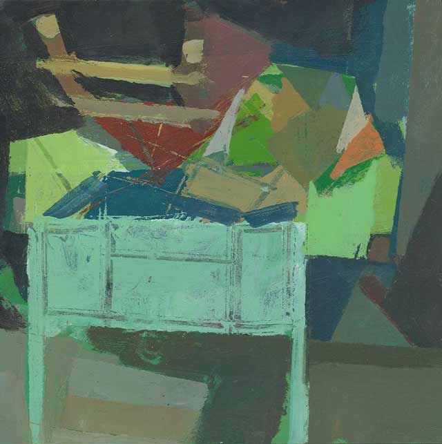
Ken Kewley Certosa Painting 12 x 12 inches Oil on panel 2010
Israel Hershberg said that “Ken Kewley is a painter who reveals a serious and profoundly comprehensive engagement with the art and act of picture making. His work is possessed of a most astonishing quality: a primal joy, a continuing infatuation perhaps, with the very purpose of being the painter, of looking at art and making pictures.”
I met Ken Kewley this summer, who taught at the Jerusalem Studio School Certosa program in Siena, Italy that I attended. Meeting Ken, seeing his work and hearing him talk about painting and color made a profound impression on me. Much of what I’ve found written online about color tends to be either too esoteric, too dry, too academic, or just dumb. All too often, writings on color tend to be in the service of doctrine or specific technique of color mixing and very little on creating the delights of color sensation. When I first read these writings on color I realized I found what has been missing; great writing that stokes our primal color poetics, that gets us pumped up to go out and find our own color voices. This compilation of thoughts on color by such a masterful colorist is a fantastic resource of inspiration and affirmations for both perceptual and abstract painters. I’d like to thank Ken again for his generosity.
I choose several examples from his many paintings and collage on his website to show along with his writings. His artwork clearly shows the thoughts written here put into practice. He shows with Lori Bookstein Fine Art in New York as well as several other galleries and venues.
Ken has expressed an interest in reading any feedback about these writings from readers here, so please write any questions or reactions in the comments. The notes on Color that you see here now is a newly revised version that Ken recently asked me to exchange with the original version – (updated 12/22/10)
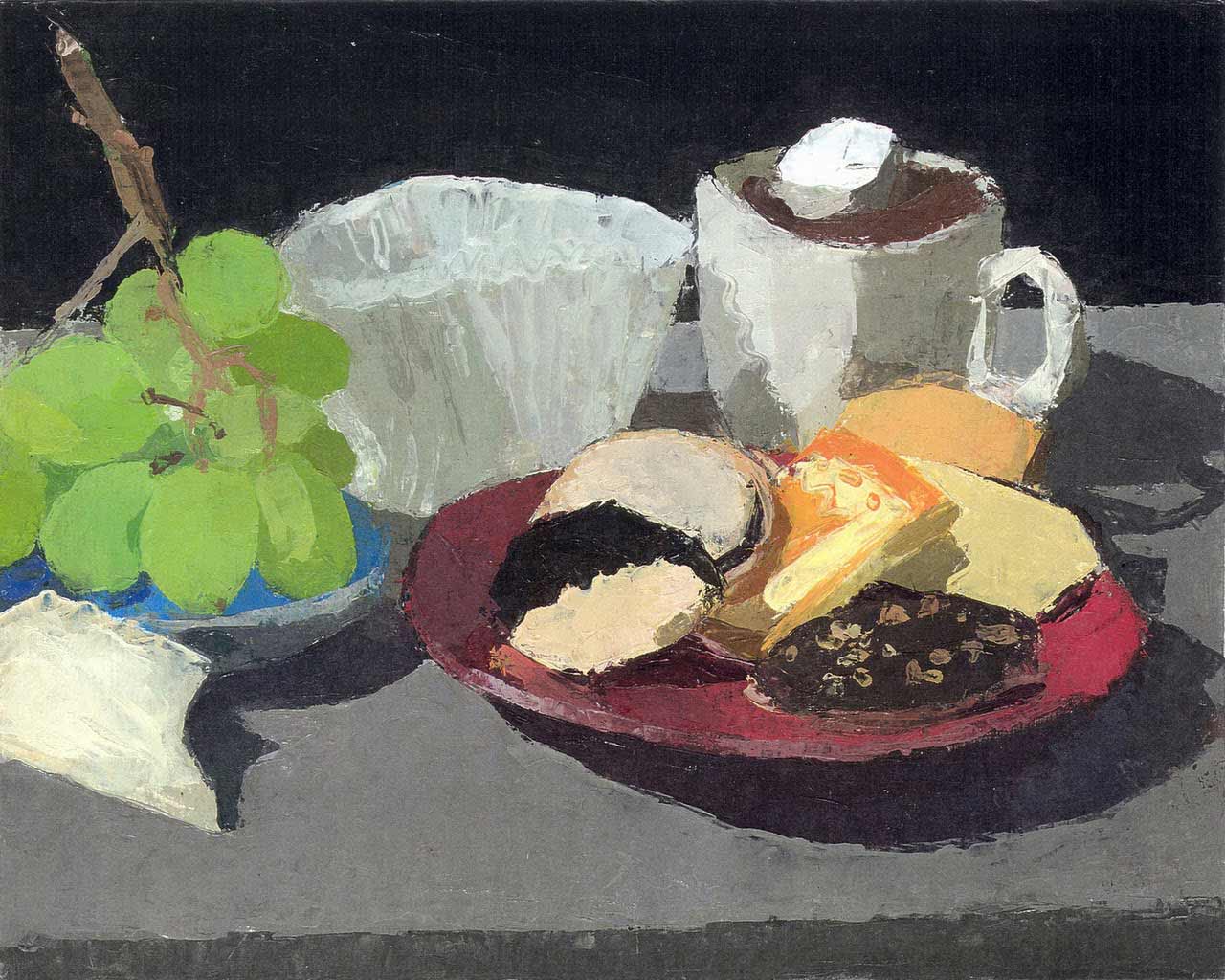
Pepperidge Farm Cookies, Grapes and Hot Chocolate. 2000 oil on board, 8 x 10 in
(click for larger view – true for many images in this article)
Color by Ken Kewley
It is all about having a passion for color. This passion gives one an unlimited vocabulary. Color is use to create steps to direct the eye around the painting parallel to the vision of the artist. Along the way, like a song writer, rhyming words that do not really rhyme, we invent color relationships to get at the surprising juxtapositions that are found in nature. It is a way of staying excited, staying in love.
Color, like drawing, is an abstraction. One color, just as one word in poetry, needs to be found to stand in for several colors. Each color needs to be chosen in consideration of the whole. Color does not become itself until the whole work is completed. A painting that earlier in its making resembled a poem, as it gets filled in, cluttered with too much color that changes or dilutes what was there, loses its poetry. If a painting isn’t working I find it is not because something is missing but that there is something that is not needed and therefore hurtful. This brings us back to love. Love colors as writers love words. It is the love that comes through when the mind gets out of the way. Don’t think too much. Trust your instincts. I try not to worry about what I do not know, what I have been unable to teach myself. My inabilities serve me better than my abilities. That art is not something that is learned and then practiced, it is a form of communication and one is always trying to say something clearer. To love and to be honest, maybe one does not exist without the other and a desire to communicate that, this is what it takes to make art.
Start by putting down the one color that excites you the most, then the next, relating it to the first. This is the relationship that excites you the most. Then the third color, relating it always to the whole. You are emphasizing what interests you and minimizing other things by putting them in the service of your true passion and leaving out altogether what distracts. Keep it simple.
Each color plays its part. Less is more. Each element is made to do more. I often look at paintings, good well observed paintings, and I wonder why they are not more exciting. There is an exciting color relationship in there somewhere but it is being drowned out by dozens of other colors. Take a random paragraph from the newspaper, remove the right words and you have a poem.
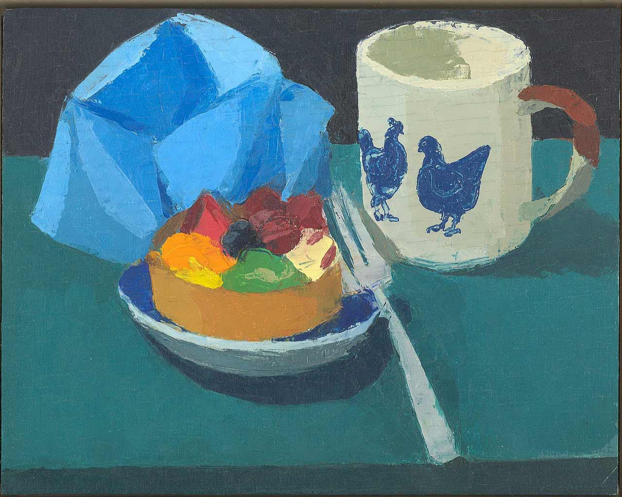
Hen Cup with Fruit Tart, 2000, 8 x 10 in. oil on panel
As far as keeping a painting fresh to the end, you cannot lose site of the reason for starting the painting in the first place. That first excitement, that one big relationship, if the details slowly obscure that relationship the painting becomes dull, then it is necessary to dig back in and pull it out even if it means upturning days of work. In the end nothing is lost and it will be more exciting for being harder found and deeper felt.
Within ourselves we all have great paintings, we all have the colors needed to make these works, and we just need to dig them out.
Try not to dilute the paint (there is a time for thick and a time for thin). Since I use one brush, one might think that I must be always rinsing the brush but I am not. Instead I am always mixing on the palette and on the painting; going up and down the value scale, from light to dark, from dark to light.
Just paint. If it works out well, that is good, if it does not, that is good. You have the perfect surface for another painting and it solves the problem of starting with an empty canvas.
I tend to like paintings where the abstraction is strong. By this I mean that the paint, the colors and shapes, are distinct, like strong actors in a play. Going towards abstraction does not mean going away from representation. It is more like describing something real my other means than illustration. It is like describing an apple with your hands, forming the shape in the air with your hands, by enclosing an imaginary object with two hands. You do not try to make your hand look like an apple. Paint takes over the role of the hands and does not hide the fact that it is paint. Painting is talking with the hands made permanent.
When color and shapes are emphasized it is the artist that is directing the viewer. “Look at this and then look at that and see how this relates to that”, the artist is saying, “This is what I want you to see.”
In painting you never do what you set out to do. Something else happens. If it always turns out right you are probably doing something wrong. Do not try to make a picture of something. Make something. When painting the model, treat each part (do not name the parts) as something separate and then compose the parts into a whole, into a composition. Use as few shapes as possible, do not think human. You are making a painting. Keep the foreignness of the parts and use them to make up the whole. I love the human figure, I do not negate it, but I trust that this love will come through in the process, through my love of painting.
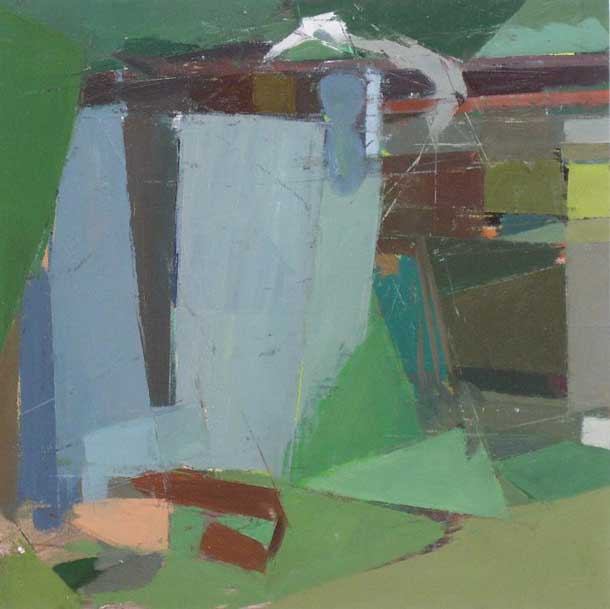
Certosa Painting 12 x 12 inches Oil on panel 2010
No color theory. Only love of color. Have all your colors ready at hand. When painting the model do not think flesh color. When painting grass do not think green. This will take nothing away from your love of the human body or the landscape.
One false mark (dishonesty) destroys the whole.
Do not allow the illustration or the details to carry the whole. If you are painting a landscape and there is a lettered sign, do not depend on what the sign says for interest. It has to be the abstract shapes of the letters and their placement in the composition that creates the interest.
Painting over previous works promotes the desire to cover quickly what is underneath. The old peeking through will not distract if the new is strong enough to carry the viewer’s attention. What would distract is covered up and what is useful can remain. You are unconsciously saving what is useful. Back to talking with hands, if you are describing an apple and right past you there is a murder taking place that would distract. You would probably need to add a little violence to your gesture. The painter needs to take possession of the subject. Painting is building something out of abstract material. A house is built of wood or brick, etc. The material itself does not resemble a house. The human figure in painting is made up of abstract shapes and colors. Take away the face from many a Corot or Courbet portrait and you would be left with an abstract painting.
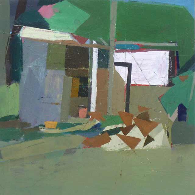
Certosa Painting 8 x 8 inches acrylic on paper 2010
Painting exercise; paint, cut painting up, and reassemble. It is important to keep things movable, adjustable.
Painting is a language. As thoughts are made up of words, the subject of a painting is made up of shapes and colors.
Painting is and is not like building a house. Sometimes it is good to start with the foundation and sometimes you can change and build a different house half way through.
Quick sketches can be just as finished as paintings.
Limits make things otherwise impossible, possible.
To restart dead paintings reshape whole by large actions.
Colors create steps that move around, into, and back out of, paintings.
Paint instinctively with joy.
Knowing how to paint may not be good. This is not heart surgery. It is better when things have to be figured out each time. Getting lost is not dangerous in painting.
Paint large areas quickly and unconsciously as much as possible. Never consciously paint them. Let nuances happen.

This is breathtaking. I definitely want to read more from Ken if that’s possible. I’ve heard a lot about Ken, have been following his work and hope to take a class with him at some point. I would love to take a color class with him! When I saw your Certosa photo of him putting pottery shards together in a color class it was most intriguing and I wanted to know more. Thanks for posting this, I’ve read it a couple times and will keep it close by…this is the way I want to hear about color. You are so right most writings, teachings on color are pretty dreadful, they certainly lack the passion Ken clearly has for it. Lots of great statements in here but for me the best line ever…”Love colors as writers love words. It is the love that comes through when the mind gets out of the way. Don’t think too much.”
Thanks Ann and Austin for such thoughtful comments. It isn’t easy to respond to the many ideas that Ken presents here but you both went to the heart of the matter.
Despite how much I like what he says, I’m not sure I could always follow his advice. Perhaps because I lean more towards the kind of writer who pulls his hair out and curses and bangs his hands on the keyboard that some particular grouping of words sounds so idiotic!
Many times I feel that way with color and painting, that it is less play than a agonizing struggle to capture the fleeting moment, trying to “get” something seemingly impossible. Yet, other painters, like Corot, get it dead on. But it is wonderful paradox that the more you try to copy nature the less real and “off” it tends to look but once you get the bigger, more abstract structure of light and form right and gives the painting feeling of rightness – from what the painting needs. It is in this moment, when you loose yourself in this process that the color can really transcend the arbitrary (like you see in colored drawing or more decorative approaches) and start to take on real meaning in the painting in terms of how the color relates to the whole.
For me, this starts to feel like loving colors and not thinking too much. I wish I could get there more often.
Thanks for this. Rather Zarathustra on color. You can always tell a good teacher by the absence of pedantry. As for me, getting grey was a turning point in my color journey, i.e. mixing black w/ a transparent yellow. The possibility of all those gentle modulations was an epiphany … or love at first sight. That seems to be the secret: you have to fall in love first. It was a struggle for me as an autodidact, to find my color, to fall in love. But that begs a question. How do non-painters ever get it? Especially in this age of diminishing connoisseur-ship, when, as Mr. Kewley points out, standard art-education is joke. I guess the patron’s reasons don’t matter so long as they’re patrons.
On another note, I’ve heard it said, and observed it in nature, that an particular animal species’ intelligence can be judged by the amount of time its young spend in play. Ex post facto maybe. But I like to believe they’re intelligent because they play.
Thanks for great paintings and an interesting article!
What a great attitude Ken Kewley has towards the making of a painting… There is so much in this interview that could be discussed. I have been reading choice parts of this interview just to kick start my day of painting.
Thank you Larry for the Interview and a big thanks to Ken Kewley for his heart felt words.
What a generous article. Thanks to Ken and Larry.
I really was interested to read what he said about painting the model-
“When painting the model, treat each part (do not name the parts) as something separate and then compose the parts into a whole. Into a composition. Use as few shapes as possible, do not think human.”
I’ve always marveled at how Ken finds surprising shapes and marks and angles in his figures, and this gave me a clue as to how that happens. Composing separate pieces as opposed to constructing a human figure.
Hi Larry and Mr Kewly
Wish I had been able post this sooner – Great article. These are great thoughts – perhaps too many all at once. It’s like trying to read Robert Henri’s The Art Spirit in one sitting. That’s in part what took me so long – trying to give the ideas the time they need. Mr. Kewly has said so many useful things in this grouping. Some of which as artists we may know but we would be wise to revisit and others which are really profound and new. I love the idea that we need less in the paintings and that so many paintings are ruined by having said too much. I am disappointed that when I’m in Philadelphia for Stuart Shils workshop, Mr. Kewly’s talk won’t coincide with that. I’ll have to keep an eye out for any talks that he gives in NYC.
What a wonderful article – thank you. Being from Australia, I have not heard of Ken Kewly. How sad is that? Now I have discovered his wonderful abstracts, so will my students. He speaks to my heart and has managed to put into these few pages – and so succinctly- much of what I have been trying to teach my students all year (and yes, I am amazed at how beautiful paint can end up so ugly!) Being predominantly a landscape painter, his words”Do not make a picture of a landscape, create a landscape.” were particularly resonant, and “to relate everything in a complex journey without resulting in chaos takes a lifetime to master” is what keeps us all, I imagine, going. Nothing challenges, engages and rewards so much as painting.
And I will take note: “If you try too hard it will show up in the work as an unpleasant element. I do not like to see artist suffering”. Neither do I, nor do I like to experience of suffering myself, but it happens…after this, I will remember the joy more!
Ken.
Thank you so much for your words of comfort and clarity. Just pulled myself out of a hole and am grateful to be painting without that pit in my stomach. That hard time was a great learning time because I made mud. Then I realized it was actually pulling out of a process that wasn’t true for me and I’ve moved forward…clearer and more truthful. Love what you said about not making a picture of something but making something. Thank you for the wisdom.
all best.
Cynthia Wick
“Rinsing the brush can be avoided by transforming whatever is on the brush toward a nameable color by adding that color or the color that when mix becomes that color or away from that color by mixing that color’s opposite.”
Um, why am I the only one confused???
“Group both lights and darks to make a light complex and both darks and lights to make a dark complex within the composition.” “Composition = a composite.”
Can someone loan him a dictionary???
“Do not make a picture of a landscape, create a landscape. Every color needs to correspond to another, to others, and to the whole. The same sounds, the same paint, can be pleasurable in the right context.”
Genius use of cliches…
“Most things can not be separated. This includes color, form and composition.”
Oh god… Please stop writing Mr. Cruelly
As a painter who is primarily concerned with colour, I found this article very interesting and very helpful. It is also beautiful to read, as Ken writes so eloquently about his art and painting in general.
love this article! a lot of great observations. would love to share this with students.
what an amazing and inspiring read! thanks for sharing! this whole thing is quotable.
i wish i could tell you how helpful those observations are. i’ve never heard anyone get to the heart of what i’ve wondered about for so long. my sincerest appreciation for everyone’s effort with this as the information in it will be indispensable to me and my practice.
I’m very happy this was so helpful to you.
Ken Kewley’s article on color (I am new to this blog) interested me greatly. Do you realize that artists are not often asked specifically about color: how they see it, use it, create it etc. in interviews. …..Kewley’s remarks are most helpful to me in that sense. And……. what about the great, great Braque Atelier paintings, beginning in the late l920s and up through the 1950s…sheer poetry. I feel that Braque has been forgotten, but I look all the time at the studio paintings from those years and am enthralled with their beauty. John Gage’s Color and Culture chapter on painters and
their palettes is a frequent reference for me, as is Nicholas Watkins book on Bonnard’s palette and
his use of color.
Just reading my almost daily page or so of this beautiful essay, I believe it will become a classic – for working artists – in its way, like gombrich on art history or Barry Nemett on art appreciation.
First, great site newly brought to my attention. Bookmarked.
Kewley’s work with color reminds me of process and method in Howard Stern’s book “How to see color and paint it.” It is the best book about painting. Essentially it uses spectrum color theory wherein you mix clean color complement colors, find the neutral grey between them and all the variations from the warm to the cool side. For instance blue violet on the color wheel is pigment ultramarine, some alizarin and touch of white. Opposite on the wheel is yellow orange with pigment cad orange and cad yellow pale. Take 70% of each and mix together for your grey. From the grey you can add white and make incredible variations.
This Blog is engaging, thoughtful, practical,…like finding a friend. I use it to encourage students, add greater depth of information where I lack it, and see powerful work. Ken Kewley’s notes are equally enlightening and empathetic.
He is very intriguing. It seems to have a very extensively complex yet emotional understanding of color and how certain colors can spark specific feelings in the art viewer. I would actually love to see more of his work.
Very inspiring post! Thank you.