
Review by John Goodrich, guest contributor
Kyle Staver is a colorist, and one of the best around – which is only to say that in her paintings she makes every color count. In art school, they drill into students the three properties of color – hue, tone, intensity – but it’s impossible to teach what truly characterizes a color, which is its compositional weight, the way it shifts and leverages other colors. In Staver’s recent paintings at Kent Fine Art, we see human figures rescuing, battling, or simply consorting with one another in mythological and religious scenes, but the key to Staver’s exuberant storytelling lies not in the literary, but in the pictorial – in the way colors give resonance to the delight of an arcing or sinking body, or the glint on light-tinged hair, or the rounding of a thigh, whether belonging to woman, man or beast.
The artist’s latest paintings are dominated by dark colors, with forms rimmed by the light from distant, interior sources. Her surfaces seem to have become slightly smoother, her forms crisper, than in previous years, as if to concentrate on the unalloyed expressions of color-forms. A smaller room at the gallery features monoprints and relief sculptures, many repeating the motifs of the paintings.
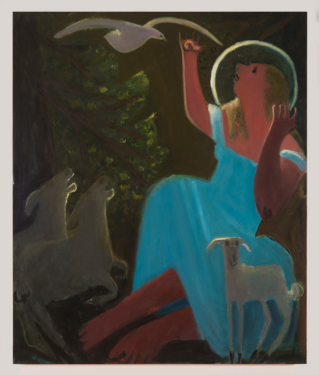
Annunciation 2 (2016), oil on canvas, 50 x 42 in.
At about four feet tall, “Annunciation 2” is one of the smaller canvases in the exhibition, but even so, the viewer must step back a few feet to experience the actions of color. The entire left half of the painting is dark – in the lowest five percent of the tonal range – but even so, its forms remain fully colorful, independently energizing the whole. In front, the deep mauve-red of Mary’s shadowed legs angle slowly and sturdily across the canvas. Behind, two sheep rise against a greenish-black background; their charcoal hues, in themselves an unremarkable gray, attain a ghostly solidity against the background, which turns, higher up the canvas, into a dense but spacious olive-brown. Together these colors impart an extraordinary buoyance to the somewhat paler (but vastly more luminous) cerulean dress dominating the painting’s right portion. Inflecting the right portion are the sudden, intense yellow notes of Mary’s halo and hair (subtly distinguished in hue), and the white blaze of a small white lamb.
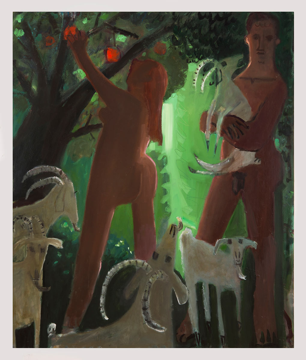
Adam and Eve and the Goats (2016), oil on canvas, 64 x 54 in.
Like any strong colorist, Staver appears to think in color, her thinking starting afresh with each painting. Other canvases explore new schemes: radiant oranges against regal blues in “Annunciation 1,” (2016) muted terracotta hues against pinkish-grays and cool flares of green in “Adam and Eve and the Goats” (2016), tawny browns against blackish blues in the large triptych “Hero and Leander” (2014). The middle canvas of this last work contains one of the small revelations that the artist obviously covets: a lifted hand, surrounded by a dark, gauze-like cloud, from which a glimmer of moon brilliantly escapes, all within a few inches of canvas space – an island of clashing events, far beyond the gestures coursing through the rest of this six-foot-tall canvas.
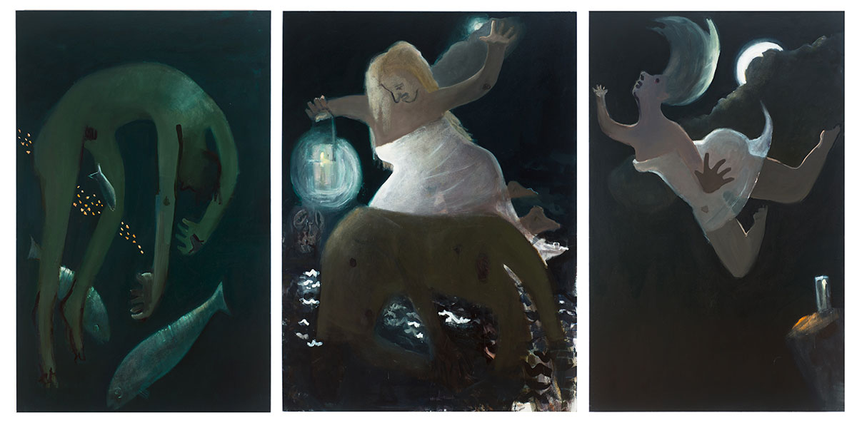
Hero and Leander (2014), oil on canvas (triptych), 68 x 154 in. overall
Painters have historically fallen into the categories of either draftsmen or colorists, with each camp facing a different set of challenges. A supreme draftsman like Ingres ran the risk of reducing color to handsome flourishes – filling in what drawing had already determined; a superb colorist like Matisse risked seeming satisfied, as Derain put it, with an “intelligent glance” – celebration without probity. And indeed, at times Staver’s color seems even less rigorously directed by drawing than Matisse’s, with few oppositions of movements or details to set off, and give measure too, the larger swirl of forms.
But there are also paintings in the exhibition in which color pressures resolve through remarkably articulate drawing. In “Annunciation 2,” for instance, the viewer experiences not just a flow of bright moments, but a rigorous, almost grave, parsing of movements. Its vertical elements (lifted arm, dress strap, lower edge of dress) peel away from the figure’s curving portions as a coordinated surge, placing the feet powerfully below our point of view – compressing the last, lowest inches of canvas, which in turn imparts weight to the figure – and locating the arc of the dove tangibly above. The bird becomes, not the symbol, but the embodiment, of small, overarching intensity. Below it, the plangent highlights of leaves dot the background, almost achingly measuring out the vacuum between arcs of dove and hip.
Staver could have illustrated Mary’s wonderment by limning a wide-opened mouth and eyes, but she instead paints this expression. That is, she captures it using pictorial rather than illustrative means. Her colors and forms locate, palpably, a spacious region between the uplifted arms, paced by the halo and the dress’ taut neckline. The diagonals of the upturned chin and nose cut briefly and quickly across this interval: charged notes in a fateful space.
Even more sublime may be the articulation, below, of the lamb: a dense but vibrant bundle of illuminated, half-lit, and shadowed notes, condensed upon the cool, spacious flood of dress. The curving ears, suspended resolutely above the hem of the dress, become oddly momentous; they seem to summarize the artist’s ardor for the strange, visual exuberance of all living forms.
The subjects of all of the paintings in the exhibition seem to arise from deeper pressures. One thinks of clouds, those bits of aerial décor that are actually only the manifestations of elemental, sweeping forces – only the aftermath of invisible, colliding fronts. Similarly, Staver’s subjects are just (just!) the climactic result of the continuous, accumulative actions of color.
What does it mean to exist as a lamb? Or as a startled saint, for that matter? In expressions unique to painting, Staver tells us.
Kyle Staver’s work remains on view at Kent Fine Art (210 Eleventh Avenue, New York City), through October 22, 2016.
John Goodrich paints, teaches, and writes about art in the New York City area. Formerly a contributing writer for The New York Sun and Review magazine, he currently writes for Hyperallergic and Artcritical.


thank you. excellent observations
What a concise summing up; yet rather than circumscribing, enhancing the experience of these wonderful paintings