
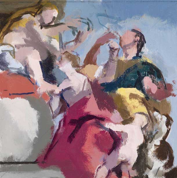
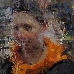
After Veronese, Happy Union, 2013, 8 x 8 inches
Robert Dukes was interviewed by Neil Plotkin for Painting Perceptions in 2011 before his his show at the Browse & Darby in London. Mr. Dukes informed me recently of his upcoming show at his Browse & Darby gallery in London. (11 November – 04 December) Browse & Darby shows the work of leading representational artists, currently having an Euan Uglow exhibition, one of Robert Dukes former teachers.
Robert Dukes is London based painter who studied at Grimsby School of Art followed by the Slade School of Art with Patrick George, Euan Uglow, and Lawrence Gowing. Robert Dukes lectures at the National Gallery and teaches for the The Royal Drawing School.
Dukes shared with me some images of new work included in this show and also graciously agreed to share excerpts from the fascinating September 2015 interview with him and the art critic Andrew Lambirth. This comprehensive and engaging interview can be read in its entirety on the Browse & Darby from this link. An e-catalog is also available.
Painting from Observation
Andrew Lambirth: When you’re doing a painting from observation, it’s not just about the visual facts, is it?
Robert Dukes: No. But the emotional thing is either there or it isn’t. You can’t turn on emotion, you can’t generate it, and you can’t fake it.
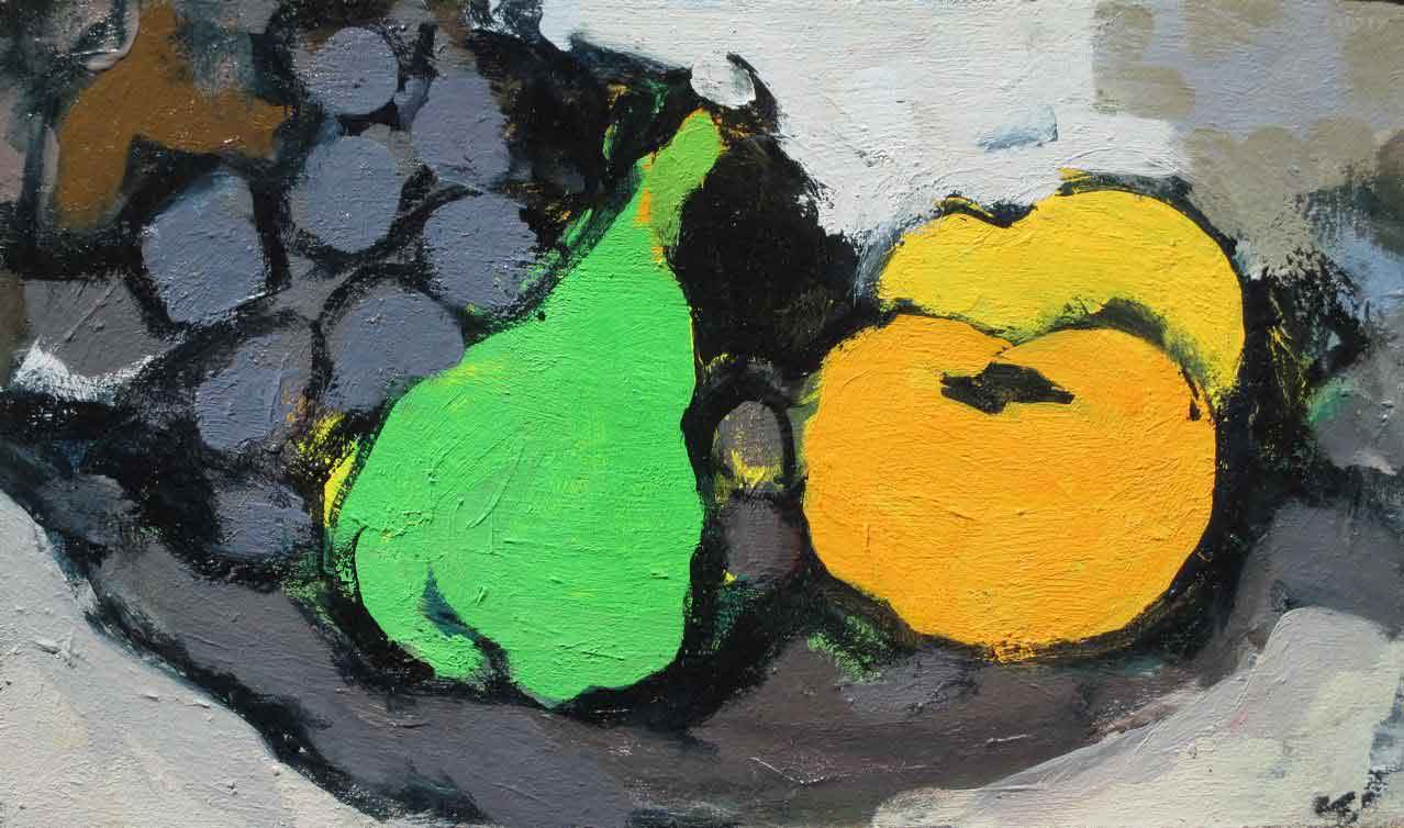
After Braque, still-life, 2014, 5 x 8 inches
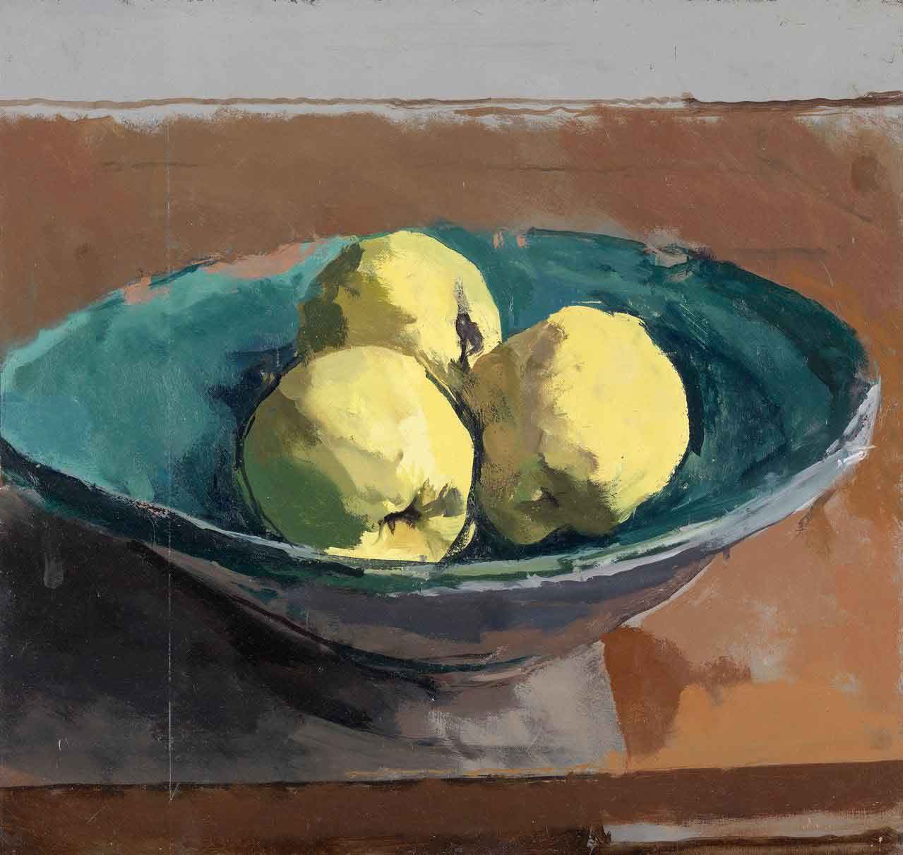
Bowl of Quinces, 2014, 12 x 12 1/2 inches
On the Unfashionability of Still Life Painting
AL: Why do you think that still life painting is currently unfashionable? You don’t see a lot of it about, by contemporary artists, do you?
RD: No, you don’t.
AL: Has it always been unfashionable?
RD: It used to be that in the hierarchy of art it was low down monetarily-wise, so you’d think that the lesser painters would do it. But a good example is Melendez, who wanted to be a fashionable royalty portrait painter, but both he and his dad fell out with the court, so he ended up an impoverished still life painter. You wouldn’t know that looking at his pictures – they’re amazing. Why is it unfashionable now? I think it’s a broader question of why serious painting from observation is unfashionable. It’s not seen as cool or ironical or knowing enough, it’s just what it is. But that’s the reason I do it. I’m painting about painting really, not making an ironical distanced statement. I want to be in the painting, I want the marks to be the thing that I’m painting, which is the opposite of the current trend in painting.
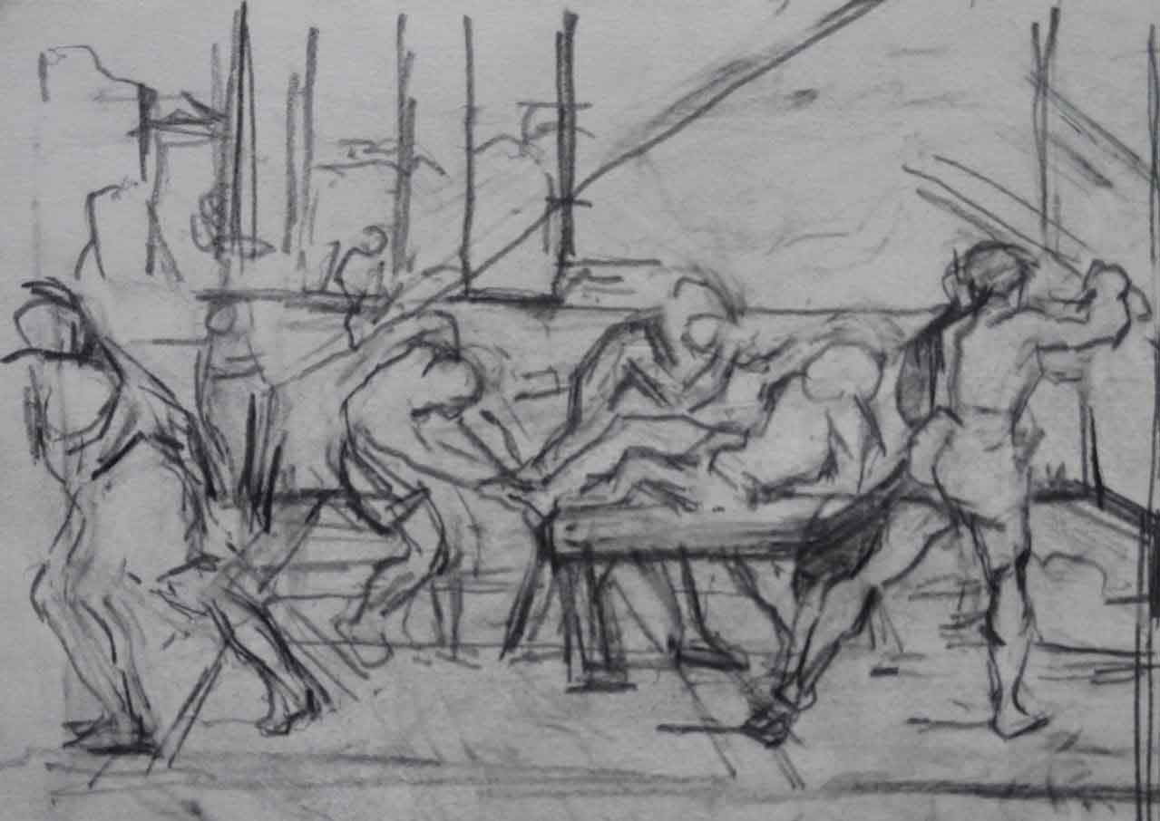
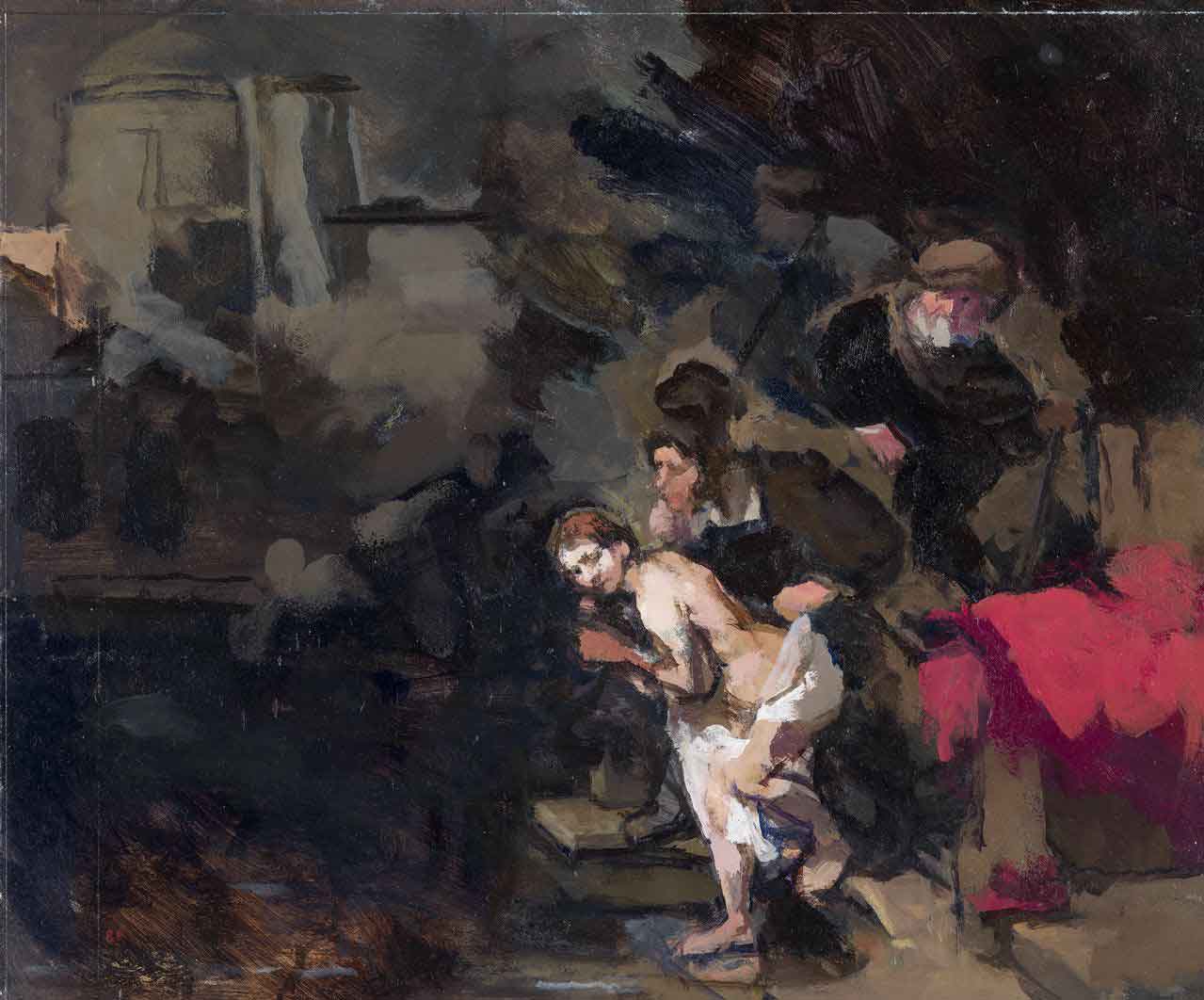
After Domenichino, Martyrdom of St. Andrew, 2011, 4 1/2 x 6 inches
pencil on paper
The Importance of Drawing
AL: How important is drawing? Is it still central to what you do?
RD: It’s enormously important. I do think there are a lot of people who are serious figurative painters, who paint from observation, who don’t draw very much – and you can tell in the work. If I don’t draw a lot, the paintings don’t have what Robert Motherwell called ‘a precision of feeling’. When you’re painting, you have to feel where all these marks are going to land, and if you haven’t got your hand and eye co-ordination in from drawing, it’s going to look flabby.
AL: So what is a typical day?
RD: I get up about a quarter to eight and I draw from 9 o’clock to just after 10 o’clock, and if I don’t draw for at least an hour before I paint, I can’t do it. It’s like getting my eye in or doing scales. The first half-an-hour is absolute torture. It’s like anybody could draw better than that. It all goes in the bin. And maybe one morning out of 20, at the end of the session something comes out that is worth keeping.
The drawings are rarely related to what I’m painting that day, they’re usually copies from reproductions in books. Then I start painting just after 10 and try to keep going till 6 o’clock. I do very similar hours when I paint to the hours I worked in the National Gallery – in other words, office hours. I think it’s best to try and find a consistency, just as it’s important to have consistent sleep patterns. So it becomes natural – this is what you do.
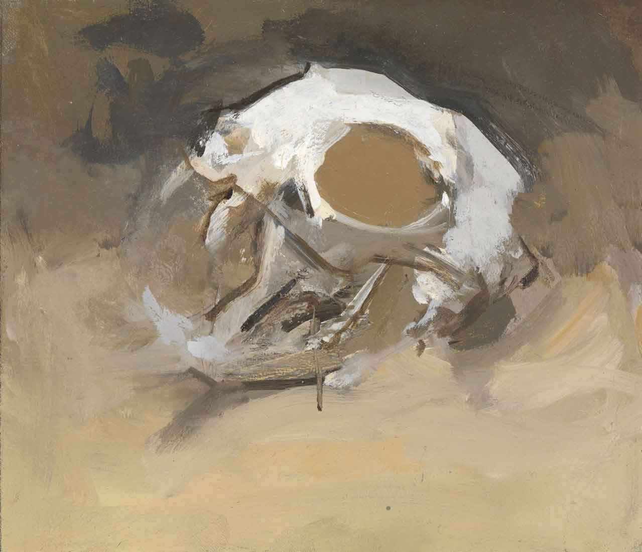
Cat Skull, 2012, 6 x 7 inches
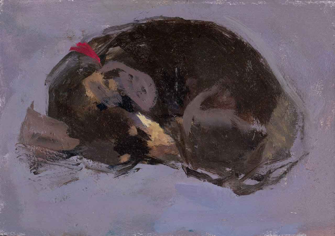
Marple on her cushion I, 2014, 4 1/2 x 6 1/4 inches
Painting from the Middle Out
AL: Tell me about this idea of painting forms from the middle out.
RD: There was a thing I picked up on even at Grimsby, which came from Camberwell, which was not to try and draw a contour or an outline and then fill it in, but try to paint across a form. Gowing talked about that when I first went to the Slade. I want my paintings to have more and more plastic force, to be more realized, to be more there. I paint from the middle out because I don’t want to rely on an outline to define the form. Somehow the colour mixtures define where the edge is rather than monocular measurement.
It’s not as if I’m copying reality: the colours relate to the colours I’m seeing. There may be seven mixtures of colour across a quince in a painting. Obviously the gradation of tone across an actual quince in natural light is infinite, so you’re making equivalents. And you’re also trying to make something that will work as a flat shape. Ideally every single mark will have its own autonomy, have decorative quality, design quality as well as standing for volume or form. Sometimes you make a colour mixture and it feels completely like guesswork, yet it lands on the surface of the picture and it almost goes by itself, and that can somehow define the scale of the form…
Painting from the middle out, and not being in such a hurry to try and find the edges may seem to run counter to the idea of measurement. If you were measuring such a subject as two quinces, one of the first things you would measure would be where the furthest right-hand side is and how high is this quince to that quince, in other words the edges. In practice you utilize both methods, and you measure back into it. When you’re painting from the middle you often feel as though you’re modelling the forms and when you measure you feel like you’re carving back into the forms.
Transcription – Is It Cheating?
AL: I know that some people think that if an artist makes a copy of another artist’s painting, in some way it’s not an original work of art – it’s almost cheating. How would you respond to that?
RD: In some ways they may be right. It’s very hard to compose a painting from scratch, but even when I’m painting a still-life from observation I’m not copying it, I’m making equivalents in paint for what I’m seeing. As Coldstream said, even the most realistic painting looks nothing like reality. In the same way, when you copy a painting, you are – to a lesser or greater degree – transcribing what you’re seeing, you’re not trying to copy it so that someone will be gulled into thinking it actually is a Braque. That would be a pathetic thing to do. Just as pathetic as those poor souls who try to paint photographic realist pictures that get into the National Portrait competition every year. It must be a living death to paint those pictures. You can’t tell anything about the person who painted them; all you can say is that they’ll probably last longer than a photographic print. They don’t have any analogy of form or structure or design or decoration or human content.
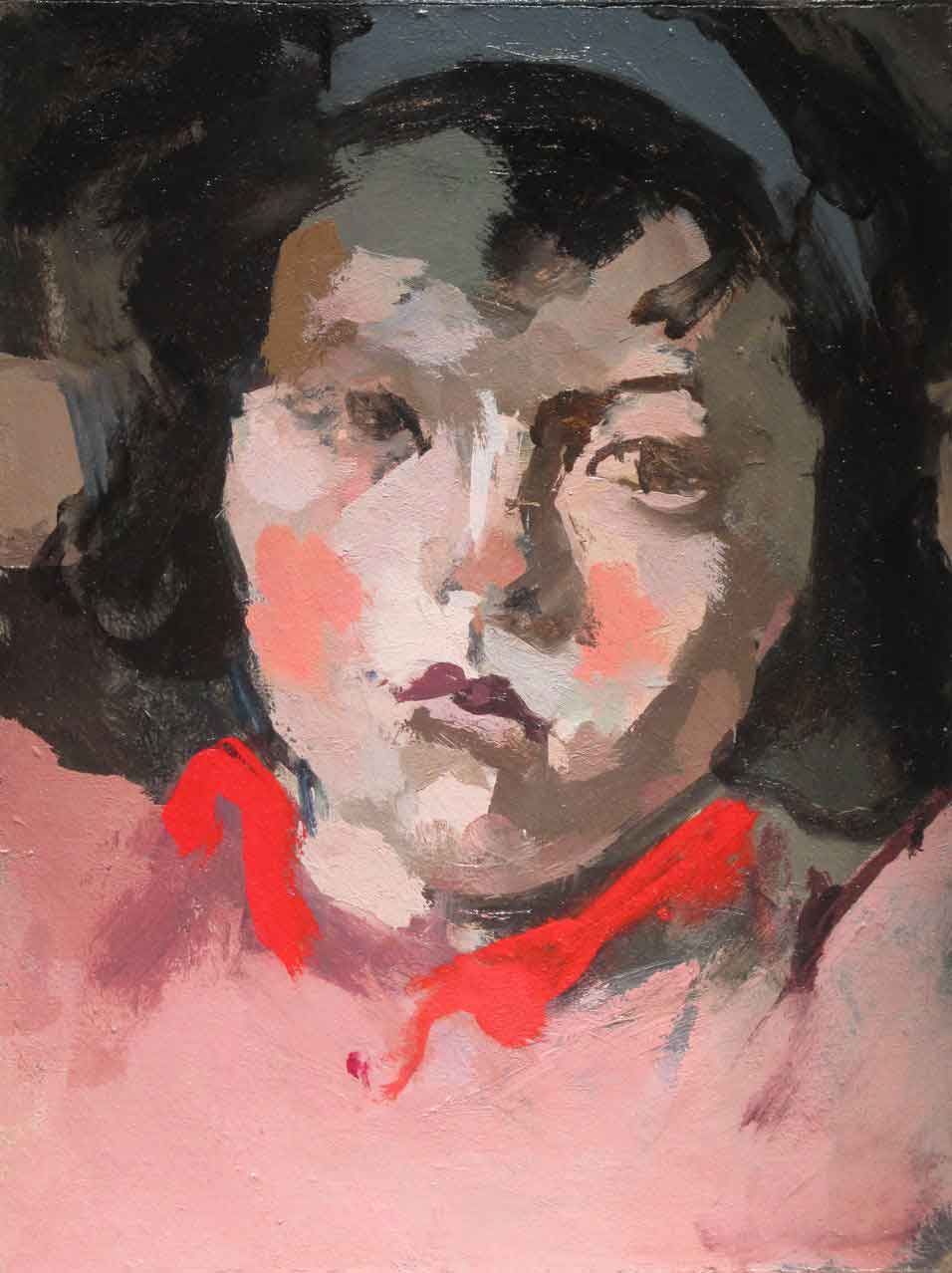
After Balthus, Therese, 2015 , 8 x 6 inches
After Balthus, A Courtyard, 2015, 14 1/4 x 17 3/4 inches
On Balthus
AL: Let’s talk about the Balthus. Why did you pick that painting?
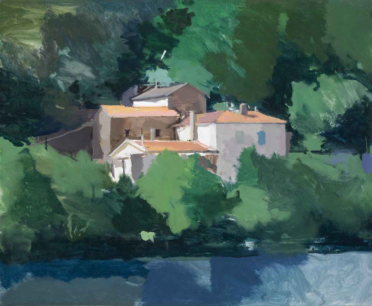
RD: Because it’s beautiful. I’ve done lots of Balthus transcriptions in the last ten years but I wanted to do something a bit bigger and more ambitious. (I’ve done lots of heads from the early Balthus portraits of Thérèse, the young girl that was the daughter of his concierge when he lived in Paris in the 1930s.) Anyway, this painting is from his chateau and I’ve edited out the tree and the farmer who appeared in Balthus’ version. So it’s not a direct transcription, and in doing that you realise how important those elements are in the original. I just wanted to paint it like a stage set. And this is why in a nutshell I wanted to paint it and paint more landscapes. I paint still-lives normally and they’re lumps. They’re usually one or two lumps, like one or two apples, in a bare space. Landscape is the opposite of that. This was like trying to paint a stage set or a big space that goes right to the edge of the canvas, rather than paint a single object in the middle of a space.
In any painting, even if it’s a single object painting, the whole surface has to be animated and that’s one of the reasons it’s hard to do single object paintings because they can just dominate the whole space and not work as a flat shape. But in a landscape the whole rectangle is animated right from the start.
AL: But certain shapes in your Balthus transcription are nevertheless leaping out at me: those two wedges and the pale quadrilateral field at the top. Is that true to the original?
RD: The two triangles at the bottom are sunlight coming through and they are very prominent in the picture. The field in Balthus’ painting is obfuscated by the tree, and so it’s not so prominent. One reason for copying anybody, and especially someone as good as Balthus, is that you become more and more in awe of how good they are. Everything in the original links up – it’s terrifying. What’s so amazing is that it seems like a game of analogy and rapport of forms and yet it seems very true to what it actually looks like.
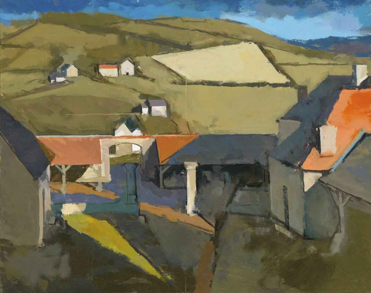
Across the lake, Cevennes, 2013, 18 x 22 inches
Can Painting be Taught?
AL: Do you agree with Auerbach that painting can’t really be taught? He said ‘all you can do is get people to where they jump in and swim’.
RD: Yes, but you can teach them certain things. I’ve been recently teaching painting for the Royal Drawing School, and there are aspects of it you can teach. What tone is, for instance. The worst question students ask – and they ask it all the time – is ‘how do I make a flesh tone?’ As though they only need one mixture to cover the face! They don’t understand it’s to do with all the other colours around it and the light conditions. That’s so fundamental. Tone is the hardest thing to teach, more than drawing or colour sense. You can also teach how to mix colours and keep a palette clean.
Tacked on the Studio Wall
All sorts of people like Freud and Auerbach have things written on the walls of their studios to remind them or egg them on. George Rowlett has “WORTHY IS NOT GOOD ENOUGH” written on his studio wall. All I’ve got in big horrible letters is: ‘MIX THE COLOUR”. It’s what I teach my students at the Royal Drawing School. If you don’t get the right colour mixture, even if you draw as well as Leonardo da Vinci, it will not sit. But I’m a bit like that myself: I try and force it, or make it work with drawing. But if I get a colour and really believe in it, it sort of falls off the brush and lands in the right place. And if it’s the wrong colour it’s like magnets opposing each other: it tries not to sit on the canvas.
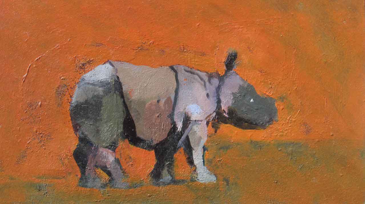
Rhinoceros, 2015, 2015, 41/2 x 8 inches

Thank for a great article. I really appreciate the quality of the both the writing and the selection of artists. Keep up the great work.
Thank you
Christine
Really inspiring interview. MIX THE COLOUR – such an important reminder. Thankyou.
Roberts teaching is the best , thanks Rob for all the time and patience you gave me at the London art academy …. I’m still drawing from that experience now years later .