
From the steven harvey fine art project promotional email that was forwarded to me from Christine LaFuente who studied with Seymour Remenick in Philadelphia.
This is the first New York exhibition of former Hans Hofmann student Seymour Remenick (1923-1999) since the 1970s. It examines his work alongside that of well known contemporary painter Stuart Shils. They met at the Pennsylvania Academy in 1981, when Shils was studying and Remenick taught night classes. Remenick profoundly influeneced Shils early landscape painting and they painted together regularly outdoors, often in Manayunk, the factory town on the Schuykill outside of Philadelphia. You can see photos of the works in this exhibition via the following link: http://shfap.com/exhibitions/pairings/pairings.html
Stuart Shils is a renowned perceptual based painter that I will look at in depth at some later point. He has a very engaging and extensive website that is worth checking out as well.
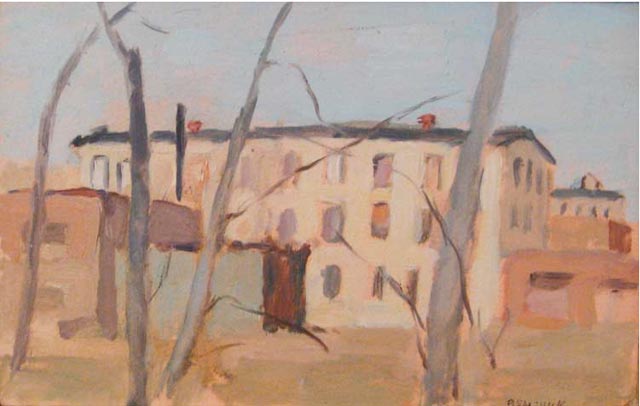
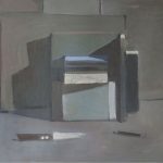
Seymour Remenick Factory Building Manayunk 1986 Oil on paper 6 x 9 inches
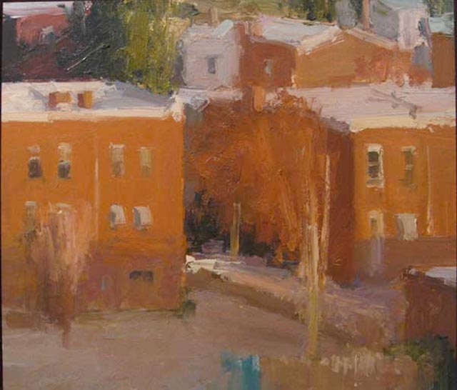
Stuart Shils Roxborough Rowhouses with Sun and Snow 2009 Oil on paper 11 x 13 inches
From the steven harvey fine art project promotional email that was forwarded to me from Christine LaFuente who studied with Seymour Remenick in Philadelphia.
This is the first New York exhibition of former Hans Hofmann student Seymour Remenick (1923-1999) since the 1970s. It examines his work alongside that of well known contemporary painter Stuart Shils. They met at the Pennsylvania Academy in 1981, when Shils was studying and Remenick taught night classes. Remenick profoundly influeneced Shils early landscape painting and they painted together regularly outdoors, often in Manayunk, the factory town on the Schuykill outside of Philadelphia. You can see photos of the works in this exhibition via the following link: http://shfap.com/exhibitions/pairings/pairings.html
Seymour Remenick also is noted for having been a student of Hans Hoffman in Provincetown, MA
Stuart Shils is a renowned perceptual based painter that I will look at in depth at some later point. He has a very engaging and extensive website that is worth checking out as well.
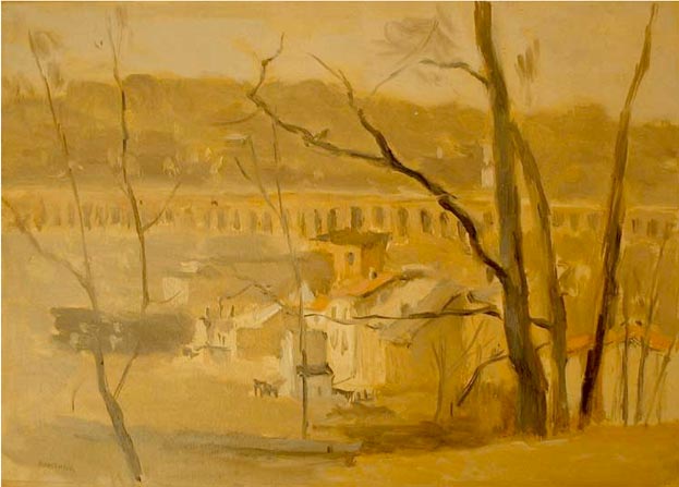
Seymour Remenick Railroad Bridge, Manayunk 1980s Oil on paper 10 x 14 inches
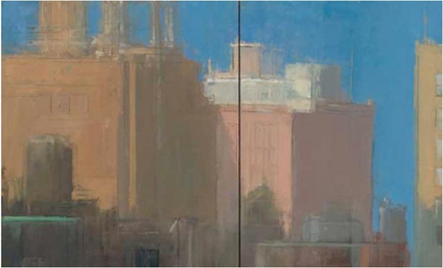
Stuart Shils West Side Rooftops Water Towers 2008 Oil on linen 15 x 26 inches (diptych)


Don’t wish to be a partybreaker, but…am I missing something here?
What makes these painting special?
“Seymour Remenick also is noted for having been a student of Hans Hoffman”
If you ask me, he should have been noted for the quality of his paintings.
How famous the teacher of this or that painter was is of little importance – the important thing is how good their students become. Pacheco was not a first-tier painter, but his student Diego V. became one of the greatest artists ever. Consequently, there were many excellent painters throughout the history whose students did not stir the waters too much.
All paintings uploaded in this post (with exception of West Side Rooftops Water Towers) look to me like works of semi-talented beginner after taking a weekend class. No offense intended.
The difference in paint handling and the clarity of vision between these works and, say Diana Horowitz’ is striking.
(I am mentioning her because she was featured in previous post, but I could drop here three dozen other names, as well)
In reply: Of course you are right, the work is what is really important. I think that Hoffmann is mentioned to help introduce Remenick. I know it always helps me to see the work of a painter when I know where they are coming from, what Lineage. Understanding Dickinson via Hawthorne, Matthiasdottir via Hoffmann, Corot via the Machiaoli (and vice versa). Introducing the teacher can help provide a context.
As far as their work…it may be helpful to look at more of their work than what is offered here (Shil’s website, for example). The question becomes: what are they after? For Shils, I feel he is after a certain light and space. The space I feel he is looking for is semi-abstract, the sky having a weight, for example, understood as a chunk of paint as much as a light, and creating an interlock with the ground below. Shils follows something of an impressionistic approach, sacrificing ‘clarity’ and detail for an overall, painterly resolve. For his temperament and needs as a painter, it is important that he works quickly, thus the rougher, brushier look of his paintings.
Your comments make me think of accounts of read of certain debates between late 19th C. French Painters where, for example, a certain Classical painter might look at Pissarro and see it as a very crude work, executed by a very young boy. I myself know that showing someone like Morandi to a beginning art class produces yawns and taunts. It can be very difficult for young arf students, who tend to only understand painting that ‘looks real’ (which usually means a dry, photographic illustration with attention to sharp contours and details), to appreciate work that is about color, light, mark, or mood, for example. I am thinking of Hawthorne’s Mudheads vs. his more ‘realized’ portraits, and a possible response to the two.
Valentino, I don’t know if you’re missing something or not but you are right to say that just having been a student of Hans Hoffman alone doesn’t automatically make him special. However, I find it interesting to see where people are coming from and try to include it when I can. In Remenick’s case it was one of the few things I could find out about him online.
I also suspect he had a great influence one others as a teacher himself. I can’t say for sure but I would imagine his teachings inspired many of his students, like Stuart Shils and Christine LaFuente. to go forward in their careers with a great love and respect from painting from life.
In any event, from what I can see from jpegs, I find many of his paintings quite wonderful. They seem modern, personable, fresh, direct and honest. His painterly emphasis on color issues, the underlying abstract design and overall mood seems more important to him than precise, more academic rendering. I suspect he was a big believer in only painting in one sitting – but since I know next to nothing about him this is only a guess.
Stuart Shils is a major nationally recognized painter who paints from observation (sadly, very few painters fall into that category) So I hope to write a much larger post at some point about his work.
John Lee, Excellent comment! I couldn’t agree more.
Valentino’s comment about missing something opens up the possibility for me to talk about what it is that I missed in the previous painter Larry presented, Diana Horowitz…. whose work I honestly like, but which frankly bores me with its topographic sense of rightness. What quality is missing in Horowitz but IS in great evidence in both Remenick & Shils, I would call passion.
When I look at these current painters I don’t see the uniqueness of the location they paint, I see their reactions to the location, their feelings about the location…. not a basic rendition of architectural facts.
Not that I want to reduce Horowitz to just a gatherer of facts, I don’t…. her painting is far better than that, BUT, for me at least, I need something more…. I want to see the ARTIST in the ART. I’d far rather see how Shils (for example) felt about the architecture than the fact that his buildings might be standing correctly…..
For me, art is all about the artist, not the stuff they do. To be able to paint the essence of something and to paint the essence of yourself at the same time seems to be an ideal that I, at least, want to see in both my own stuff and the art I look at…. it’s the quality I search for above all others.
Earlier, Larry had a group of Hooper’s watercolors on…. I’ve always felt these got the facts “right”, but his oils got the facts right, but with “feeling”.
Another painter who does Horowitz’s sorts of subjects is Colin Campbell Cooper, whose NY paintings are a real instruction manual for Urban Landscape (cityscape) painters. Pretty much forgotten about today, naturally.
As to the importance of one’s teachers, if I were to list mine, and anyone knew who they were, all it would tell you was that I must have had a horrible time in art school. Frankly, I don’t give a damn who taught who… if you are any good, you’ve left your teachers in your dust long ago. I’d like to see the whole question dropped…. let the art historians play with each other over it, give them something to do since they don’t seem to understand the art they write about….
Good points Wm. about wanting to see the artist in the art. But what if the artist’s identity/personality is radically different from yours? Why can’t Ms. Horowitz’s show her artist self as being someone who cares deeply about her careful study of the light on architecture forms? Some people express their true self quickly in a very loose gestural manner. Others may spend years getting everything just right. I find Diana Horowitz’s work enormously satisfying but I can also enjoy Remenick’s work. For me, they both are involved in making great painting and not just precise recording of what they saw, instead they both seek the best ways to make their paintings out of the raw material of life. What I tend to find boring and disagreeable, is painting that is solely about copying nature – to show off precisionistic rendering skills in a dry academic fashion, often seen in inferior photorealist work. Great photo realist painting, like Richard Estes work, succeeds in showing us much more than just facility in copying a photo – it shows inventive and creative ideas about vision and design which, of course, is another view of the artist in the art.
The importance or lack of importance of teachers would be an excellent topic for a future post. I already have a few gears spinning about this subject. Too many issues to get into right now but I will say that probably as many painters became great despite their teachers as those that became great because of them. I find it interesting because I’m interested in what sorts of things these teachers taught, and what kinds of art that teaching eventually inspired people to make. Hans Hoffman along with Charles Hawthorne had a significant influence on many painters.
Today there is one notable teacher of perceptual painting, Lennart Anderson, that I am curious to learn as much as I can about. I keep wondering why so many of Lennart Anderson’s students (many whose work I feature here – like Diana Horowitz) went on to be such terrific colorists.
I hope I didn’t sound rude. When compared my post with Larry’s gracious response one might get such an impression (and draw wrong conclusion as to what my idea of great art is). Perhaps I am too sensitive about Art, and perhaps my English is not as good as I’d like (I am Croat).
I do not share your opinion on quality of these two painters, NOT because I hold “academic rendering” (as Larry put it) in highest regard, or because I think that only painting that resemble photography equals good art. (Btw, painting actually may be super tight without being dry, lifeless and/or photographic; take Van Eyck, Phillipe de Champaigne or Van Huysum, for instance).
In short, I do not dislike these two painters because they paint in loose manner, but because…well, I said why.
These pieces simply do not look like MASTERFUL works of someone who prefer to paint loosely (or who has chosen to paint these particular series of paintings quickly).
Don’t know what other think, but I know that painting can be academic AND first rate (*), it can be photo-realistic and great (**), and it can be very loose and brilliant (***).
It’s just that – and that’s my point – these works do not fall in the latter category.
Bernard Dunstan’s, Ken Howard’s, Peter Wileman’s, E. Potthast’s, H. Twatchman’s, Richard Pikesley’s, Roy Freer’s, Jeff Jones’ (and many others) do.
(*) – there are many examples; last month I was in Paris again and am still under strong impression of the works I’ve seen there
(**) – I haven’t seen many such works, though
(***) – by the same token, it can be all about light, color, mark, or mood but poorly executed OR just not good enough. Les Fauves, for instance, made many such pieces.
Thanks Larry! same to you
as far as teachers go, I do still like to see where people came from, as I said above. another way of putting it, I like to see what they are responding to. To see Picasso as a response to Cezanne, to see Degas as a response to Ingres (past master) as well as to the (truer) impressionists. An interesting Lineage that runs from the French to the British: Degas to Sickert to Bomberg to Auerbach. The way that a painter like Frank Auerbach is very different, yet very much LIKE, a painter like Walter Sickert.
As far as Diana Horowitz work goes…her paintings do look a lot less painterly, for example, than Shils or Remenick (or many many others). Maybe they only seem less painterly in reproduction. And then maybe it isn’t even important that they are painterly at all. But I see her work as being about an attempt to get a specific light, working perceptually and on a rather small scale, getting that light in a painting that walks some personal line between complexity and simplicity. While Horowitz does have much more detail, number of buildings, harder edges, than Shils for example, I think she is also deciding to simplify a lot of her shapes for sake of clarity and, again, that light. A play between sharper and softer focuses.
Unfortunately, I see Colin Cooper as a maker of stylized, watered-down, ‘impressionism pictures’. I fail to see something either personal or felt in his work. That is the problem I have with other painter’s listed above: Dunstan, Wileman, Ken Howard and others…they are somewhat respectable as image makers, but are they making something that is truly their own? I see them as largely appropriating the look and the subject matter of much stronger painters, Sorolla, Sargent, Sickert, et al. without getting much substance.
I don’t mean to be rude, nor am I here to attack anyone. I am only responding to some very interesting questions.
John Lee,
I’d certainly not be able to argue that Cooper painted some pretty awful stuff, however, when he painted something that was major, I’d have to say he it it big time. Don’t know how much of his work you have seen, but I could provide a few titles of some work I’d consider major.
I would have to say I can’t think of him as doing watered down impressionist paintings, I’d reserve that dubious distinction for Childe Hassam, the other painter of the period and of “New York City” as a subject.
Do I consider Cooper in the same league as Sargent or Sorolla, no… I don’t, but I also don’t like to make these Hollywood star “best” sorts of comparison’s…… From everything I’ve read (I’ve not done original research), Cooper was pretty much of an originator for his time and with the NYC sky-scape as a subject…. I grant him those points as I do Sargent and Sorolla for their contributions.
Larry, your question of what if an artists personality is radically different from mine: Well, I take it as a “given” that 95% of the time this is a truism….If nothing else, I don’t believe you’ve yet dealt with a painter who worked strictly in water-color, so that alone is a major difference. Of the artists you’ve actually dealt with, only two have been close to the “realm” of subject matter I deal with, Cindy Tower and I’m sorry I’ve forgotten his name, but the guy who did the wonderful paintings of piles of trash, some of which were being lifted by magnetized cranes. In neither case, however, were their mediums or their “style” (for lack of a better word) like mine.
So…. with out (I hope) sounding argumentative, I’d like to think I’ve been able to deal fairly with all the artists I’ve commented on so far. The one who was furthest from my understandings was Ligare, who I can’t feel any empathy for at all.
I assume a lot of the people who comment on this site are teaching, or have taught at some point. The sign of a decent teacher is their ability to read the students direction and to try and add support for the road the student is on, not for pushing their own. I hope as both a sometime teacher, and someone who has studied art for a long time, I’ve been able to see the differences between my personality and that of the artist (or student) in question.
Certainly there are (and will continue to be) people whose work I just don’t get. John Lee mentioned Morandi in an earlier comment and how showing his work to students just produced yawns…. I have to admit you would need to add my yawn to the list… I’ve never felt anything for his bottles.
I look forward to Larry’s proposed future topic of the importance of teachers…..
The subject matter is often what draws people to making a particular painting as well as getting someone to look at it. But what can really keep a person with the painting and keep coming back to that painting is usually how it was constructed in terms of the design, the power of all the formal concerns that goes into any great painting, regardless of subject or medium.
Morandi, imho, was all about that later aspect – the underlying 2D abstract organization of forms. I love his paintings for being great paintings with compelling compositions, color configurations, and interesting shape relationships,etc dusty old bottles and jars don’t interest by themselves – it takes a great painter to lure me in.
This is why I can keep coming back to his work over and get something new from it, and never get bored.
Bill, By the way does gouache painting count? I did feature Mike Hernandez’s watercolor in this post…
http://173.254.55.177/~paintiu3/?p=103 I also featured Alfred Leslie’s watercolor landscapes (101 views from the road)
But it is true my preference tends to be more towards opaque mediums. Which, is more commonly used when painting from observation.
Larry,
Maybe I’ve seen a bad representation of Morandi’s work. What I’ve seen were all nearly identical, a flat table top, 5 or so shapeless bottles and the whole in ocher, mauve, brown, white…. NO color, in the red-blue sense, simply close valued hue’s, and no space as such, a flat 2-D design, from which the handful of paintings I saw showed little to no variation.
As to W/C….. I’ve worked exclusively in the medium since the early 50’s, and under the influence of the CA watercolour movement of the 1940’s, just to give you a little history. Probably my greatest influence in that group would be Emile Kosa. Other than Kosa, I’d say M.B. Prendergast, then the usual…. Sargent, followed by Homer, followed by the earlier English guys.
Gouache, or Body Colour as the English called it, has traditionally been considered a separate water-media. You need to think of W/C as having two categories, the traditionalist, which would include me, and would be defined by the fact that we DON’T use Chinese white, or any gouache color (and I’d define gouache as being a water media color that’s pre-mixed with some Chinese white, and then those painters who DO use Chinese white, either by adding tiny touches of it to an other wise all transparent painting, or by establishing all their lighter areas by mixing degree’s of Chinese white into their colors at will.
I guess I go even further than most traditionalists, in that I don’t use any of the “tricks” of W/C either, by which I mean I don’t use rubber cement to “save” my whites, instead I paint around them; I don’t sprinkle on table salt to add textures; I don’t add such things as India ink to get black, and I don’t use a knife blade to scrape the paper to get back to white.
Most W/C painters consider me stupid for the above stance, but I don’t advocate it for anyone else, nor do I define W/C paintings by saying you must have this or not have that.
I can fully understand why someone might not find W/C to be as interesting a medium to look at as oils. There is no question that over the years, W/C became a symbol for runny messes with tints defining loose amorphous shapes, and, as a medium to try, it’s usually presented in such a way as to all but guarentee you will fail at it… good way to keep the competition down!
For me, once I had seen the CA painters like Kosa, I realized W/C can be just as powerful as oils… you might note that many of the Photo Realists use W/C and made very powerful paintings…. it’s just a question of realizing the degree’s of transparency each hue has, and then layering these in such a way as to keep light coming through the paint from the paper, and yet to present a deep, rich tone to the color.
There was a beautiful Morandi show at the Phillips last year, that showed the range of his work: etchings, some portraiture, some landscapes, but of course his main subject are the bottles on that table. He did work within a very narrow range, the same bottles, the same table, in the same room. And sometimes he would work in a series that studied very subtly differences in the light (otherwise the paintings in the series did really look alike).
I think what is incredible is what working in that narrow range (subject, size, and palette) gave him. Not quite sure how to describe it. Beautiful grays, very subtle. The color of built up dust. The paintings glow, that maybe the best way to put it. they are painted relatively quick, in one go, usually. I might be proven wrong, but I do feel that one has to have spent some time working from life, looking closely at light, value, and Color to really appreciate someone like Morandi. And he is definitely not theatrical, or after some grand statement. He is looking for Just the right Color Weight, one form against the next, weighed against the wall, the table. He makes Gray into a color. It ia about intense looking.
I do have to give Cooper a little more credit than I previously did. I initially looked him up and saw a grand view of NY city and the harbor, another painting of a few figures, an impressionist garden party sort of painting. But looking at some more images, there is a little more weight to his work, some earlier work with a darker palette. I don’t know if I have seen any of his paintings in person, though I might have (as I am also a PAFA alumni from Philadelphia). I have some sympathy for his work from an academic point of view. Still, I really do not see a single thing that is original about his work. And I of course do not think that one needs to invent a language of painting, for example, to be original. I simply see his work as taking other painters as the model and following it in subject and style.
This could easily slip back into the painting teacher/painting student conversation that is coming up in our recent comments. The irony is that an american painter like the kansas city artist Wilbur Neiwald might at first glance be dismissed as being simply a follower of Cezanne or Giaccometti. His subjects and mark obviously borrow from those masters, especially Cezanne. So then, what is the difference? I see Neiwald as having an honest, real, felt response to his subject. He is really carving the forms and the spaces that he sees. He goes beyond the look, he was never concerned with the look.
When it comes to watercolour, British 19th century watercolourists are the most impressive artists in the medium I have seen so far, and I’ve seen more than a few. Zorn and Sargent were also absolute masters of the medium (There are many other artists, past and contemporary who are not familiar to the Western public). A. Wyeth did wonders with gouache, just like Robert McGinnis.
However, if I were to chose a single artist who is an embodiment of the watercolor artistry it would be – one and only – Arthur Melville.
The Genius.
I love every brushstroke he made.
Larry: Thanks for this timely announcement of the show! I never would have found it without your blog.
I’ve been a lover of the work of Shils, Horowitz, La Feunte, Lennart Anderson, Remenick (what I could find) for years. These are all wonderful painters and its great to see the lively debate above.
One needs to expose oneself to this work. These are paintings for God’s sake! Not photos, slides or jpegs. Shils produces some exquisite things. Morandi does too, but you’ve got to go see it and not just look at a book or a digital photo on the web. I get lazy too but we don’t paint so that we can put images on the web. If you can, GO SEE THIS WORK and give it the time it deserves.
These are really the best painters going and when I’m not sitting at my desk at work (supposed to be writing software) I’ll try to contribute a post as to what Shils’s work does for me.
For now: its mostly about arrangement of color and shapes.
He does that very well and gets the paint to go on so that it is anything but “dry”. The surface of his paintings are very evocative and they are breathing with life. He really is a painter who suggests rather than describes. Horowitz does it in a less expressionistic way.
Last night I read the first chapter of the recent book “Like Breath on Glass: Whistler, Inness, and the Art of Painting Softly”. It describes some of the goals of this kind of work very well. I’ll try to put up some quotes later.
John Lee,
I checked the catalogue of a large Cooper show I have, and it only listed a couple from Penn, 1 from Phil…. and, not his stronger work. As the show was in S. CA, it was strong on West Coast collections, not very much from the East Coast. I could recommend a couple of East Coast locations where stronger work by him could be seen if you are interested.
David,
From the above, you might gather I’m on the West Coast, actually not even the Coast any longer…. getting to see work is difficult. Certainly you are correct that seeing stuff in person is the only way, but most of the work we’ve been discussing is in the East. I’m just glad we DO have the internet, I wouldn’t be aware of 1/100 of what is out there otherwise.
Valentino,
Thanks for the mention of Melville. I know very little about him, having only seen 3 postage stamp sized reproductions, but from those I can see why you are so into him. I found one very expensive reference book on him for sale… if you happen to know of any sources for his work: catalogues, books, collections, etc. I’d really like to know.
I am not able to respond anything longer than two sentences, for some reason. I keep receiving a note that my “your comment seems a bit spammy.”
Valentino,
If I understand you correctly, the blog (spam filter) is sending you emails that say your longer comments seem spammy? I will see if I can find out why and stop that from happening. For now, if you want, please email me directly with the full text of you previous email(s) and I can then post it manually. Sorry for this. The spam filter may kick in if there are several links in the post.
— Larry
(larry at larrygroff dot com)
No, it does not send me any mail. A blank page opens with text like “Your comment seems a bit spammy etc…” I’ll send you my post on your mail.
here is your email post
Melville was one of my heroes ever since I first saw one of his pieces.
Here are two links with few images (click for enlargement)
http://www.artnet.com/artist/11653/arthur-melville.html
http://www.nationalgalleries.org/collection/online_az/4:322/?initial=M&artistId=3315&artistName=Arthur%20Melville&submit=1
Unfortunately, there ain’t too much books on him. I located one title on Amazon.uk:
http://www.amazon.co.uk/Arthur-Melville-Iain-Gale/dp/1873830092/ref=sr_1_1?ie=UTF8&s=books&qid=1254490628&sr=8-1
In the same package I ordered book “Sir William Russell Flint” (another Scottish watercolor master) as well. Both books are worth purchasing.
Book on Flint is more focused on his (female) figure works, btw. Admittedly, his women are so gorgeous that I do not mind the lack of landscapes pieces.
In terms of reproduction quality I would rated Melville book 4 out of 5 stars and Russell Flint 3,5 out of 5. (caveat: my standards are pretty high:)
I browsed my HD and uploaded several Melville’s and Flint’s images here:
http://rapidshare.com/files/287768303/AM.zip
Btw, in the same package there are two other folders with several Croatian turn of the century painters. Pay attention to Josip Racic, prodiguosly gifted Croatian painter (1885-1908).
http://hr.wikipedia.org/wiki/Josip_Ra%C4%8Di%C4%87
One may notice certain superficial similarity in technique between him and Sargent, though I am not sure if he was familiar with JSS or Zorn. Most probably not. He has studied in Munich (influenced by Velazquez, Leibl and Manet) and later spent a couple of months in Paris, where he died at the age of 23 (probably a suicide, he always lived on the brink of poverty).
What is amazing is that these works were done by a very young painter. Racic was in his early twenties (19-23 years) when he painted those. Yet, his ability of psychological penetration imparts his portraits unique vitality and power.
Valentino,
Thanks for the Melville references, I’ll check them out as soon as I’ve finished writing. Sorry you are having the posting problem, hope Larry gets it cleared up quickly. The book you mention by Gale is the one I found also, and, as there was no information on it, I thought the price was way over my head.
Sir William Russell Flint…. probably the potentially best W/C painter since Sargent. I say probably, because I’ve seen what he could do, versus what he actually ended up doing. The nudes you mention are, to use a critics term from the period, “vapid”. Once you’ve seen one, you’ve seen them all. There is no “truth” to them, no “flesh”, no sensuality, and nothing that would hint at what might be real….. they are Barbie Dolls painted as confections and bon-bon’s for Victorian drawing rooms. Sort of 19th. Century Mel Ramos’ .Even the late Victorian’s grew tired of them, and Flint’s rep. went down the drain.
But, in the beginning, he was a true master of the medium. Try to see a reproduction of his Diploma painting, I believe its currently owned by the RWS in England. It’s amazing……
I will also check out the other painters you mentioned.
This brings up a huge question. When everything changed in the late 1940’s, and abstraction became the only recognized style, generations of fine Realist painters got totally left out of both the exhibitions, the galleries, and, worst of all, any art books about the period. We are missing literally hundreds, maybe more, top-flight painters about whom we either know far to little, or nothing at all.
This continues down to our time, of course, and while Larry’s blog is catching up with some of “today’s” painters, there are all those from the recent past who are left out.
I was hoping one of the areas of expansion Larry might consider for the future development of this blog could contain a section where information, such as Valentino has on Melville might be stored…..
Two days ago I got a small catalogue on The CA Watercolor Movement, something I consider myself to be a “late” part of, and a group I’ve studied since I first saw them in the late 40’s. I thought I knew a lot, and yet there were 5 painters in this catalogue I’d never heard of……… that’s by way of an example of how sketchy our references are at this point.
Imagine what a major museum show and catalogue might be like!
Bill,
If you haven’t already you check out the Art Renewal Center’s on-line museum and overall site. They have an extensive collection of images from such artists as the watercolorist Sir William Russell Flint you mentioned… http://www.artrenewal.org/asp/database/art.asp?aid=1154 I had never even heard of him before as well as a number of these other older academic style painters. Another site, a forum, you might also find of interest would be the rationalpainting.org site. You have to register to be a member but it is a large site with many artists who contribute to discussions frequently about the sort of painters you are talking about.
As far as the sorts of art and artists I’m most interested in discussing for this blog, I am most interested in contemporary perceptual painting but would look at more relevant historical painters as the mood and interest strikes me. From time to time I will look at some non-perceptual painters (in fact I have one right now that I’m working on) but I want to focus on contemporary observation-based oil painting.
There are already many blogs that focus on amateur and popular-mainstream plein-air painting, blogs on academic type painting and portraiture, a few blogs on realist and photo-realist painting (mainly the painter’s work themselves), and numerous blogs that focus on current “cutting-edge” post-modern type paintings.
What you don’t tend to see are blogs, like this one, that looks at a wide range of contemporary modern perceptual-based realist painting. I like to mix it up, tight precisionist work next to loose quasi-abstract, Modernist next to academic, hobbyist plein air painter next to world famous pro’s. I also like to throw in painters to the mix to stir up trouble, like my next painter that I plan to post in the next day or two – stay tuned!
>I thought the price was way over my head.
Hm, actually, I thought it was not too pricey, only £12.75 + PP. A kind of regular price for 128 page art book…?
>When everything changed in the late 1940’s, and abstraction became the only recognized style, generations of fine Realist painters got totally left out of both the exhibitions, the galleries, and, worst of all, any art books about the period. We are missing literally hundreds, maybe more, top-flight painters about whom we either know far to little, or nothing at all.
Unfortunately, it is so. However, times are changing and I do believe the best of them will be brought into the spotlight sooner or later. We should not forget that the tradition of fine realist painting were kept alive in 50s, 60’s and 70s thanks to fine illustrators. The best of them were unsurpassed masters of design and pictorial composition.
larry, this blog really is quite unique and very refreshing. i check it daily (sometimes more often) and i appreciate all of your hard work.
have you by chance seen catherine kehoe’s blog?
http://powersofobservation.blogspot.com/
it’s not updated very often but i think you may find she touches on a lot of the same themes as you.
Thanks Erik! I hope to continue to make it worth your return visits. I have seen Catherine Kehoe’s blog before. She is a great painter and from what I’ve heard, teacher. We were classmates studying with George Nick together and we also both studied with John Moore (although not at the same time)
Seymour Remenick- Railroad Bridge, displays a nice wholesome sensitive touch at least to me it does, reveling a felt sort of calmness or serenity. I’m only guessing but that’s okay its art after all but one example showing up in the painting that I noticed in which he strives to keep this calmness intact is near the end of the bridge it goes fuzzy killing the speed that would have been apparent if executed by a lesser artist. It’s a fun image allowing me to take a momentary glimpse into the mind of this artists very being, it seems. I guess he allows the imagination to filter out the chaos without the distraction or experiences of reality getting in the way to produce a certain reaction only he knows so well. Christine Lafuente has this innate ability as well where I feel calm when viewing her work. She must be experiencing this or wants it in her own life thus it appears in her paintings…guessing of course.
It’s nice to see all the different personal visual dramas being playing out and displayed on this site,,, play being the operative word. Kind of a game I play with myself too when viewing and trying to figure them out but also knowing I am probably a million miles away from actually doing that but fun none the less.
I guess the great thing about painting and remembering all those things you see in passing during the day and thus remembering that certain moment on some level in your head begins producing so many variables to play with is engaging and probably why I love painting but those images we envision in our head sure don’t look like photographs do they. Cézanne comes to mind; Bonnard sure doesn’t look like photographs and then Peter Doig who has really captured my admiration in the last couple of years and many, many more who seem to get it.
Morandi— boy is he magical in execution, just a friggin joy to observe his particular insight… he sees into the often missed boredom of simple bloody bottles and turns them into the sublime. How does he do that… sob. :^))
Great site and fun to look at. Thanks Larry.
TDK, I like what you said here:
One way to quiet nature’s visual chaos is to paint less inventory-style of what is in front of you and more what you see in your peripheral vision or painting what you see through tightly squinted eyes. Another way is during the process of intense concentration when you finally forget yourself, put doubts and insecurities aside and just paint on autopilot. That is where things really start to happen and I think that is what is going on with Remenick’s and Lafuente’s work.
Thanks again for you comments.
yeah, Catherine Kehoe’s blog has some GREAT info for teaching!
I agree John, Catherine Kehoe’s students are very lucky to have someone put so much thought and effort in teaching.
I took a look at the works on Shills web page and just have to reiterate that I do not see anything special in them. For some of those one can not be certain about the age and artistic competence of its creator.
If one looks for a true master of minimalism (for lack of better term) here is the man:
http://www.galerijakaptol.hr/hr/fundus/josip_vanista/
These pics are not the best part of his oeuvre, but, unfortunately, he is rather old (born in 1924) and do not care for his web presence that much. Although I like these new works, but his paintings from 50s, 60s and 70s (not to mention graphite portraits and still lives) are stunning.
In response to some of the previous comments, I would like to offer some words on why I personally respond to both Stuart Shils’ and Diana Horowitz’s work so strongly. My response to the paintings is experiential and any attempt to put it into words can only be an approximation. I am drawn to the sense of light and air that permeate both artists’ work, created by the wonderful tuning of the large color masses against their neighboring masses and in relation to the very specific color world of each separate painting. Although each painter simplifies in a different fashion and to a varying degree, I find that they are both adept at keeping the details from interfering with that first, broad impression when the eye takes in the scene and is momentarily overwhelmed. Where Shils is a master of the visual Haiku—lush fields sliced with fierce staccato markings—Horowitz’s paintings more slowly reveal themselves to me, with my vision bouncing between sweet accents and the vibrant, colorfully humming sense of the whole.
I just saw the Seymour Remenick show at the Lancaster Museum of Art today and I gotta tell you… some AWESOME stuff. I think they note his being a student of Hofmann because his early work is abstract. I didn’t see it as name dropping. It just helps understand why his earlier work was what it was. To see a large group of his work helps understand that he wasn’t a flailing amateur grasping at happenstance. You can see in his drawings that he can render detailed architecture when he wants to. His paintings look like he’s much more interested in a visual experience of a scene and not so much a documentation. A brick wall in shadow isn’t an insane description of individual bricks and lines of mortar. He seems to have a great ability to create mood, use focus to draw the eye, and utilize the concept of less is more. He has an excellent use of brush stroke, nothing is overworked. You really start to ask some important questions (I think) when looking at his work. And his landscapes reminded me a lot of Corot. I didn’t find his portraits to be as impressive or as inspired. I’m looking forward to reading the catalog this weekend.
Thanks Hank, for letting us know about the Remenick show and for your brief review. Wish I could see it – maybe I will look into ordering the catalog.