Review by Christopher J. Graham, guest contributor
Diegesis, the latest exhibition of work by Julie Beauflis at Matthew Brown features a suite of paintings and drawings. The name Diegesis refers to the term used to describe a form of storytelling within a film, and at times can refer to telling a story within a story. Sparse atmospheric paintings in the show contain delicate shapes paired with warm colors. The work evokes the desert landscape that Beauflis is inspired by, according to the gallery’s press release, written by Lillian Davies.
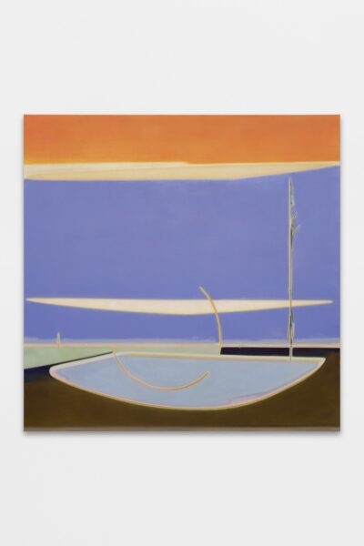
Julie Beaufils Pool, 2022, Oil on canvas, 51.125 x 51.125 in (image courtesy of Matthew Brown Los Angeles)
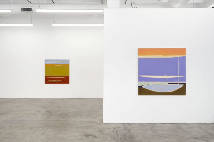
Pool is a painting that features a large blue color field in the center of the canvas that dominates the composition. The blue color field establishes a structure in the piece. The lower third of the canvas has an olive to ultramarine transition that feels quite design savvy. This move sets the tone for Pool’s main action, the repetition of its central fan shape in each third of the canvas, beginning with an Agnes Pelton-esque pale blue fan at the bottom of the canvas. The fan shape becomes compressed as it rises, changing to an off white before ascending further to be squashed in the uppermost orange field. Transformation alongside familiarity in shape is an essential characteristic of the paintings in Diegesis.
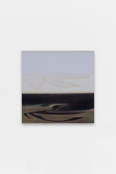
Julie Beaufils, Natural figures, 2022, Oil on linen, 23.625 x 23.625 in (image courtesy of Matthew Brown Los Angeles)
The solid color blocking of Pool makes it something of an outlier in the group of paintings. From here, Beauflis switches to linen from Pool’s canvas. In Natural Figures, a figure resembling a whirligig floats above its shadow, which appears to also be part of a water channel. The composition recalls Ana Mendieta’s 1976 Silueta Series. The floating figure’s shadow form twists differently than its upper register counterpart. The artist’s embrace of the linen’s texture allows for the oil paint to soak in the surface. This permeation causes colors to flatten into the surface, exuding a mellowness kept consistent in the rest of the show.
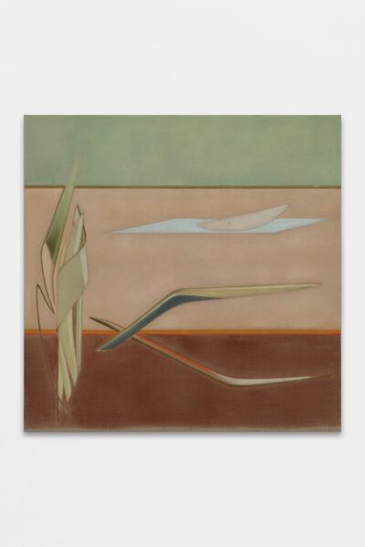
Julie Beaufils, Boomerang, 2022, Oil on linen, 51.125 x 51.125 in (image courtesy of Matthew Brown Los Angeles)
Boomerang pairs divergent angles with stealthy horizontal zips. The tri-Earth tone color fields and slick shape-work give the viewer multiple planes to move within. The eponymous boomerang is a central character in this work. It moves across the linen, later mangled in a cluttered wreck on the lefthand side of the painting. Matthew Brown’s press release states Beauflis sees the boomerang as a model of karma; what one puts out in the world will come back in some sense. This is seen most successfully in Inside-Out Temple. The piece echoes the three-part ascension of Pool, with its tile shape rising to the top of the picture plane. Delicate line work on the lefthand side contrasts with flattened fields of color stacked towards another whirligig shape hovering over the ground.
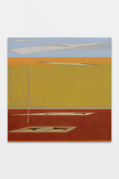
Julie Beaufils, Inside-out temple, 2022, Oil on linen, 51.125 x 51.125 in (image courtesy of Matthew Brown Los Angeles)
The colors of Inside-Out Temple are warm and inviting. The horizontal stacking of burgundy, gray, green, yellow, and finally blue give the viewer a shift in perspective. The viewer has the option to see the other abstract shapes in the work from the vantage point of each color void-space. Metaphorically, the viewer participates in the changing shapes of the work. Each transformation gives a distinct perspective of the painting.
Contrary to conventional thought, the ground in Beauflis’s work, that is–the lower section of a horizontal division doesn’t feel “grounding” for a viewer at all. Instead, the horizontal division that usually represents terra firma promotes the notion of a vast abyss.
This notion of the abyss is most evident in Dioramas. The painting’s deep blue pushes the void space further back into the linen. From there, the blue is broken up by a series of diagonal zips that cumulate in a form that takes an eighth-note shape at the bottom of the canvas. The shape is full of Prussian blue, with its cold chromatic quality, gives way to the void space again in the painting.
Dioramas borrows the whirligig shape from Inside Out-Temple and Natural Figures. Now a clear reoccurring figure, its presence is so slight here it could almost go unnoticed. It transitions from a kind of pictorial protagonist to a supportive roll against the other shapes. A smaller work, Solarium exudes a harsh red void set against a purple form. Its intense colors fill me with the kind of dread found in a Phillip K. Dick novel.
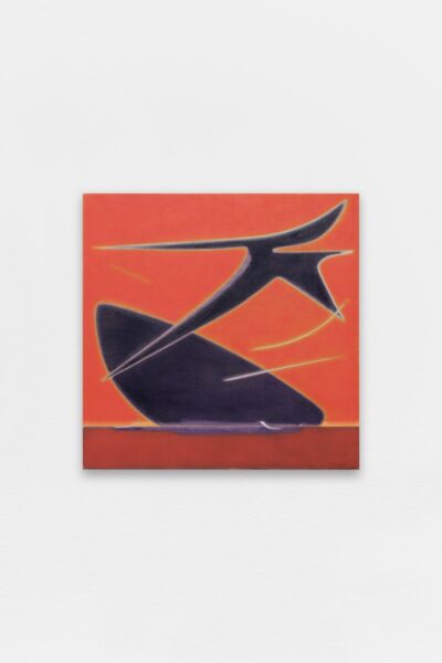
Julie Beaufils, Solarium, 2022, Oil on linen, 23.625 x 23.625 in (image courtesy of Matthew Brown Los Angeles)
Beauflis’ drawings vaguely recall the work of cartoonist Chuck Jones. The drawings included in the show reveal aspects of Beauflis’ composition process. The shapes crafted in the drawings truly become themselves in her paintings. In this sense, the title Diegesis is an apt name for a body of work dealing in characters familiar to the artist, and taking in several paintings to the viewer as well. Soon the viewer notices the whirligig shape in many paintings, and the boomerang described previously returns in future works. Matthew Brown mentions in the press release that this is the first time Beaflis’ drawings have been explicitly included in an exhibition. This inclusion grants the viewer a boon in the form of a key to the artist’s work.
The slight angles and attention to light remind me of paintings by Eleanor Ray, where delicate color work gives way to light-filled landscape compositions. In Beauflis’ case, the color blocking and shape-making suggest a pictorial hierarchy with figures that resemble Eero Saarinen architectural sketches. Utilizing the inherent warmth of ochres, and terra vert, Beauflis can echo the most extreme aspects of Googie designs without satirizing them or becoming campy.
What Julie Beauflis achieves in Diegesis is a focused effort in making compositions with her familiar forms. The result evades Palm Desert kitsch and instead offers an abundance of sincerity.



Leave a Reply