Review by Christopher J. Graham, guest contributor
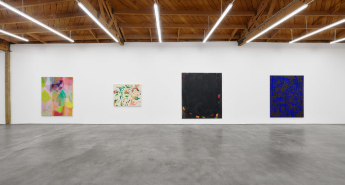
Installation view of Painters Paint Paintings: LA Version, Curated by Alexander Warhus, (July 23 – August 27, 2022), Nino Mier Gallery One, Los Angeles.
Images courtesy of Nino Mier Gallery
The press release for Painters Paint Paintings: LA Version-curated by Alexander Warhus at West Hollywood’s Nino Mier Gallery states that a contemporary painter’s largest concern is with the paint itself. Multiple painterly positions, it describes, are available in a single work. With so much freedom, the writing suggests painters can distinguish themselves based on the individual needs of their singular paintings. Space and composition are given to the reader as a common denominator, with a sense of suspension as a shared factor.
These paintings have a lot in common. They are mostly abstract in presentation, though some bodily forms sometimes appear. In every work, the paint seems to be the piece’s subject. Each work sits together, with a painting occasionally, subverting my expectations from the last.
There is a clear curatorial hand in Painters Paint Paintings: LA Version. Many works feature surfaces with open spaces, textural paint application, and popping color. Ambiguity seems to be a reoccurring quality.
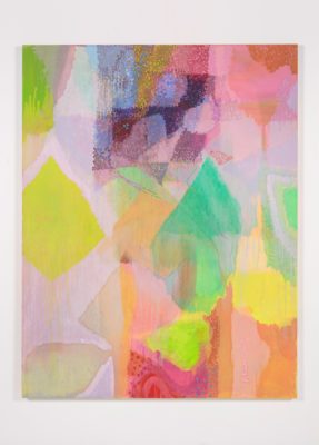
Victoria Morton, Powerful Growl, 2017 Oil on canvas 70 7/8 x 55 1/8 in,
Images courtesy of Nino Mier Gallery
There is a painting in the show by Victoria Morton that features open spaces, textural paint application, and popping color. Powerful Growl, hinges on its warm color relationships. In the upper third of the canvas, the artist employs thin layers of paint, creating a misty shroud over the ground. On top of this are small marks that make a lop-sided square. The hazy shapes float across the canvas obscured from the viewer. With this as an appetizer, the curatorial hand peels its layers back from here.
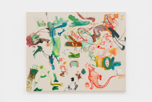
Betsy Ross Composite by Sue Williams follows suit with open space, textural paint, and vibrant color but pares down the atmospherics. Allusions to the figure are made and quickly dissolved. The work subverts expectations by showing the texture and color of the canvas, as opposed to some painted ground.
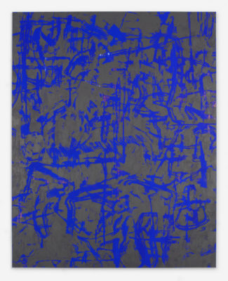
A large abstraction by Raul Illarramendi buzzes with high contrast. At first sight, the blue looks like it is sitting on top of a grayed-out ground. Upon closer investigation, it’s revealed the blue is in fact the ground and the gray-ish color turns out to be a brown. The painting holds tension in an all-over-styled composition.
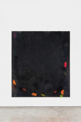
Next to that painting is another abstraction, of a Rothko-like spirit. An earthy brown ground and warm colors are applied with thin layers on the surface of the canvas. A large void in the center of the canvas opens the viewer to contemplate spatial relations. Fittingly, the work is called When you’re out of your mind; you can stay inside. Painted by Stefan Müller, the foreboding title loses its teeth for me after several minutes with the work. The phrase seems to turn over on itself, from a message of reassurance in the face of adversity to a shoulder shrug. The second portion of the title you can stay inside, reverberates with me as I take in the rest of the show. Oddly, I feel it shirks responsibility for the conversation it appears to generate.
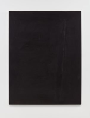
In Andre Butzer’s Untitled, a thin Newman zip shines through dark acrylic paint like a dim lamp in fog. The indecisiveness of the zip employs the same open void as Stefan Müller’s piece. The zip doesn’t appear to divide the planes of the canvas as much as it just exists, asserting its presence through suggestion rather than force. The painting’s apparent ambiguity lands less as a shirking of duty to me, and now I believe I am finding the rhythm of the curatorial choices. The paint is the protagonist in this gallery, projecting its agency with its presence. When I moved through the gallery to view a new piece, I felt the operating terms in the room had shifted wildly.
There is a chance that this is just one of the facts of viewing a group show. But in a single piece of artwork is an entire journey being communicated to the viewer. Context is hard to maintain in this arena. An interesting side effect of this is that I was willing to allow the painters to explain their individual positions ad-hoc.
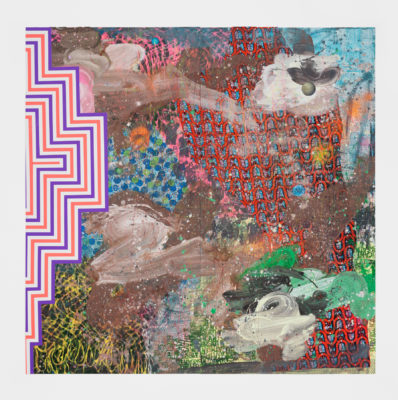
David Huffman, Sun Ra’s Dream Part 2, 2022 Acrylic, oil, African cloth, spray paint, glitter, photo collage, and color pencil on birch wood panels A suite of 2 panels 96 x 96 in (overall)
Much of the work at Nino Mier led with ambiguity. There was a curatorial choice to allow paint to be the defining theme of the show. Yet, the piece that held my attention the longest for its paint handling was a piece with less ambiguity and more explicit diversity in the material. David Huffman’s Sun Ra’s Dream Part 2 is more precise in its use of pattern. Using African textiles to establish a field to work within, Huffman allows the paint to waft across the surface. Throughout the surface, the pattern undulates between painted and fabric. Basketball-like forms float into pale taupe smears and sit atop a stenciled chorus of I Can’t Breathe. This refrain as a demand for civil rights and equity appears at the bottom of the work underneath a scatter plot of polka dots. From the upper right corner of the work, a moon appears, watching all the terrestrial troubles from the cosmos.



This post offers a beautifully articulated and insightful analysis of the exhibition, truly enriching the understanding of the featured painters’ approaches to paint. Excellent work!