Review by John Goodrich, guest contributor
Lennart Anderson: A Retrospective At the New York Studio School Gallery through November 28, 2021
Counting high among the must-see shows this season is the Lennart Anderson retrospective, an exhibition of thirty-five paintings that fills the New York Studio School Gallery with luminous precision. Curated by Graham Nickson and Rachel Rickert, the still lifes, portraits, landscapes and multiple-figure compositions – spanning some six decades – includes loans from many collections, including the Whitney and Brooklyn Museums. Pacing the installation are two especially large, complex figure compositions, which – though feeling slightly cramped in the tight hanging – testify impressively to the artist’s ambitions and achievement.
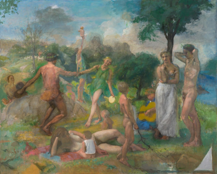
Anderson (1928-2015) belonged to a generation of intrepid painters – including the likes of Alex Katz, Paul Resika, Philip Pearlstein, Paul Georges, Leland Bell, Nell Blaine, and Al Kresch – who pursued figuration in a time when Abstract Expressionism, and then Pop Art and Minimalism, were ascendant. Older gallery-goers today may recall the passionate debates held by these painters (among many others) at the Figurative Artists Alliance in the late 60s and 70s. A number of them had studied with Hans Hofmann and were inspired by the abstracting influence of European modernism, but Anderson pursued his own path; most influenced, perhaps, by his teacher Edwin Dickison, he updated the masters with an exceptional fidelity to rendered detail and richly atmospheric spaces. His personal tastes were idiosyncratic – he admired both de Kooning and Degas – and his viewpoints could be provocative: he held that Matisse was a “tonal painter,” and that Degas’ late works were “failures.” Tragically, macular degeneration severely impaired his eyesight in his later years. He continued to paint to the end, however, and the exhibition includes his last large painting, the unfinished “Three Nymphs on a Bluff” (2014-15), which despite its reductive detail reveals his habitual robustness of form.
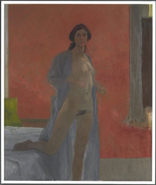
Among the first paintings to greet the eye is the arresting “Nude” (1961-64), which depicts a standing figure, an open bathrobe draped across her shoulders and one bent leg resting on a bed behind. The painting combines a luscious sense of light with flowing lines and strategically placed detail. Though close in tone, colors shape a powerful impression of the figure’s shadowed presence; vibrant, scumbled reds in the background press around the pillar of muted skintones, which prove, up close, to consist of countless blendings of reddish and greenish ochres. A handful of light-catching notes on the figure affirm the illumination of the scene, while the head – the painting’s only finely detailed element –resonates as the culmination of the flowing lines of robe and torso. So convincing is the effect that one startles to realize that the hands – so firmly located – are mere veils of color.
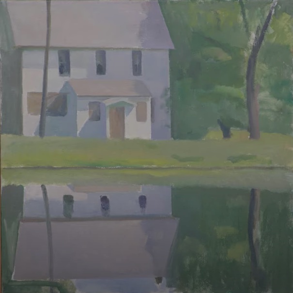
Lennart Anderson, White House Reflected, undated, Oil on canvas, 18 3/8 x 18 in., Collection of the Estate
Several small landscapes, among them the striking “White House Reflected” (n.d.), vividly capture the beating force of the sun, or the suffused light of a cloudy sky. But a series of portraits, their volumes complexly modeled in barely differentiated hues, seem particularly well suited to Anderson’s instincts as a painter; at once empathetic and incisive, they navigate each subject’s complex volumes with keen, natural ease.
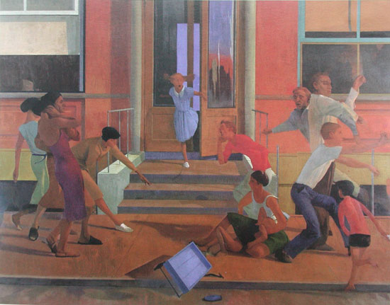
Lennart Anderson, Street Scene, 1961, Oil on canvas, 77 x 99 in., Collection of BNY Mellon
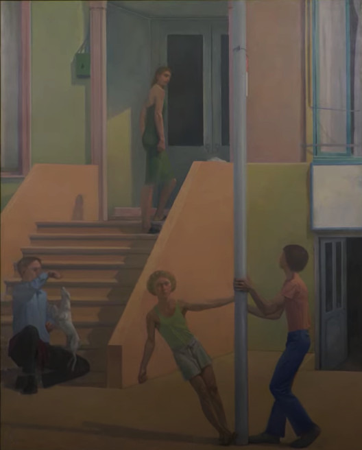
Lennart Anderson, St. Mark’s Place, 1969-1976, Oil on canvas, 93 13/16 x 74 1/8 in.© Estate of Lennart Anderson Courtesy of the Fralin Museum of Art.
Dominating each of the two rooms is a large multi-figure composition some eight feet long on its larger dimension: the vertical “St. Mark’s Place” (1969-76) and the horizontal “Street Scene” (1981). Both embrace a contradictory impulse: a modern urban scene, informed by the warm, restrained, glow and precise, counterbalanced compositions of quattrocento painting. (Is it any coincidence that the artist had spent three years at the American Academy in Rome in the late 50s?) I found myself particularly drawn to the evocative details in “Street Scene” – the expressive bend of a man’s arm as he dangles a treat above a small, leaping dog; a carefully observed electrical utility box on a wall; the folded newspaper, tucked onto a masonry ledge, just above our eye level. These paintings bring to mind Hilton Kramer’s reaction to one of Anderson’s “Idylls” – the three huge paintings he worked on for decades, none of them, regrettably, in the show: “In a saner art world than ours, museums would be vying for the honor of mounting a major retrospective of Mr. Anderson’s work.” And indeed, in terms of their size, ambition, and complexity, these two large paintings are as worthy of museum walls as the large canvases of Puvis de Chavannes lining the walls of Gallery 800 in the Metropolitan Museum.
“Museum-worthy,” however, can be a two-edged sword, and, as impressive as they are, “St. Marks Place” and “Street Scene” are not my favorite paintings in the show. As with Puvis, robust local modelings tend to cover up a relatively placid disposition of overall color. Unlike the radiant “Nude,” hues tend to fill, rather than leverage the larger movements; we experience luminous, deftly arranged moments rather than the wild, galvanizing, top-down unfolding of events in, say, a large Titian or Courbet. But then, this is quibbling: hardly any painter since Corot has achieved such an effect, though to my eye some works by Bonnard, Seurat and Balthus come close.
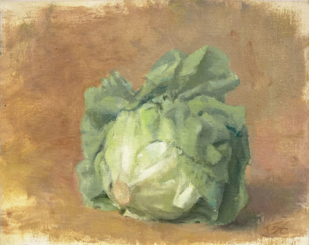
And at times, so does Anderson. Each of the half-dozen still lives in the show hums with rich, atmospheric depth, but “Lettuce #3” (1995) delivers something more. The edge of the uppermost leaf courses, with momentous, deliberate effect, across the middle of the canvas; it practically grows before the eye. In “Still Life with Victorian Washstand” (1967), the stand’s surface – a thin, bright sliver among the ornate, lathe-turned legs and railings – becomes an island of bright events within a room’s subdued tones. The events in question – a pale statuette, a silver cup, a folded towel – appear self-generated; they resist their surroundings, acquiring an almost eerie presence. As with the still lives of Chardin – one of Anderson’s heroes – we’re liable to feel intensely edified, and nourished.
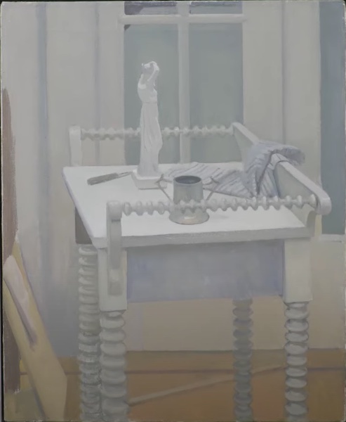
Lennart Anderson, Still Life With Victorian Washstand, 1967, Oil on canvas, 22 x 18 in., The William Louis-Dreyfus Foundation
For more images of artwork and information please visit the website for Lennart Anderson




Good review.
What a deeply informed and sensitive review of one of the most influential artists of my generation.