I’ve been captivated by John Lee’s meticulous observational study and innovative approaches to color in his paintings. I’ve long followed his work’s impressive evolution through his social media updates. So, when John agreed to an email interview from his home in Williamsburg, Virginia, I was thrilled. In our conversation, we delve into his background, but the spotlight is primarily on his insights regarding color and his methodical approach to observational painting. A few years ago Antrese Wood interviewed him in her podcast on Savvy Painter which offers a detailed look at his past influences and inspirations. Our discussion here further expands on several aspects about his creative use of color and compositional ideas. A heartfelt thanks to John for sharing his time and insights so openly in this interview.
John Lee, based in Williamsburg, Virginia, is an Associate Professor of Painting at William & Mary, is a graduate of the certificate program at the Pennsylvania Academy of the Fine Arts in Philadelphia, holds a BFA from the University of Pennsylvania, and received his MFA from the University of Indiana in Bloomington. John is an oil painter who works directly from life with an interest in color, light, space, and weight. He has worked in traditional genres such as still life and self-portraiture, but his primary subject matter is interior spaces. John has shown at various venues nationally, but primarily in the northeast region, including a 2019 solo show at First Street Gallery in New York. He is a past member of the Zeuxis Still Life Association and has shown with the Midwest Paint Group. He recently served as a juror for the Bethesda Painting Awards in Bethesda, MD (Serving Virginia, Baltimore, and Washington D.C.). From the artist’s CV on his website
Larry Groff: What were your early pre-painter years like? Was there something in particular that made you want to become a painter?
John Lee: Larry, thank you for this opportunity. People often say they’ve always drawn since childhood, and I’m no exception. Throughout school, I was the ‘school artist,’ in my youth, I crafted things from everyday materials—dragons from milk cartons and objects with popsicle sticks, paper cups, scotch tape, paper plates, etc. I created numerous puppets, masks, costumes, spaceships, and props for action figures. Perhaps that was when my creativity truly flourished.
I was born to artsy parents who met in art school. My father taught studio art at the college level, exposing me to the art world, museums, galleries, classrooms, and art books. In the mid-1980s, during high school, I developed a deep fascination with hip-hop, sketching graffiti in notebooks and on walls. I delved into graffiti as an art form, which led me to the New York Art World, pop art, and neo-expressionist painting. This sparked my interest in the broader art world. I explored Pop artists, their reactions to Abstract Expressionists, and the influences stretching back to Picasso. Despite this, I initially resisted studying art in college, not wanting to merely follow in my father’s footsteps.
Instead, I attended a liberal arts college but was academically unprepared, though art came naturally to me. After failing out, I returned home, worked odd jobs for six months, and then joined my father’s summer drawing class. This experience was transformative; everything clicked. I immersed myself in classic drawing books and modernism essays. One essay on modernism, revealing its distinction from ‘Contemporary,’ left me so electrified I couldn’t sleep that night. It was during these college-level studio classes, many taught by my father that I solidified my path in art and forged a new connection with him. From then on, I’ve felt most at home in art studios, museums, galleries, or art bookstores. They are my conduit to the world.Additionally, a pivotal moment occurred while I perused Nicholas Fox Weber’s book on Leland Bell. Sitting in an art history class, I was captivated by the color and movement of a figure’s leg in one of Bell’s ‘Morning’ series paintings. It appeared flat yet felt solid and alive. This revelation deepened my obsession with Bell’s work, leading me to scour Philadelphia for his book. Bell’s insights resonated with me, and his words have been a recurring source of wisdom. Understanding Bell opened my eyes to Matisse, Picasso, Cezanne, and eventually Corot, Titian, and Chardin, among others. Bell taught me to perceive the ‘music’ in painting, enabling me to appreciate the harmony in the masterpieces that preceded him.
LG You studied at PAFA; I’m guessing that was hugely important in terms of learning to paint and forming your ideas about artmaking. Can you tell us something about your experience there?John Lee: The Pennsylvania Academy of Fine Arts (PAFA) was significant for various reasons. Still, looking back, I’ve always regarded my initial art classes at the local college in my hometown as the most influential. A few core concepts were instilled in me, such as seeing color and gesture drawing, stemming mainly from art books. Kimon Nicolaides’s ‘The Natural Way to Draw‘ emphasized gesture as a form of empathy, capturing the movements and weight of the world. Painting ideas from Charles Hawthorne, gleaned from his book and Arthur Stern’s color book, taught me to perceive in terms of gestural and spatial movements and to see the world as surprising color relationships. These concepts resonated with me instantly; they are why I paint and am drawn to the thrill of seeing. This passion carried over to PAFA, where some instructors recognized my knack for color,working across the whole composition simultaneously, and my ability to discern underlying abstract relationships.
I chose PAFA for its studio art courses (with a model), the less daunting prospect of living in Philadelphia compared to NYC, and a curiosity about the city where I was born (though I had no memory of it, having moved to Arkansas at one year old). At PAFA, I grew fascinated with academic art training, delving into books on French academic training and anatomy. My earlier education focused on broad gestures, so I taught myself to work ‘on point’ with a charcoal pencil, mastering contours and cross-hatching, and making numerous drawings from casts and skeletons. I memorized the names of muscles and bones. I immersed myself in this academic style for a couple of years, thinking it was what the Academy epitomized.
Yet, deep down, I knew this wasn’t the direction my heart was truly drawn to in art. When I painted a still life, it inherently took on an abstract quality. Jan Baltzell, a painter and teacher, recognized this, often showcasing my work alongside her class’s. I resonated with Baltzell’s teaching, particularly her inclusion of Matisse and a memorable Lennart Anderson postcard, an image of the painting with the pile of nails and hammer. Anderson’s work. I felt very connected to Lennart Anderson’s work as I knew it from the ‘Art of the Real’ book I saw in my first painting class. Both Anderson’s and Leland Bell’s, work was a longstanding obsession of mine, though I felt a closer affinity to Anderson’s temperament. In my final year at PAFA, I met Scott Noel and felt an immediate connection. He became an influential figure in my life, especially around 1996 before his rise in popularity.
Post-graduation, while working and painting, I constantly imagined Scott observing my work, pondering his potential feedback. Over time, I disagreed with some of his teachings, which felt restrictive, akin to playing basketball with professionals. I wasn’t interested in completing a painting (or section) in one session. However, Scott’s insights on ‘tone’ helped me reconcile my earlier academic training’s limited palette with my initial education, which was rooted in primary and secondary mixtures. This melded my understanding of value, dull temperature, and spectrum colors. Scott served as a bridge, harmonizing my previously disparate ideas about color.
LG: You got your BFA at Penn and then your MFA at the University of Indiana. What was that like? Who did you primarily study with, and what might you say about how they influenced your direction in painting?
John Lee: I attended Penn at night while holding a day job, leaving no time for painting during those two years. My coursework primarily focused on art history and literature, with poetry and short story classes particularly enjoyable. During this time, I developed a confidence in writing that I later applied to relate painting with liberal arts students. I took a class called Urban Sociology that explained the city of Chicago in terms of social zones, such as the downtown entertainment district, surrounded by the skyscrapers of the business district, surrounded by the industrial, and then the suburban zone. I saw this as a traditional still-life setup, with the skyscrapers as the bottles and the factories as the apples. Perhaps this relates to what Erle Loran discusses in his book that dissects Cezanne’s compositions.
Upon completing my studies at Penn, I immediately enrolled in an MFA program at Indiana University, drawn by its respect for figurative work and its affordability, as I was self-financing my education. Before attending Indiana, I researched the program online, a relatively new tool. I discovered Tim Kennedy and Eve Mansdorf, both IU’s painting instructors and former Lennart Anderson students, whose work I admired. My research also led me to Maureen Mullarkey’s website, where I encountered the works of Ken Kewley, Dik Liu, and Catherine Kehoe.
Further research revealed that many painters from the Kansas City Art Institute continued their studies at Indiana University for their MFA, including students of Wilbur Niewald, another lifelong fascination of mine. This suggested a potential connection to IU. However, I found that some faculty members at IU didn’t share my admiration for certain painters like Porter, Sickert, Lopez, and Uglow, which led to some disagreements during my tenure. Despite this, I received support from all the teaching faculty.
One of the most valuable takeaways from my time at IU was a piece of advice I overheard from Eve Mansdorf. She advised that whatever part of a painting you’re working on should be at eye level. This revelation has been crucial to my practice, leading me to prefer easels that allow for such adjustments, even for small panel paintings.
LG: You describe yourself as a ‘Responsive painter’ who engages with ‘visual stuff.’ How is what you do different than what might be called a perceptual painter?
John Lee: During my time at IU, I experimented with different approaches to painting. I ventured into creating abstract figures (breakdancers), preceded by extensive drawing studies, and a large figure painting featuring myself and a friend, focusing on the life within the figures. While these projects pushed the boundaries of my previous work and garnered positive feedback from faculty, two other paintings resonated more deeply with me. One was a still-life from my studio; the other depicted a tranquil hallway in a 19th-century schoolhouse’s basement. Both captured what I instinctively sought in my art: attention to light, nuanced surprises, discovered colors, tactile quality, and a sense of forms sitting in space.
This approach is what I mean by ‘Responsive,’ a term I adopted from the classic drawing textbook Nathan Goldstein’s ‘The Art of Responsive Drawing.’ In responsive painting, one is moved by the act of looking. It transcends mere depiction or representation. It’s not about conveying information or subject matter through paint. Instead, it’s about being stirred by the light, color, movement, gravity, and the unexpected connections and disconnections. It’s about sensing something beyond the subject and its apparent factuality.
This perspective could, or perhaps should, inform our understanding of ‘perceptual painting.’ It seems self-evident that a painter working directly from life should be excited by their visual experience. However, I’m not convinced that this is always the case. For me, the meaning has little to do with the inherent significance of objects. The subject matter doesn’t hold personal or social importance for me. Yet, I wonder if aspects of my work, like color, might stem from familial connections. My mother, an amateur interior decorator, painted our living room ceiling an earthy violet. An older painting of my father featured a cardboard box. Over time, earthy violets and cardboard hues have become significant to me. Whether this preference is inherited or coincidental remains unclear.
I’m not interested in the subject matter for its own sake nor necessarily fixated on the paint. However, I delight in both when they connect deeply with light, color, gravity, and movements. It’s about more than just rendering the subject convincingly. The subject matter serves merely as a conduit for this exhilaration. Goldstein emphasized that all drawings (and paintings) should originate from excitement about the subject’s potential expressive energy and how it might coalesce in the artwork.
LG: Your high engagement with color in your paintings is remarkable. Could you tell us some of your thoughts on why and how color is important to your work?
John Lee: Thank you. Why is color so vital to me? That’s a challenging question. I find myself captivated by color moments. Just today, walking through a new campus building, I was struck by the colors inside the door jambs down a hallway. I might pass a vacant storefront and be drawn to the hues inside or the colors cast by a shadowy porch. A color event might stop me when walking down the hallways in some building. In the mornings, I wake to the colors near the ceiling corners in my bedroom. These experiences have been a part of my life forever. It’s akin to being ensnared in a delightful realm. I’ve painted basements, attracted to their dark hues. Basements, often sites of entrapment in fiction and reality, intrigue me.
Some basement paintings I titled “The Incredible Shrinking Man,” inspired by a 1950s sci-fi film where a man, shrunk to an insect’s size, ends up trapped in a basement. But as a painter, I’d relish being ‘trapped’ in a basement! Even waiting in a bank, I fantasize about spending a year painting the colors around the edges of the bank’s interior. If a painter isn’t trained to perceive color and light, they might venture out searching for subjects. But a color-trained painter sees hues right in their front yard, their home, or upon waking. Fairfield Porter once said, ‘An artist who can’t paint without the right subject matter is like someone who can’t get out of bed in the morning because they haven’t found life’s meaning.’ That’s not a direct quote but a recollection.
LG: You often work within a narrow range of color values, which helps create a harmonious feel to your palette. How did you develop this approach, and what do you believe it adds to the overall impact of your paintings?
John Lee: I’m not sure if this was a deliberate choice, but both consciously and subconsciously, I’ve shied away from strong contrasts of light and shadow, as that’s often expected. I’ve intentionally avoided windows or doors in my paintings, openings that could lead to spaces with more intense light. Instead of embracing a broad variety, I’m drawn to focusing intently on a particular passage or challenge. When we navigate between two realms, like light and shadow, it’s too easy to fall back on certain generalizations. Light might only need to make sense in relation to the shadows, and the reverse is also true. With a general strong light juxtaposed against a strong dark, one might get away with merely suggesting everything. However, I’m always intrigued by the notion of painting a wall where the values are subtly varied, yet there’s a rich diversity of colors and hues within that wall. A painter often simplifies the wall and then concentrates on a glaring beam of sunlight hitting it. To me, drama can be easier to capture, and there’s more to discover when we look beyond the drama.
Old movies, especially those filmed in New York City during the ’70s or ’80s, hold a certain charm. I often find myself gazing past the actors and characters, looking around the edges of the scene to observe the weathered, hazy atmosphere of NYC from that era. Similarly, during department meetings, I might find my gaze drifting to the colors surrounding my colleagues as we sit around the table. I recall Jan Baltzell, the PAFA teacher I mentioned earlier, advising someone to “Pay attention to floors in paintings and how different artists handle floors.” That advice has resonated with me. I’m captivated by floors in Dutch paintings, as seen with Saenredam’s cathedrals, Gerard Ter Borch’s interiors, Rackstraw Downes, and many others. . This relates to your question about a quieter drama, not so much the overt drama at the center of the painting, whether narrative action or contrast of light and shadow. Bonnard’s bathtub paintings, with their colors reflected in floors, tubs, and tiles, come to mind, as does Morandi’s still lifes, where objects cluster tightly at the painting’s nucleus, akin to an Albers square.
As a youth exploring college art programs, I often encountered paintings of hallways with dramatic light reflections beneath an open door. Those paintings struck me as merely clever, a kind of ‘look at this dramatic reflection!’ approach, with the reflections typically brushed in loosely, almost glibly. I remember thinking I’d never want to make such paintings back then. Still, over time, I’ve grown to love painting floors in various settings, like institutional hallways, losing myself in the subtle color nuances.Compressed colors are fascinating. Ingres once remarked that the most beautiful thing in art is two juxtaposed colors of the same value but different temperatures. I used to refer to this as ‘Simultaneous Contrast.’ I appreciate the sense of compression in color, a feeling of gravity: close colors, a sense of density. Looking back, I wonder if this preference indicates a deeper desire for more frequent hugs.
LG: Your painting is an ‘attempt to unify observed color divisions’ without relying on chiaroscuro. What do you mean by this?
John Lee: My response to your last question touched upon this. However, regarding the development of my approach, I primarily perceive color as something discovered through mixing paint. I can’t simply select a color and use it directly. While I find numerous captivating colors from brands like Williamsburg Paint, it’s not a matter of picking a tube of color and applying it straight or with minimal alteration, such as creating a tint. Instead, color must emerge from a foundation of prismatic primary and secondary paint mixing. Consequently, I often find myself toning down colors more than not, perhaps contributing to unity within my palette.
LG: What are some challenges of working with this restricted color range? Does the lighting of your setups or scene similarly avoid deep shadows or overly bright contrasts?John Lee: I think part of what makes this question interesting is that by ‘restricted color range,’ one could be referring to the restricted colors of the setup, or one could be referring to the restricted colors on my palette (the range of color paint mixtures). Regarding the color in the setup, the observed colors are so close together that it could be a bit like walking on ice; one false move and one loses the unity of the plane. I want to get the strength of the color, which is to be bold, but also to temper the color to find a value and intensity that allows the color to sit and lock together with the other colors.This is to be contemplative.So, it’s about trying to find my way between the boldness, which is related to the dance and the gesture, and then to the contemplative side, which can kill that felt response to the color. It’s like Fauvism; that is also not Fauvism. It’s perhaps self-defeating. I see this as an instinct, a natural part of my sensibility, and for this reason, I feel connected to several 20th-century British painters who seem to have a similar, related sense of color.Uglow, Harold Gilman, Duncan Grant, Vanessa Bell, and Gwen John, among others.
So, I can think that I have the color, but then when I bring the painting into another light, I may feel very different, or if I back up a bit more from the painting, it may not feel as correct as it did when I was closer to the painting.I want the colors to unify, on the one hand, but on the other hand, I can often enjoy it when they sort of ‘slip out of gear’ a bit, and there is something a bit jarring. But the jarring quality is something that I feel I arrived at in hopefully a more sincere way than would be the case if I was too consciously pushing a dramatic color-intensity contrast. I want the painting to find itself organically, the poetry to be a by-product of working on the color relationships.
I may seek out situations, lighting situations, or events based on something other than deep shadows and strong contrasts.I may like contrasts of temperature or intensity over value.As I think about it, I cannot even think about or recall any recent paintable moments for me that were based on strong value contrasts. Those situations (with strong value contrasts) are usually seen in classroom situations where the studio is darkened with no overhead lighting, and then a clamp light is shone on a set-up of all-white still-life objects.Beginning students often work with the desire to fill in extremes, blacks and whites, that are preconceived and then can be placed into the drawing, whereas painters, on the other end of that spectrum, are pushing the color into place.I am thinking about how a 1980s-era Wolf Kahn mixes the paint on canvas, so the color is conjured and tuned in an open manner rather than being understood and placed. I want to paint between these two extremes, looking for satisfying notes and chords of color.
LG: How does your observational painting process influence your color choices? How faithfully do you respond to the colors you’re looking at? Why is (or isn’t) that important to you?
John Lee: I follow the colors I see, knowing that the colors are elusive.I don’t think I can be completely faithful to what is there.The color can always be something else from what I initially saw or expected.I see the potential for differing colors almost everywhere.I don’t consciously invent colors that knowingly depart from observation.With some paintings, I can be in a mindset where the colors are stronger in how I see or paint them.I see those colors ‘in’ the subject, within the view I am painting, and attempt to pull them out.I want to be true to what is there, to be respectful of what is there.Yet it can also feel irresponsible to the painting as a whole.It’s like life, perhaps.I am not a very good liar, I don’t like to tell lies.But I also realize that to make something happen, it may be necessary to be dishonest on some level.Making a painting involves composing all the large parts with some sense of resolution. I think I let myself get bogged down with the many little colors I see in an area.I avoid simplifying passages.How broken up should the plane be?It seems there is always more to see within any given area.This color exploration is more important than delivering a certain subject or object.I am less interested in telling you something about the subject and more interested in looking closely at the color I see.
LG: When I studied with George Nick, he stressed to students the importance of careful observation and getting the exact color tone. I loved his work, but I often felt his colors weren’t the same as what I saw. I thought his colors were often more interesting than I saw in nature. He discouraged slavish copying of nature, instead to work parallel to it. With this in mind, what more can you say about getting “accuracy,” perfect pitch, and individual expression in color?
John Lee: A few years ago, I conducted an experiment where I completed two quick small self-portrait head paintings in just over an hour each. Starting with a quick pencil drawing, I laid down large color shapes, mixing them just once and painting them cleanly without later alterations. I focused on approximating the value, allowing the hues to be as exaggerated as needed. This was to gauge feedback on social media, with some painters who studied with Nick in mind. I wondered whether I over-analyze colors in my work, pondering, “Why can’t I just put it down and let it be?” While I received positive online feedback, I couldn’t adopt this approach regularly. I need to trust and believe in what I make, which means slowing down and meditating on the painting as I work.
I’ve long admired George Nick’s work and followed his career. When I turned 41, I realized from a Nick catalog that his career seemed to take off around 43, his age when I was born. This observation was based on his output as I perceived it. From what little I could glean, his teaching seemed to emphasize value and tonal relationships, possibly instructing his class to create paintings with only three values. While I wasn’t a Nick student and may be mistaken, it seems hue might be more flexible as long as it aligns with relative value. Value appears more justifiable than a variety of hues in nature.
I consider Fauvism as a movement where painters might have thought, “What if value (tone) is less important?” The Fauvists amplified hues, letting their intensity be as needed, often diminishing light and dark relationships, which could flatten forms and space. This flatness might be a byproduct of their focus on enhancing colors. (Regarding Fauvism, I’ve heard arguments that Matisse’s color works due to tonal structure, a viewpoint I don’t necessarily share.)
I was taught to view all color properties as equal players; no single aspect like value or intensity is more important than another. Color is an open, evolving concept. Sometimes, it’s thought that correct value relationships allow color to be applied almost decoratively. I see color as an interwoven aspect, constantly finding itself. Adjusting one element affects the others.
Color is overwhelming, akin to an introvert faced with myriad choices. It stops me, keeping me focused on a corner of my painting, reminiscent of the paradox of halving the distance to a wall without reaching it. I aspire to be broadly decisive, but that often feels forced. I admire Gabriel Laderman’s still life paintings, which use a single color for the floor. I seek unity, like an ant trying to comprehend the entire room, in contrast to a painter in a spaceship viewing the entire painting as a continent.
Lately, I’ve been painting mostly while seated. This perspective sacrifices some aspects of standing up to paint, but I appreciate the child-like viewpoint it offers. Rather than dominating tables from above, I explore under tables and into shadows, like peering into caves or observing porches across the street. They become architectural spaces rather than mere furniture to pass by. I want my paintings to be like exploring a foreign city, especially on those days without an agenda, discovering intriguing areas. I aim to replicate this exploratory experience alone in my studio.
LG:What role, if any, does mood or emotion play in your color decisions? Would using color to evoke or orchestrate a mood interest you? Can you talk about a specific example?John Lee: I often strive to capture or create a mood in my paintings, but this is a reflection I make in hindsight. I perceive ‘mood’ in two aspects. ‘Mood’ for me typically signifies an overall feeling conveyed by the color or, more precisely, the light. I aim for an overarching sentiment, yet I don’t consciously focus on it while painting. I find myself drawn to darker, more subdued scenes in terms of color. Examples include the rear of a quiet thrift shop during a weekday, a vacated storefront in a strip mall, a dark hallway, or a basement. These settings usually lack human presence, which is often when I find color most intriguing. My paintings have been described as ‘melancholy’ or ‘sad’. There’s some truth in that, but it’s not my intention to deliberately depict specific human emotions through my work.
LG: Your subject matter often depicts cluttered spaces, jam-packed with books, supplies, tools, tables, beat-up couches, and filing cabinets; your color orchestration helps transcend the mundane complexity into a visually cohesive composition. Do you consider these objects and space just the scaffold for the real show, which is the color/shape/light interaction? Or do you see the geometry and drawing of the setup as being equally important to the composition and meaning of the painting?
John Lee: I’ve thought about this off and on for some time. Occasionally, I feel the urge to sketch the subject with pencil to capture the fluid, intuitive connection between shapes and values, objects and light. However, it’s usually the color that initially captivates me, making it an essential element of the image. This leads to a necessary disconnect between drawing and painting. It’s unsatisfying to respond to color without having it firmly situated in space, to see it lock in. I sometimes fantasize about being a pure abstract painter who can focus solely on color, free from the constraints of drawing. Yet, I need the composition to convey a sense of space and a grounding plane. It’s paradoxical because while I want the painting to emphasize color and geometry, I also need a tangible sense of the floor. Consequently, the painting might veer towards a more conventional space, potentially accommodating a figure, something I prefer to avoid in my work.
LG: Many painters who work from life use a spot-color technique taught by painters like Edwin Dickinson and Charles Hawthorne. How do you see your approach as different or similar to theirs? Are these artists an influence in your work, and if so, how have you adapted or diverged from their methods to suit your artistic vision?
John Lee: Charles Hawthorne’s book, “Hawthorne on Painting,” was one of the first I read in a painting class, given to me by my teacher. Ever since, I’ve paid close attention to painters connected to the teachings of Hawthorne and Dickinson in their painting lineage. In my mind, I’ve constructed an imaginary ‘Hawthorne family tree’ comprising painters who studied with Hawthorne, Dickinson, Hensche, and Nick, or those possibly influenced by their teaching. I love the concept in its purest form: observing the world visually through color relationships. It’s more than a technique; it’s a sensibility, a way of seeing. Henry Hensche’s color studies and demos, with their vibrant colors, excite me, though his completed works and overall aesthetic appeal less to me. However, the notion of building with color, prioritizing it to the extent of spending considerable time mixing individual colors that captivate me, is fundamental to my painting. While I’m not sure if Hawthorne himself directly influences me, the concept of perceiving the world as color spots, shapes, and planes is vital.
I greatly appreciate Dickinson’s paintings but don’t often think about them. His work had developed a cult-like following, which might have initially put me off. Appreciating Dickinson’s work through art book images is challenging; there are fewer books on his work, and the images are often dark and difficult to decipher. This doesn’t diminish the quality of his work, which I find terrific. His ‘At First Strike’ paintings, created without preliminary drawing or a preconceived final product, painted in response to an initial impulse or emotion, remind me of de Kooning’s working method. I see a connection between the blurriness and unstable footing in Dickinson’s work and photography, with the desire to grab something in the moment. My paintings don’t embrace that level of openness; I require more structure and gravity. However, I do relate to Dickinson in terms of color, as he reportedly mixed his colors down extensively, involving a lot of paint mixing to achieve his hues.
LG: What colors do you put on your palette these days? Do you usually mix your colors individually as the painting progresses, or do you mix large batches of colors you think you’ll want before you start?
John Lee: I mix the colors one by one as I go. Color can only be found in the moment. The basis for my palette has been cadmium orange, permanent green, and Mars violet.A secondary triad is just something that I stumbled upon, but I have liked the colors that I achieve when mixing them. Ultramarine Blue is the blue that I use the most, but sometimes Phthalo Blue is used as well. I use Cadmium Red and Yellow in the deep form; I prefer the ‘deep’ to the medium I’ve used for years.I use Alizarin Crimson, Phthalo Green, and Ivory Black.I have a few other colors on the palette that I may use on occasion, as the painting calls for, but I mainly use forms of secondary and primary colors.I don’t think they are like spectrum colors, but they are colors I can mix with.The colors on my palette include Venetian Red, Cadmium Red medium, Cadmium Red Deep, Cadmium Orange, Cadmium Yellow Deep, Naples Yellow Grumbacher, Yellow Ochre, Titanium White, Ultramarine Blue, Phthalo Blue, Permanent Green, Cadmium Green, Phthalo Green, Alizarin Crimson, Mars Violet, Ivory Black.
LG: I read that you use Utrecht and Williamsburg paints. I heard some people dislike Utrecht’s paint, saying it had too much filler. I think Lennart Anderson once said, ‘Good painters can use cheap paint and make something wonderful, but students should buy the most expensive paint they can get. Care to comment on this?
John Lee: I don’t see a problem with the Utrecht paint in that I go through large tubes of my colors (in both Utrecht and Williamsburg), but I have several smaller tubes of Williamsburg and Holbein colors around that I never use!Expensive paint may be arguably stronger in a way, but it’s also akin to a sense of materials and materiality that I don’t relate to.I don’t look too long at the tools and materials.
LG: Can you describe the techniques you employ to create the illusion of spatial recession in your paintings? Accurate angles and perspective would seem important in your work. Does color play a more or less important role in the illusion of spatial recession than the traditional perspective in your work?
John Lee: I have always liked the idea that if you paint the relationships, the space takes care of itself.I don’t use something like a vanishing point or do something purposely to make the space recede.When I see something not sitting spatially, I adjust it, of course, but it has to do with the color not being correct or the sharpness of an edge or a transition being too jarring.I like the idea that it’s just painting color relationships correctly to make the painting work.But correctly may not mean copying nature.The angles are naturally part of making it work. Everything is both a color and a shape.The shape has an axis and edges.It goes back to the earlier question about the geometry of the drawing in relation to the color. I think it’s all important (like the color and the drawing) and organically intertwined.We dissect composition for convenience to discuss paintings and teach painting to others.
LG: Your paintings often emphasize diagonals or orthogonal lines; you don’t seem to stress the vertical/horizontal grid-like relationships. Is this something you think about?
John Lee: In hindsight, I realize that when I get an idea for a painting, I prefer to be positioned slightly off to the side to create a diagonal composition. It’s not an overly dramatic diagonal, but it’s not a direct frontal view either. I believe that a frontal view might appear too flat or symmetrical, whereas a diagonal view creates a sense of depth and discovery. When viewed from an oblique angle, the planes in the painting appear to rise upwards, yet they still seem grounded and in line with gravity.
LG: What would you say is most critical for your compositions to get right?
John Lee: After giving it some thought, I have concluded that everything must feel right. It may sound vague, but composition is about achieving that sense of harmony. A perfect painting for me creates an open and grounded space, but doesn’t necessarily invite someone in. The color must be unique and interesting, yet it should also blend seamlessly with the spatial plane of the painting. In other words, I want the unique quality and weirdness of the color, but I also want the color to feel like it exists within the space of the painting.
The painting should strike a balance between functionality, storytelling, and abstraction. I don’t want it to be too abstract or too grounded in reality. It must exist somewhere in the middle, negating those two extremes. Although it is an abstract painting, I want it to be based on observation.
LG: Has there been some idea or practice in painting you once strongly believed in that you’ve changed your mind about?
John Lee: No, but I have spent time thinking about artists and genres coming from a different perspective.I read a few books about Frank Stella, for instance.As mentioned earlier, while at the Pennsylvania Academy, I got into researching academic teaching for a couple of years and was a bit obsessive about anatomy for a year.I tried some crosshatching. In the past, I was an avid researcher of the 1980s art world and the painters they were influenced by.As a researcher, I got into Pop, Minimalism, Abstract Expressionism, Neo-Expressionism, and Neo-Conceptualism.In retrospect, it was all just curiosity and trying to understand particular art worlds
.
But really, everything clicked for me in the beginning due to the excitement of observed color and light.I immediately fell in love with painters like Fairfield Porter and Lennart Anderson, who were immediately available.The love of color soon led me to see that left leg in Leland Bell’s 1976 ‘Morning’ painting (in Fox Weber’s book).The understanding of space and movement that I got from Bell opened the world of painting for me, alongside the eye for color and light from the color spot ideas, and it has built upon this foundation ever since.
LG: In your teaching, do you ever find that students and faculty today are more concerned with issues of social relevance, narrative meaning, and the student’s intent, important concerns to discuss in critiques? Have the more traditional criteria about where painting can go wrong visually taken a lesser role? Are the measures for evaluating ‘good’ and ‘bad’ art different today than what you experienced as a student? Does that matter?
John Lee: Students somewhat understandably want to make something meaningful, and they know that social or personal subjects are meaningful.They make an image or form that depicts that meaningful subject, either directly or indirectly.Whether they work figuratively or non-figuratively, from observation, photo, imagination, or memory, they understand a particular subject and want to communicate their ideas.They want to tell their story, whereas I want them to hear one: that of Matisse, Picasso, Morandi, or Mondrian.Artists communicate through the types of marks, the interaction, and the color interaction.For example, there is meaning in where the horizon line is located in a landscape painting. The visual form tells a story; it’s not about pointing outside of itself to find meaning.But those types of concerns with teaching have always been there!They go back as far as I can personally remember.I can recall many examples of badly painted images that are supposed to have meaning because of their subject matter, that one might see in studio classrooms or galleries.Mercedes Matter wrote that article about teaching art in 1971, I think. And I have always held the New York Studio School in the highest regard.I can remember the first time I saw the school’s catalog in the spring of 1990 and how it spoke to me.
But does it matter?I am hopeful with my teaching and want everyone to get it.I want them to see the color and feel the gravity, empathize with the subject visually, feel the movements and counter-movements, and understand something about visual dynamics and how they have inherent meaning.
LG: To what extent can irony and conceptual aspects turn what might have traditionally been considered a ‘bad painting’ into a ‘good painting’?
John Lee: I have heard of an infamous art exhibition around 1979 or 81, a NY show titled ‘Bad Painting’ (I believe that was the title).I could look it up, but from my memory, painters like David Salle were included.I think I read that Leland Bell saw Salle’s work and didn’t understand why it was painted the way it was (when you think of a classic Salle painting).Someone attempted to explain to Bell that the painting was painted badly on purpose, and Bell remarked, ‘That’s ridiculous.’ This is just my memory from reading this in the late 1980s.I showed this interchange (from an art magazine) to my painting instructor then and said that Bell doesn’t understand the irony of making art from that perspective.But I was also 20 years old and interested in the 80s art world and painters that Warhol influenced.I hadn’t developed an interest yet in painters like Cezanne or Matisse.It takes time and development through some depth of immersion to appreciate the quality and feeling in painting.At the same time, there were things about painting that I instantly gravitated towards (like color).
I suppose I am saying that if you don’t see the interaction of form, you will more likely gravitate towards another interpretation, such as irony or conceptual.Perhaps a standup comedian can mock someone else’s life and get a laugh only because the comedian and the audience have not lived that (mocked) person’s life.They are not inside that person’s life.I tend to think that painters appreciate painting because they look at it and are living the life of the painting.The painter can see and imagine the thinking and the feeling that went on to make that painting; they can see what the painter was responding to and how they are shaping it.Fairfield Porter talked about the idea that the person looking at the painting lives the painter’s life ‘vicariously.’The painter can see into the painting and discover the impulse and the motivation of the painting.

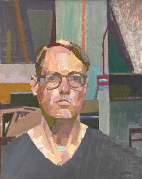
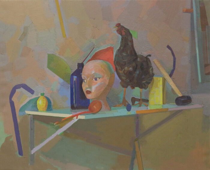
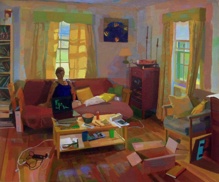
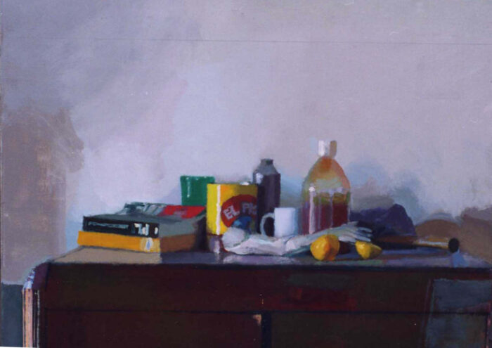
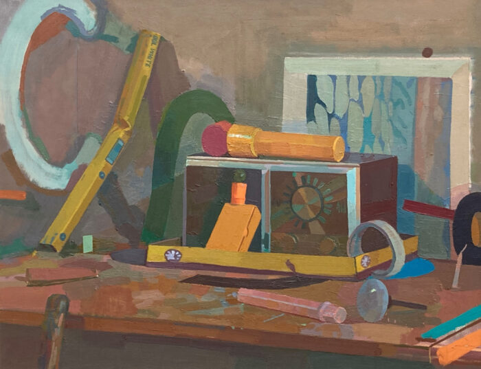
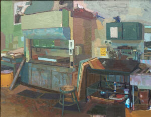
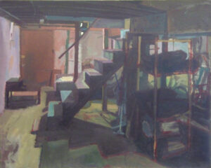
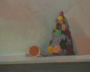
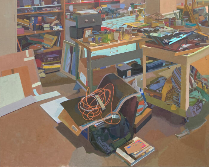
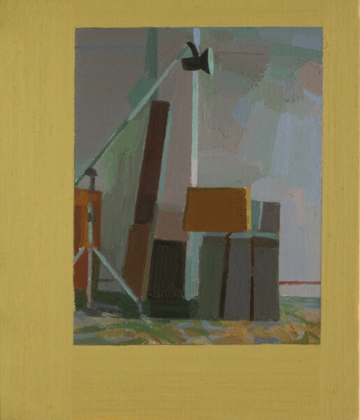
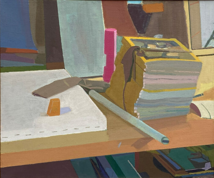
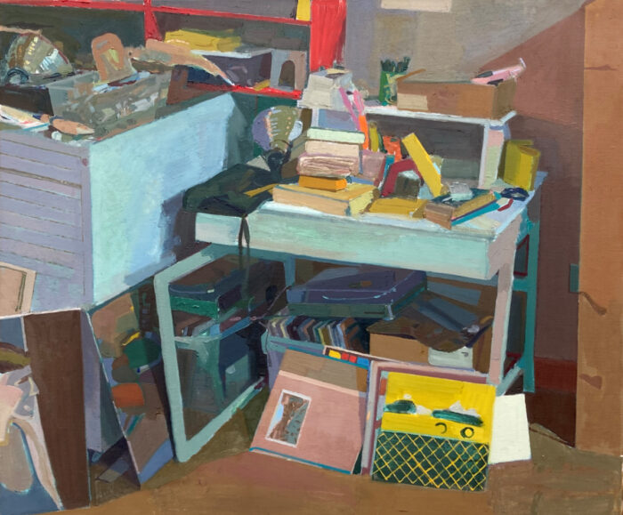
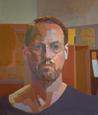
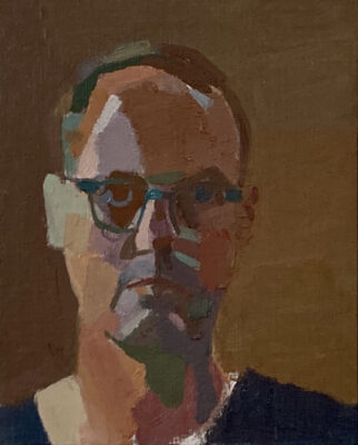
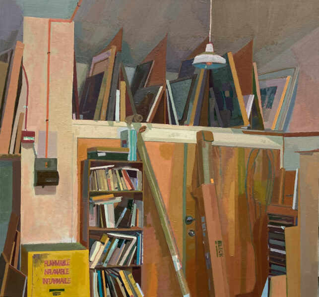
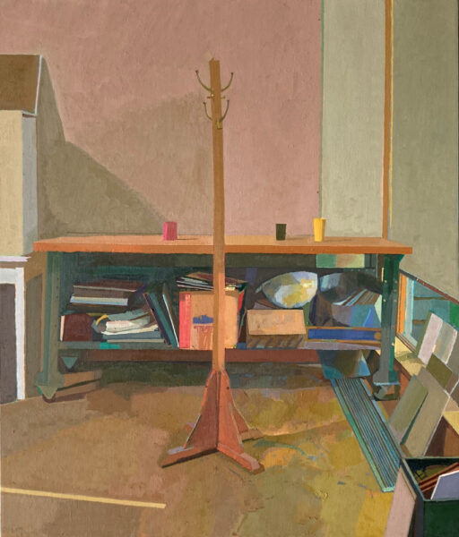
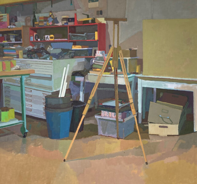
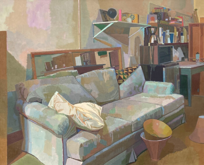
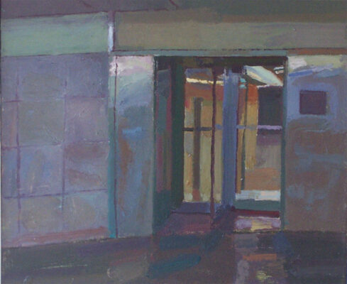
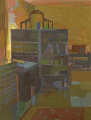
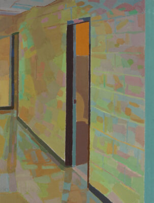
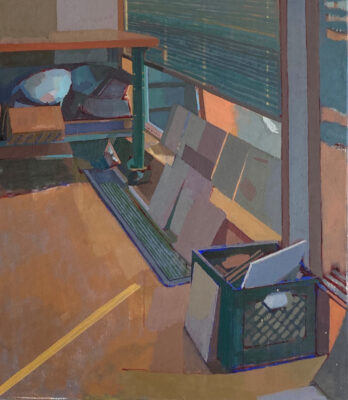
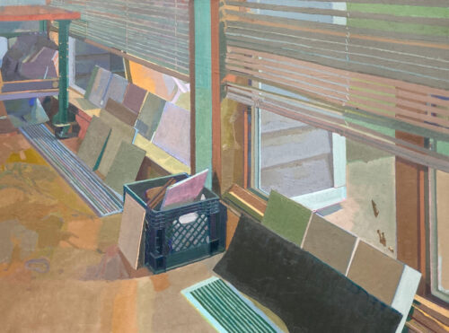
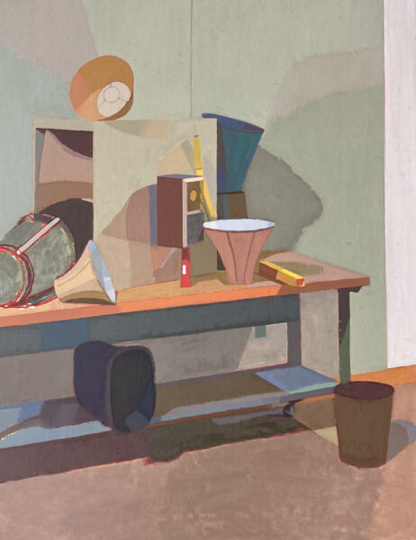
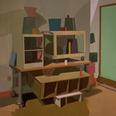
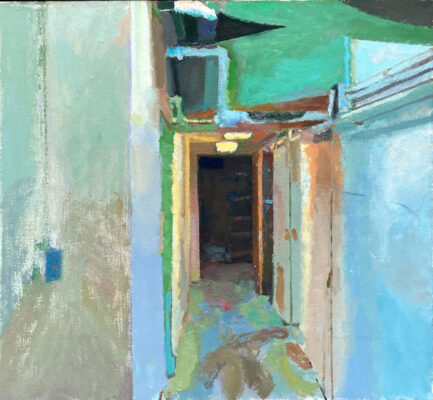


John has developed as a painter to find his own point of view That said, his point of view is one that others have believed in too – that color is personal and perception is subjective and that a painting is the amalgamation of so many sensations and their transformation into the painting
John is persistent in his work to make it right which is a place that is discovered
I’m glad to know John and I admire his dedication to his students He gives them so much to absorb and their personal freedom to make something of their own from it
This is an excellent interview one I will share with my friends and students
Bill
white
A very thoughtful and intelligent interview/essay. I can’t help but love the strict formalism of the discussion; there are no comments or explanations on the use of studio junk as the subject matter, just a discussion of the color and diagonals. And I enjoyed the comments on early fascination w 80s art world. John, you didn’t attend Studio School in 70s or Yale at that period?? You are someone who did so vicariously. You would have LOVED Leland Bell; right up your alley. And William Bailey. But it all turned out fine. I’m all for your pedagogical approach: teach the language and grammar first. And if you understand color, the drawing will take care of itself. Similarly, If a student has anything meaningful to say through the subject matter, it will take care of itself. I’m reading now a bio of Diego Ribera; there’s an artist who had plenty to say about the subject matter. But the subject matter alone is not at all what makes the paintings great. Leland Bell had a quote from some famous jazz musician: “It ain’t’ what you do, it’s how you do it.”
John, I just now read your interview. I enjoyed it. Interesting how your sentences align with what comes across in many of your paintings. There’s a different feeling to the color in your more recent work and it feels more alive and inspired. Too bad you didn’t get to spend time with Leland in person. He would appreciate your paintings. You reminded me how much he hated Salle. He wasn’t a great fan of Hopper either…
John Lee’s students are fortunate! Posts of their class work on his Facebook page show his expertise as an instructor. I love that he can pack so many shapes into a painting without making it feel cluttered. The newer paintings especially inspire in their increasing clarity of light. I have much respect for his work. Thanks for this interview.